Intermediate
Paging
Paging helps present numerous items from the dataset dividing them into groups to display on separate pages. It is used in conjunction with data components like dataview, datatable and list.
Pager can be initialized as:
- a separate UI-related component (should be linked to a component to enable paging);
- as a property of the component it is used for.
In both cases pager can be placed into its own HTML container different from that of the associated component.
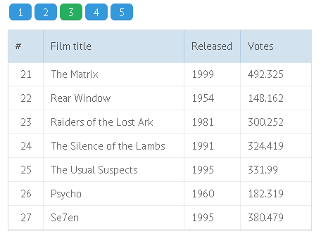
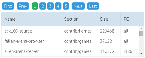
The main properties of a pager object:
- size - the number of records per page;
- group - the number of pages (numbered squares for paging);
- page - sets the page that will be shown initially (zero-based numbering).
If a component container is too small to display the number of items specified by the size config, a scrollbar appears.
Related sample: Paging Animation
Paging and Dynamic Loading
With dynamic loading, only part of the stored records is loaded into the component during initialization. Each time you page through the component, a data request is sent to the server to load the next portion of data.
Related sample: Dynamic paging. Loading from DB
Read more about dynamic loading.
Pager as a Separate View
In this case pager is initialized as a separate component in layout and is linked to the datatable by its ID.
webix.ui({
    rows:[
        {
            view:"datatable",
            columns:[ ...],
            pager:"pagerA", //linking to a pager
        },
        {
            view:"pager", id:"pagerA",
            size:50,
            group:5
        }
    ]
})
Related sample: Visible Pager in Layout
When pager is used as a standalone view, the size property can be combined with either the limit or the count property to set the total values for the pager, namely:
- limit - the total number of pages in a pager. The number of records will be calculated automatically.
- count - the total number of records the pager will process. The number of pages will be calculated automatically.
You can as well use Webix pager as a separate entity without a master component, and provide a fully custom logic for it - go to the end of the article for details.
Pager as a Component Property
Here the pager object appears to be the property of a datatable and includes its own parameters:
webix.ui({
    view:"datatable",
    columns:[...],
    pager:{
        size:50,
        group:5,
        level:1,
        template:function(){}
    }
});
Related sample: Level-based pager
Several Pagers per Component
If you want more than one pager for the component, for instance, pagers above and below the view, there should be two containers in HTML layout, or two views with pager instances. The two pagers must be linked to each other with the help of the clone method.
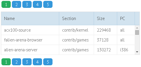
You can clone both standalone pagers and those included into the component constructor.
Cloning a standalone pager
// an identical pager
$$("pagerA").clone($$("pagerB"));

// a pager with some properties of its own
$$("pagerA").clone({
    container:"pagingB_here",
    size:50,
    group:5
});
Related sample: Two-area Pager
With a component pager, you need to get the pager object with the getPager() method:
Cloning a component pager
grida.getPager().clone({
    container:"paging_here_too",
    size:10,
    group:5
});
Related sample: Defining Several Pagers on a Page
Cloned pagers will change their values simultaneously!
Invisible Pager
Paging can be implemented through an invisible pager, which gives you the ability to control the process by custom functions and create your own "Next/Previous Page", "Jump to Start/End" buttons, etc. instead of a standard pager.
For these needs, you should include the apiOnly parameter with the true value into the pager constructor, whether it is initialized as a separate view or as a component's property.
Datatable with Invisible Pager
view:"datatable",
pager:{
    id:"pagerA",
    apiOnly:true, //makes pager invisible
    size:50,
    group:5
}
In this case, the dedicated buttons will help us page:
Next Page Button
<input type='button' value='next page' onclick='next_page()'>function next_page(){
$$("pagerA").select("next");
}
Related sample: Non-visible Pager
The select() function can take the index of the desired pager (zero-based numbering,) or its order ("next", "prev", "first", "last").
Custom Templates for Paging
By default, a pager looks as a set of numbered squares accompanying the component. But at the same time you can change the pattern with the help of a custom template:
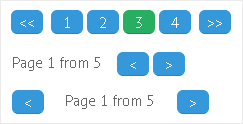
Template elements may include the following elements:
- {common.prev()} - 'less-than' sign, directs to previous page;
- {common.first()} - double 'less-than' sign, directs to the first page;
- {common.next()} - 'greater-than' sign, directs to the next page;
- {common.last()} - double 'greater-than' sign, directs to the last page;
- {common.page()} - displays the number of the current page (starting from 1);
- {common.pages()} - displays a set of numbered squares;
- pager data elements (e.g. '#limit#' to display the total number of pages);
- standard text.
pager: {
    template: "{common.prev()}{common.next()}Page {common.page()} from #limit#"
}
Related sample: Custom Pager Template
HTML Custom Pager
You can use HTML elements as a base for a custom pager that includes both HTML tags and pager properties in its template.
Properties of the component pager are stored in the data object, pager templates reside in the common object:
- data.page - the index of the current page (zero-based numbering);
- data.size - the number of data records per page (either set manually, or calculated on the base of the component size);
- data.limit - the number of processed records. Equals to the number of records in the connected component;
- common.next(), common.prev(), common.first(), common.last() - the page order signs.
Custom 'select' pager
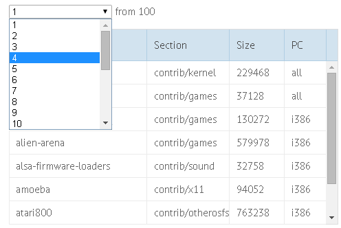
pager:{
  template:function(data, common){
    var current = data.page + 1;
    var html = "<select onchange='grida.setPage(this.value-1)'"+
        "style='text-align:center; width:150px'>";
    for (var i=1; i<=data.limit; i++)
        html+="<option "+(i == current?"selected='true'":"")+">"+i+"</option>";
    html+="</select> from "+data.limit;
    return html;
  },
  container:"paging_here",
  size:10,
  group:5
}
Pager Localization
By default, pager uses recognizable signs to display order buttons (first, last, prev, next).
Default Locale
webix.i18n.pager = {
    first: "<span class='webix_icon wxi-angle-double-left'></span>",
    last: "<span class='webix_icon wxi-angle-double-right'></span>",
    next: "<span class='webix_icon wxi-angle-right'></span>",
    prev: "<span class='webix_icon wxi-angle-left'></span>"
};
Pager localization allows using words of any language for these buttons:
Custom Locale
webix.i18n.pager = {
    first: "First",
    last: "Last",
    next: "Next",
    prev: "Prev"
};
Related sample: Pager Localization
Animation during Paging
Animation it switched on by the animate property. Set to true, it allows scrolling through the view in the X or Y mode, depending on the scroll value of the main component.
Animation can take various effects when they are stated in the animate constructor through the type, subtype and direction parameters.
pager: {
    animate:{
        direction:"top",
        type:"flip"
    }
}
Related sample: Paging Animation Types
Learn more about animation types and subtypes in the corresponding chapter of the manual.
Page and Component Size
Here we treat two tasks:
1 . How to ensure that the number of records per page equals to the number of records the component can display?
The number of records per page is stated by the size:{number} parameter of a pager.
At the same time, the number of records can be limited in the component itself by the following parameters:
- yCount - (number) the number of items in the vertical mode;
- xCount - (number) the number of items in the horizontal mode (typical of dataview and x-list).
All you need is to make these two parameters the same:
rows:[
    {
        view:"pager",
        id:"pagerA",
        size:10
    },
    {
        view:"datatable",
        columns:[...],
        pager:"pagerA",
        yCount:10
    }
]
Related sample: Adjusting Component Size to Page
2 . How to adjust the component size to the page size?
To adjust the number of records shown per page to the size of parent HTML container and, hence, to the component's height, you should let pager autosize.
<div id="testA" style='height:600px; width:300px;'></div>webix.ui({
rows:[
{
view:"pager",
id:"pagerB",
autosize:true,
group:5
},
{
view:"list",
pager:"pagerB",
container:"testA"
}
]
});
Related sample: Adjusting Page Size to Component Size
Paging Methods
Getting Pager Object
$$("datatable1").getPager();
Getting Current Page
Note that you'll get the page index (zero-based numbering), so add 1 to get the actual page number.
$$("datatable1").getPage();

//or, using the pager object
$$("pagerA").config.page;
Setting (Opening) Page
To switch to the necessary page, specify the page index within the dedicated method:
$$("datatable1").setPage(2); // makes the third page visible
or select the needed page:
$$("datatable1").getPager().select(2); // selects the third page
Standalone Pager
Pager can be used without a master component for creating custom logic. To render such a pager, the following code should be used:
webix.ui({
  view: 'pager',
  template: '{common.prev()} {common.pages()} {common.next()}',
  master:false,
  size: 50,
  group: 5,
  count: 1000,
  on: {
      onItemClick: function(id, e, node) {
          //..some custom logic..
      }
  }
});
The template parameter can be omitted in favor of the default template.
Related sample: Standalone Pager
Note that the count and size parameters should be used anyway, count divided by size equals to the total number of pages.