Intermediate
Data Editors
In this article built-in component editors and edit actions for them are discussed. To learn about Webix editing pattern, go to the main article.
Opening and Closing Editors
- an editor for the component is enabled, or opened, by the editaction that is defined for the whole component;
- an editor is closed by moving focus outside the editor (e.g. clicking another component part) or by pressing the 'Enter' hot key for saving the new value, or the 'Esc' hot key for exiting without saving.
Editor Types
editor:"text" Learn more |
 |
editor:"password" Learn more |
 |
editor:"inline-text" Learn more |
 |
editor:"select" Learn more |
 |
editor:"combo" Learn more |
 |
editor:"richselect" Learn more |
 |
editor:"multiselect"Available in Webix Pro edition only Learn more |
 |
editor:"checkbox" Learn more |
 |
editor:"inline-checkbox" Learn more |
 |
editor:"color" Learn more |
 |
editor:"date" Learn more |
 |
editor:"popup" Learn more |
 |
Related sample: Editor Collection
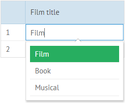
Text
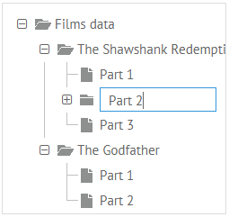
A base editor for text values of DataTable and DataView cells, list rows. By default it is enabled on clicking the needed item.
{ id:"title", header:"Film title", editor:"text" }
Related sample: Basic Use of Editors
Setting number format for a text editor
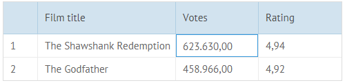
You can define a numeric format for entering values into a text editor. For this purpose, you should use the numberFormat attribute.
For correct rendering of number values, you should specify a delimiter for groups of digits and set a delimiter that will separate the decimal part in the float numbers. It is also possible to define any optional separator for numbers ("1-11"). For example:
webix.ui({
    view:"datatable",
    columns:[
        { id:"votes", editor:"text", numberFormat:"1'111.00", header:"Votes"},
        { id:"rating", editor:"text", numberFormat:"1.111,00", header:"Rating"}
    ],
    data: [
        { id:1, title:"The Shawshank Redemption", votes:"623630", rating:"4.943" },
        { id:2, title:"The Godfather", votes:"458966", rating:"4.921" }
    ]
});
Custom number format for editors
There is also a possibility to specify a custom number format for a text editor. In this case you will need to use functions set in the attributes described below:
- format - the function that handles a value that will be rendered in the cell
- editParse - the function that handles a real value kept by the control
- editFormat - the function that handles a value that will be visible for a user during editing
webix.ui({
    view:"datatable",
    columns:[
        {
            id:"phone", editor:"text", header:"Votes",
            format:function(value){
                return webix.i18n.numberFormat(value);
            },
            editParse: function(value){
                return webix.Number.parse(value, {
                    groupSize:webix.i18n.groupSize,
                    groupDelimiter:webix.i18n.groupDelimiter,
                    decimalSize : webix.i18n.decimalSize,
                    decimalDelimiter : webix.i18n.decimalDelimiter
                });
            },
            editFormat:function(value){
                return webix.i18n.numberFormat(value);
            }
        }
    ]
});
Related sample: Text Input with Custom Number
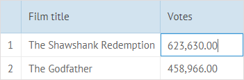
Locale-dependent number formatting
You can apply number format for a text editor depending on the set locale.
1. First of all, apply number format for the necessary text editor:
webix.ui({
  view:"datatable", id:"grid",
  columns:[
    { id:"id", header:"", width:30},
    { id:"title", editor:"text", header:"Film title",width:200},
    { id:"votes", editor:"text", header:"Votes", width:120,
      format:function(value){
        return webix.i18n.numberFormat(value);
      },
      editParse: function(value){
        return webix.Number.parse(value,webix.i18n);
      },
      editFormat:function(value){
        return webix.i18n.numberFormat(value);
      }
    }
  ],
  editable:true, autoheight:true, autowidth:true,
  data: [
    { id:1, title:"The Shawshank Redemption", votes:"623630" },
    { id:2, title:"The Godfather", votes:"458966" }
  ]
});
2. Then use webix.i18n.setLocale to apply the necessary locale to the number format of the text editor:
window.switchLocale = function(locale) {
  webix.i18n.setLocale(locale);
  $$("grid").refresh();
}
Related sample: Locale-Dependent Number Format for Text Editor
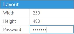
Password
A base editor for passwords that masks symbols in the input.
// in the property sheet an editor is defined by the "type"
{ id:"pass", label:"Password", type:"password" }
Related sample: Property Sheet: Basic Initialization
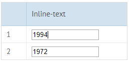
Inline-text
A customizable text editor. Here you should set a template for the editing area - the type and dimensions of an input area.
{ id:"year", template:"<input type='text' value='#value#' style='width:130px;'>",
    editor:"inline-text" }
Related sample: Using 'inline' editors
- If you specify the editor:"inline-text" attribute, the component will provide a special processing treat for the editor while editing: invoking edit-related events.
- If you don't specify the editor attribute, you should provide the processing logic for the editor on your own.
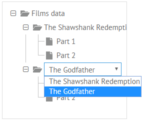
Select
A customizable editor that allows choosing one of the offered values. It looks like a standard HTML select control.
{ id:"type", header:"Category", editor:"select", options:[...]}
Related sample: Using the 'select' Editor
The options can be defined in several ways. Look here for details.
Combo
Webix Combo control with the possibility to filter a popup list by entering symbols into the dedicated input.
{ id:"title", header:"Film title", editor:"combo", options:[...]}
Related sample: Datatable: Combo Editor
- The options can be defined in several ways. Look here for details;
- The editor is subject to extensive customization.
Pro Extensions for Combo Editor
In the Webix Pro edition the editor can be extended to show either a dataview or datatable in the popup:
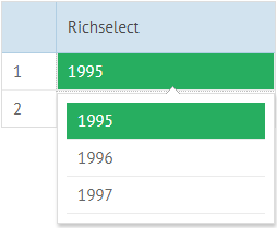
Richselect
Webix RichSelect control that is a non-editable variation of a Combo editor.
{ id:"title", header:"Film title", editor:"richselect", options:[...]}
Related sample: Datatable: RichSelect Editor
- The options can be defined in several ways. Look here for details;
- The editor is subject to extensive customization.
Pro Extensions for Richselect Editor
In the Webix Pro edition the editor can be extended to show either a dataview or datatable in the popup:
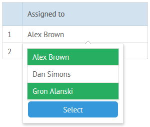
Multiselect
The editor is available is Webix Pro edition only
The editor is based on Webix MultiSelect control and allows selecting multiple options at a time.
{ id:"assigned", editor:"multiselect", optionslist:true, options:[...]}
Related sample: Multi-Select Editor in the DataTable
- The optionlist property is defined for the editable element (here:column) so that it could parse multiple values from the editor into a single cell value.
- The options can be defined in several ways. Look here for details.
- The editor is subject to extensive customization.
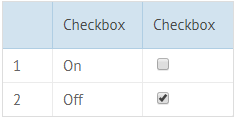
Checkbox
A checkbox editor presupposes the choice between two values (true or false). In general, yon can assign any value to "true" and "false" checkbox states.
{ id:"ch3", header:"CheckBox", template:"{common.checkbox()}", editor:"checkbox"}
The notation above does nothing with the checkbox value. If you want to derive its value as a data item property, you should either:
- Define the checkbox options with values for each state:
{ id:"ch3", template:"{common.checkbox()}", editor:"checkbox", options:{
    "true":"On","false":"Off","undefined":"Off"}}
Related sample: Using 'Inline' Editors
- Set the checkValue/unCheckValue pair:
{ id:"ch1", checkValue:"on", uncheckValue:"off", template:"{common.checkbox()}",
    editor:"checkbox"}
Related sample: Checkbox and Radio in DataTable
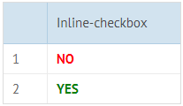
Inline-checkbox
A customizable checkbox. You can do without a checkbox icon and define any template for boolean values, even a styled text.
function custom_checkbox(obj, common, value){
    if (value)
        return "<div class='webix_table_checkbox checked'> YES </div>";
    else
        return "<div class='webix_table_checkbox notchecked'> NO </div>";
}
    ...
{ id:"ch1", header:"", template:custom_checkbox, width:40, editor:"inline-checkbox"}
Related sample: Custom Radio and Checkbox in DataTable
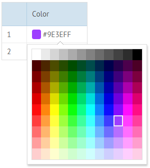
Color
Color pop-up editor. It is used for editing color value in the dataset with the help of a Colorboard. Colors are stored as hex codes; hence, you should set an appropriate template for a component item to display the chosen result as a color, for instance, to make a colored background.
var tpl="<span style='background:#value#; border-radius:4px;'> </span> #value#";
{ id:"start", editor:"color", template:tpl, header:"Color A",width:120}
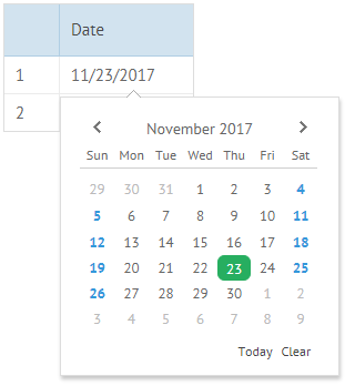
Date
Date pop-up editor. In its essence, it is a DatePicker that initializes a Calendar to pick the necessary date.
{ map:"(date)#enddate#", editor:"date", header:"End date", width:120}
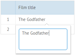
Popup
Text pop-up editor for editing long texts based on Textarea. The popup has width: 250 and height:50 properties by default.
{ id:"title", header:"Film title", editor:"popup"}
Related sample: Pop-up Editors
Besides the standard for editors "Enter" hot key used for entering text, the Popup editor supports the "Shift+Enter" hot keys functionality. It is used for making a new paragraph in a multiline text (moving a part of text to a new line).
$Popup
$popup allows for changing all the popup editors in one scope.
Date and Color editors are popups by default. For text popup editor, you should specify the "popup" value for the editor property.
webix.editors.$popup = {
    text:{
        view:"popup",
        body:{view:"textarea", width:250, height:50}
    },
    color:{
        view:"popup",
        body:{ view:"colorboard", width:200, height:200, rows:20, cols:20 }
    },
    date:{
        view:"popup",
        body:{ view:"calendar", weekNumber:true, width: 220, height:200}
    }
};
There is also another way to add a popup editor. This can be implemented through a Suggest control that complements another view. Inside such a Suggest you can change its type from "list" to "calendar" or "colorboard". Read more about it here
Related sample: Different Types Of Suggest
Popup Configuration
Configuring popups in a scope
You can configure editing controls inside popup windows, e.g. define other dimensions, alter properties of textarea, colorboard and calendar (check the corresponding articles.)
Popup editors can be configured in a scope with the following code. All the same-name editors in the application will be redefined:
//config may as well include only text, color and date hash
webix.editors.$popup = {
    text:{
        view:"popup", width:250, height:200,
        body:{view:"textarea"}
    },
    color:{
        view:"popup",
        body:{ view:"colorboard", width:500, height:500, rows:50, cols:50 }
    },
    date:{
        view:"popup",
        body:{ view:"calendar", weekNumber:true }
    }
};
Configuring popups separately
Any instance of a popup editor can be configured separately, with the help of the suggest property of an item in question:
Adding a weekHeader to the Date editor
{ id:"start", editor:"date", suggest:{
    type:"calendar",
    body:{
        weekNumber:true
    }
}}
- type (string) - the type of a suggest list that defines which Webix component will be used in the suggest body. The possible values are:
- "list" - a default suggest type that is used for select editors (combo, richselect and multiselect), can be omitted;
- "calendar" - a suggest type for the date editor;
- "colorboard" - a suggest type for the color editor;
- body (object) - the configuration of a component (list, calendar or colorboard)
Select editors offer a wide range of customization possibilities that are described in detail separately.
Defining Options for Select Editors
Options for select editors (select, combo, richselect, and multiselect) are defined under the common pattern width the help of the "options" or "collection" attributes of the dedicated column.
There are several possibilities:
- Options are set in the "options" attribute either in an index or associative array as well as in an array of JS objects (directly or in a variable):
Options defined by a simple array in the column config
columns:[
    { id:"cat_id", editor:"select",
      options:["Crime", "Thriller", "Western"] }
]
Related sample: Using the 'select' Editor
Options defined by an associative array (hash)
var option_hash = {
    "1" : "Thriller",
    "2" : "Crime",
    "3" : "Western"
};
//...
columns:[
    { id:"cat_id", editor:"select", options:option_hash }
]
Options defined by an array of objects in the column config
columns:[
    { id:"cat_id", editor:"select", options:[
        {id:1, value: "Crime"},
        {id:2, value:"Thriller"},
        {id:3, value:"Western"}
    ]}
]
Related sample: Using the 'select' Editor. Specifying Select Options in a Variable
Related sample: Datatable: Combo Editor
- Options can be taken from another data component or a DataCollection:
var options = new webix.DataCollection({
    url:"https://docs.webix.com/samples/13_form/01_controls/server/data.php"
});
//...
columns:[
    { id:"cat_id", editor:"select", options:options },
    { id:"purchases", editor:"richselect", options:"other_grid_id" }
]
Related sample: Datatable: Combo Editor
- Options are taken from a file or loaded by an url defined by a string value of the "options" attribute.
Options loaded from an external file
columns:[
    { id:"cat_id",  editor:"select", options:"data/options.json" }
]
Related sample: Loading Data in the 'select' Editor
- Options can also be defined as a function or a proxy.
var myProxy = webix.proxy("rest", "/server/data");
webix.ui({
    rows:[
        {
            view:"datatable",
            columns:[
                { id: "titleId", width:400, options:myProxy, editor:"richselect" }
            ],
            data:[
                { id:"1", titleId:1 }
            ]
        }
    ]
});
"Options" have an alias attribute "collection" that features the same functionality.
Using "collection" to define options
columns:[
    { id:"cat_id", editor:"combo",  collection:film_options, header:"Category"}
]
Related sample: Datatable: Option collections for columns, filters and editors
Advanced Configuration of Select Editors
The combo, richselect and multiselect editors are highly customizable just like the widgets themselves. You can change the following things:
- the template of list items;
- the template of the input field (combo editor only);
- the filtering pattern (combo only);
- the text of the "Select" button (multiselect only);
- the number of list items in the popup;
- functions can be attached to a list.
To apply your changes, you need to set:
1. options or collection to interpret options into text;
2. suggest to define the configuration of a related popup list.
For example:
{
    id:"year", editor:"combo", options:years,
    suggest:{
        template:"#value#", //template of the input when editor is opened, default
        filter:function(item,value){ //redefines default webix combo filter
            if (item.value.toString().toLowerCase().indexOf(value.toLowerCase()) === 0)
                return true;
            return false;
        },
        body:{
            template:"Year #value#", //template of list items
            yCount:7, //10 by default
            on:{
                "onItemClick":function(id){
                    webix.message(this.getItem(id).value);
                }
            }
        }
    }
}
Related sample: Datatable: Advanced Combo Editor
Multiselect specificity
To configure a suggest list for a multiselect editor, one should specify its suggest type - multisuggest:
{ id:"year", editor:"multiselect", options:years, optionlist:true, suggest:{
    view:"multisuggest",
    buttonText:"Select items"
}}
The optionlist property of multiselect may contain a separator for the values of the control. If you use multisuggest as a part of a multiselect editor and need to change the default separator, you should specify the desired separator both in the multisuggest and in the optionlist:
{ editor:"multiselect", optionslist:";", options:[], suggest:{
    view:"multisuggest",  separator: ";"
}}
Datatable and Treetable Specificity - Live Editors
Webix datatable, treetable, and property sheet can use any of the above mentioned editors in the live mode and update the same data property in case it's used not only in the edited column.
//"rating" is used in both columns, while it can be editable only in the first one
columns:[
    { id:"rating",  header:"Count", editor:"inline-text", liveEdit:true},
    { template:"#rating#", width:150 }
]
Related sample: Using 'live' Editors
The moment the second column (the one that is automatically edited) changes its value, onLiveEdit event takes place.
Edit Actions
- 'click' - opens the editor on a single click (used by default);
- 'dblclick' - opens the editor on a double click;
- 'custom' - allows setting the necessary way of editing, e.g a keyboard event.
When setting an editaction to "custom", you need to refer to UIManager and write a function to enable the needed editing pattern:
webix.UIManager.addHotKey("enter", function(view){
    var pos = view.getSelectedId();
    view.edit(pos);
}, gridc);
Here editing is enabled on pressing the "Enter" key on the selected item.
Custom Editors
The library allows creating fully custom editors.
webix.editors = {
    "mytext":{
        focus:function(){/*...*/},
        getValue:function(){/*...*/},
        setValue:function(value){/*...*/},
        render:function(){/*...*/}
    }
};
To define a new editor, you should specify at least 5 methods for it:
- focus() - sets the focus to the input with the editor;
- getValue() - gets the value of the editor;
- setValue() - sets the value of the editor;
- render() - renders the editor;
- getInputNode() - gets the input area object.
For instance, this is how a built-in text editor is created:
webix.editors.myeditor = {
    focus:function(){
        this.getInputNode().focus();
        this.getInputNode().select();
    },
    getValue:function(){
        return this.getInputNode().value;
    },
    setValue:function(value){
        this.getInputNode().value = value;
    },
    getInputNode:function(){
        return this.node.firstChild;
    },
    render:function(){
        return webix.html.create("div", {
            "class":"webix_dt_editor"
        }, "<input type='text'>");
    }
}
Inner properties are:
- this.node - the HTML tag of the editor. Appears after render() executes;
- this.value - the initial value of an input. Appears after setValue(); executes;
- this.config - the editor configuration;
- this.popup - the popup ID (is used for editors with popup windows).
Extending Editors Functionality
In addition to creating an editor "from scratch", you can extend any of the existing ones. It becomes helpful when slight changes are needed.
For instance, you have a datatable column with e-mails. The input type email from HTML5 package will warn you in case some of e-mail address features are missing.
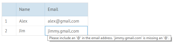
In this case you extend the existing text editor and change the render pattern in it:
webix.editors.myeditor = webix.extend({
    render:function(){
        return webix.html.create("div", {
            "class":"webix_dt_editor"
        }, "<input type='email'>");
    }
}, webix.editors.text);
Related sample: Custom Text Editor
Back to top