Button
API Reference
Button Types and Styles
Webix Buttons comprise several types and build-in styles.
Button Types
A type defines the content of the button. There the following types:
- standard (default)
- image
- imageTop
- icon
- iconTop
To set the type, set the type property:
{
    view:"button", id:"my_button", value:"Button",
    type:"icon", icon:"wxi-pencil", inputWidth:100
}
Icon Buttons
{ view:"button", type:"icon", icon:"mdi mdi-email", label:"Mail", width:80 }
Icon button features some specific configuration options:
- icon - (string) the icon name. The name of a default icon is formed as wxi-name. A custom icon requires specifying the full name of the icon;
- label - (string) the text on a button by the icon;
- type - (string) defines the type of a button:
- icon - a small icon button with a label to the right of the icon;
- iconTop - a big icon button with a label below the icon.
For further information about icons in Webix widgets read the Icons with UI Widgets article.
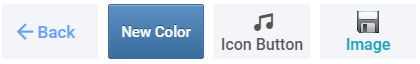
Image Buttons
{ view:"button", type: "image", image:".../img.gif", label: "Image Button" }
Related sample: Buttons: Type 'image'
Image button features some specific configuration options:
- image - (string) path to the desired image;
- label - (string) text on a button by the image;
- type - (string) defines the type of a button:
- image - a button with an image and a left-hand label:
- imageTop - a button with an image and a label below the image.
HTML Buttons
{
    view:"button", css: "icon_back_btn",
    label:'<span class="webix_icon fas fa-angle-left"></span>'+
        '<span class="text">back</span>',
    inputWidth:100
}
Related sample: Buttons: Styling
To create a button with some HTML content inside, you need to specify HTML markup and CSS styling. To add your CSS class, set the css property of the button. You can use the class to style the button itself, its text, icon or image:
.icon_back_btn .webix_icon{/*  ... */}
.icon_back_btn .text{/*  ... */ }
.icon_back_btn button{/*  ... */}
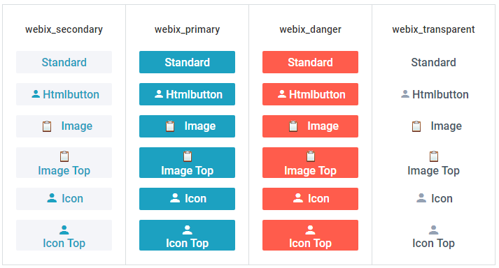
Button Styles
Buttons have four styles for coloring that can be set in the css property:
- webix_secondary light-grey or blue (depends on the skin, default),
- webix_primary turquoise or green,
- webix_danger red,
- webix_transparent transparent (takes the color of the parent widget).
Buttons with Badges

{ view:"button", width:40, badge:12, type:"icon", icon:"mdi mdi-comment" }
Any button regardless of its type can be equipped with a badge with the help of a same-name property.
Related sample: Buttons: Type 'icon' with Badges
Setting Autowidth for Buttons
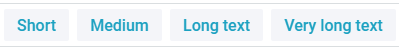
{ view:"button", label:"Short", autowidth:true }
It's possible to adjust the width of a button to the size of its content, using the autowidth property set to true.
Related sample: Buttons - AutoWidth
Button Configuration
This are the configuration properties of Button:
- value - (string) defines the text displayed on standard-type buttons;
- label - (string) defines the text or/and HTML markup for the regular button as well as for buttons of image and icon types and their variations;
- type - (string) defines the type of the button;
- width - (number) sets the width of the button;
- inputWidth - (number) sets the width of the text on the button and adjusts button width to it;
- image - (string) sets a path to the button icon;
- align - (string) positions a button with relation to a parent view;
- popup - (string) defines the ID of a popup window that will be shown on button click;
- click - (function) defines a function that will be executed on clicking the button (another possibility is to attach an event handler to onItemClick using the button ID);
- css - (string) name of CSS class applied to a button;
- badge - (number/string) adds an orange circle that notifies about the number of new messages for an icon button;
- autowidth - (boolean) sets the mode in which the button width automatically adjusts to the button content.