Available only in PRO Edition
Multitext
The control is available only in Webix Pro edition.
API Reference
Overview
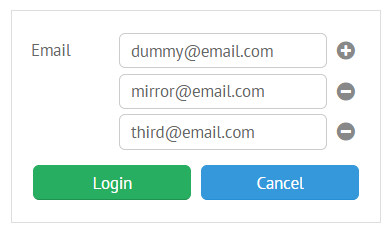
UI-related multitext is a dynamic control based on standard Webix text input. It offers the possibility to add and delete additional fields on the go.

Initialization
{
    view:"multitext",
    id:"multi",
    value:"dummy@email.com",
    label:"Email"
}
Related sample: Multi-Text input
Main properties:
- value (string) - the initial value to display in the input field. The string parts separated by a comma (",") will be put to additional input fields);
- label (string) - text label of a control. It can be customized by:
- labelAlign (string) - label alignment towards its container. Possible values are "left" and "right". In any way, it's placed left to the control;
- labelWidth (number) - width of the label container;
- labelPosition (string) - defines label position related to the input field. The only possible value is "top";
- placeholder (string) - the initial text in the text field, disappears as you start typing in it;
- attributes (object)
- icon (string) - the control's icon.
Field IDs
Each field of a multitext control features its own ID. It can be either a given (for the basic field) or an auto-generated one. All the methods of a multitext object can be applied to any field object.
Order of Adding New Fields
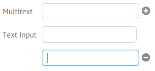
New fields are added at the bottom of Multitext parent layout. However, if you will create some other view after the Multitext one, new rows will be added after this view.

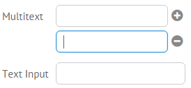
In order to add new fields in the correct way, you should place the Multitext view into a separate layout:
webix.ui({
  view:"form",
  elements: [
    {
        rows:[
            {view:"multitext", name:"multitext1", label:"Multitext"}
        ]
    },
    {view:"text",name:"newinput",label:"Text Input",width:270},
  ]
});
With such a configuration, each new field will appear after the previously added one.

Tuning Additional Fields
Additional fields inherit configuration from the main one. In order to define common settings for all additional fields, state it in the subConfig object:
webix.ui({
    rows:[
      {view:"multitext",
      value:'99999, number',
      label:"Custom" ,
      pattern:{mask:"###-## ########"},
      attributes:{ maxlength:10 },
      subConfig:{
         pattern:{mask:"###-##-##"},
         attributes:{ maxlength:10 }
      }}
    ]
});
In case of dynamic configuration, handle onSectionAdd event.
Detailed information on formatting text inputs you can find in the related article.
Adding and Removing Fields Dynamically
Multitext API allows adding and removing additional fields dynamically:
var newFieldId = $$("multi").addSection();

// remove specific field
$$("multi").remove(newFieldId);
// remove all the additional fields
$$("multi").remove();
Notes:
- Only additional fields can be removed, the basic one always remains.
- The methods can be called from any multitext object from the group.
Setting and Getting Values
Multitext features an extended API for setting and getting its values.
- setValue and getValue methods for working with the value of the whole control;
- setValueHere and getValueHere methods for for working with the value of the first (basic) field.