Switch Button
Since 5.2
API Reference
Overview
The Webix Switch Button is a slider variation of the Checkbox and Toggle Button controls. It allows a user to turn some settings on and off, depending on the current position of the switch.
Thus, the control provides the possibility to choose between two opposite states and has two values for them: 0 (off) and 1 (on).
Initialization
The code below creates a Switch button on a page:
{ view: "switch", value: 1, label:"Light" }
Main properties
- value - (number) sets the turned on (1) or turned off (0) state of the button
- label - (string) sets the label of the button
- labelWidth - (number) sets the width of the label (80 by default)
- labelRight - (string) sets the text of the right-hand label
- onLabel - (string) a text label on the button in the turned on state
- offLabel - (string) a text label on the button in the turned off state
Switch Types
The Switch Button can be presented in several ways, depending on its configuration options. Thus, you can create:
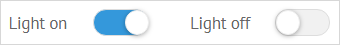
a default switch with a left-hand label:

{ view: "switch", value: 0, label:"Sound" }
a switch with a right-hand label:

Use the labelRight property for this. Note that in order to align a switch with a right-handed label to the left part of the screen, you need to clear the default labelWidth value (which is 80 by default):
{ view: "switch", value: 0, labelWidth:0, labelRight:"Sound" }
a switch with labels specified right on the button:
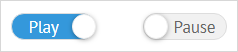
Apply the pair of properties onLabel/offLabel to initialize such a switch:
{ view: "switch", onLabel: "On", offLabel:"Off", value: 1 }