Slider
API Reference
Overview
Slider is designed for setting a numeric value from a predefined range of values. It's done by dragging a marker to the left and to the right over the value line.
Negative values are possible.
Initialization
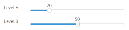
{ view:"slider", label:"Level", value:"20", min:10, max: 120, name:"s1"}
Main Properties
- value (number) - initial value of the control;
- label (string) - text label of a control. It can be customized by:
- labelAlign (string) - label alignment towards its container. Possible values are "left" and "right". In any way, it's placed left to the control;
- labelWidth (number) - width of the label container;
- name (string) - name of the control used to get its value in the form;
- step (number) - distance to the next selectable value (1 by default);
- min (number) - minimal value of a slider control. 0 by default;
- max (number) - maximum value of the slider control. 100 by default;
- title (template|function) - text label over the slider marker;
- type (string) - the type of the slider marker. The default marker is round. To set an alternative square marker, set the type value to "alt";
- moveTitle (boolean) - defines that the text label of slider is movable. true by default;
- vertical (boolean) - makes the slider vertical. false by default;
- axisTitles (boolean|function) - adds axis titles for a slider. false by default;
- titleWidth (number) - sets the width of the title for a vertical slider, if it's on the left when used with axisTitles.
Related sample: Slider: Custom Step.
Note that if you set min and max parameters, the initial control value should be within their range.
Vertical Slider
Webix Slider can be both horizontal and vertical. The image below shows how vertical sliders look like:
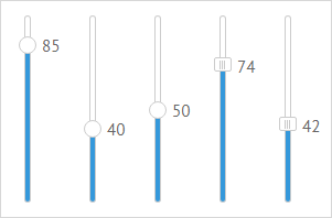
To set the vertical mode, you need to specify the vertical attribute in the slider configuration object:
{ view:"slider", name:"s1", value:85, vertical:true}
Related sample: Vertical Slider
Slider Title
Slider title is based on the current value of the control.
For a simple title that displays the current value and a static text, set a template via the webix.template class:
{view:"slider", title:webix.template("Selected: #value#")}
For a complex title that changes its text depending on the current value, define a function template:
{view:"slider", title:function(obj){
    //title for values over 20
    var text = obj.value > 20 ? "Minimum level reached. " : "";
    return text + "Value: "+ obj.value;} //title for other values
}
By default, the slider title is movable. You can change this behavior by setting the moveTitle property to false:
{view:"slider", title:webix.template("Selected: #value#"), moveTitle:false}
Related sample: Slider: Labels
Slider Events
Make use of slider events to set changing title for a drag marker:
- onChange - a common event for all controls that fires each time the value of a control changes. For slider it takes place as soon as you stop dragging the marker, which sets a new value.
- onSliderDrag - fires each time you drag the marker over the line while paying attention to the changing value.
{view:"slider", on:{
    onChange:function(){
        this.define("title", "Final value " + this.getValue());
        this.refresh();
    },
    onSliderDrag:function(){
        this.define("title", "Dragging... Currently "+this.getValue());
        this.refresh();
    }
}}
Related sample: Slider: Labels
The new title is set with the help of the define method while the current value is derived with the getValue one.
Read more about Changing Properties of Components.
Back to top