Available only in PRO Edition
RangeSlider
The control is available only in Webix Pro edition.
API Reference
Overview
Range Slider is an advanced Slider control that allows selecting a specific range of values with two markers.
The colored space between the markers defines the values included into the range.
Initialization
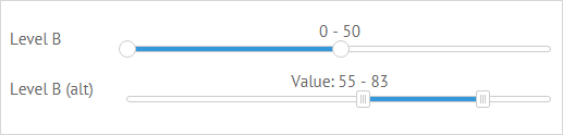
{ view:"rangeslider", label:"Level B", value:[0,50], name:"s2"}
Main Properties
- value (string|array) - the starting and the ending values of the range;
- label (string) - the text label of the control. It can be customized by:
- labelAlign (string) - the label alignment towards its container. Possible values are "left" and "right". In any way, it's placed left to the control;
- labelWidth (number) - the width of the label container;
- name (string) - the name of the control used to get its value in the form;
- title (template|function) - the text label over the slider marker;
- type (string) - the type of the rangeslider marker. The default marker is round. To set an alternative square marker, set the type value to "alt".
- moveTitle (boolean) - defines that the text label of rangeslider is movable. true by default;
- vertical (boolean) - makes the slider vertical. false by default;
- axisTitles (boolean|function) - adds axis titles for a range slider. false by default;
- titleWidth (number) - sets the width of the title for a vertical range slider, if it's on the left when used with axisTitles.
Vertical RangeSlider
You can initialize RangeSlider both in the horizontal and vertical modes. A vertical range slider is presented in the image below:
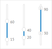
To make the control vertical, set the vertical attribute of the rangeslider configuration object to true.
{ view:"rangeslider", value:"15,60", width:70, vertical:true },
Related sample: RangeSlider: Vertical
RangeSlider Title
RangeSlider title is based on the current value of the control.
For a simple title that displays the current value and a static text, set a template via the webix.template class:
{view:"rangeslider", title:webix.template("Selected: #value#")}
For a complex title that changes its text depending on the current value, define a function template:
{view:"rangeslider", title:function(obj){
    // title for values over 20
    var text = obj.value > 20 ? "Minimum level reached. " : "";
    return text + "Value: "+ obj.value;} // title for other values
}
By default, the rangeslider title is movable. You can change this behavior by setting the moveTitle property to false:
{view:"rangeslider", title:webix.template("Selected: #value#"), moveTitle:false}
Related sample: RangeSlider: Vertical
RangeSlider Events
Make use of rangeslider events to set a changing title for a drag marker:
- onChange - a common event for all controls that fires each time the value of a control changes. For a rangeslider it takes place as soon as you stop dragging the marker, which sets a new value.
- onSliderDrag - fires each time you drag the marker over the line, while paying attention to the changing value.
{view:"rangeslider", on:{
    onChange:function(){
        this.define("title", "Final value " + this.getValue());
        this.refresh();
    },
    onSliderDrag:function(){
        this.define("title", "Dragging... Currently "+this.getValue());
        this.refresh();
    }
}}
The new title is set with the help of the define method while the current value is derived with the getValue one.
Read more about Changing Properties of Components.
Back to top