ColorPicker
API Reference
Overview
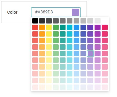
Colorpicker allows for selecting a color from the dedicated colorboard that is initialized on clicking its input field.
Initialization
{ view:"colorpicker", label:"Front color", name:"color", value:"#ffaadd" }
Related sample: Colorpicker in Form
Main Properties
- label (string) - text label of a control. It can be customized by:
- labelAlign (string) - label alignment towards its container. Possible values are "left" and "right". In any way, it's placed left to the control;
- labelWidth (number) - width of the label container;
- value (RGB, HSL, HEX formats, HTML color codes) - the initial value of the picker that is changed by picking any color from the colorboard.