Setting Progress Bar and Overlay Messages
Webix allows visualizing the application workflow by adding the following elements to its components:
- progress bar
- progress icon
- overlay box with or without message
Setting Progress Bar/Icon
Progress bar and icon are provided by Webix Progress Bar module that can be easily mixed into any component including layouts.
webix.extend($$("view_id"), webix.ProgressBar);
Since now, the component with "vew_id" ID features two methods:
- showProgress(config) - shows the progress bar/icon according to the passed configuration, or default one if the configuration is not provided
- hideProgress - hides progress bar/icon that was shown by the above mentioned method.
Configuration for a progress bar/icon includes:
- type (string) - type of a progress element:
- "top" - progress bar at the top of the view
- "bottom" - progress bar at the bottom of the view
- "icon" - progress icon at the center of the view
- icon (string) - icon name (only if type:"icon" is set). Icon names can be checked at Material Design Icons
- delay (number) - life time in milliseconds of the progress bar, after which it is hidden (if hide parameter is enabled)
- hide (boolean) - specifies whether a progress bar/icon should be hidden after its life time
- position (number) - an optional parameter, works only for the progress bar. Specifies the position of the inner scale on the bar. Varies from 0 to 1.
Progress Bar for the Data Component
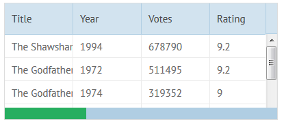
Progress Bar
//initializing the component
webix.ui({
    view:"datatable", id:"data",
    // ...
});

//adding progress bar functionality to it
webix.extend($$("data"), webix.ProgressBar);

//using the functionality
$$("data").showProgress({
    type:"bottom",
    delay:3000,
    hide:true
});
Related sample: Progress Bar: Data
Progress Icon for Layout
Progress Icon
//initializing the layout
webix.ui({
    id:"app", rows:[
        // app config
    ]
});

//adding progress bar functionality to it
webix.extend($$("app"), webix.ProgressBar);

//using the functionality
$$("app").showProgress({
   type:"icon",
   delay:3000
});
Additionally, an app can be disabled while progress is running.
Related sample: Progress Bars: Layout
Setting Overlay Boxes to Components
Overlay box is provided by Webix OverlayBox module and allows creating placeholders for data components.
The module needs to be included into the component via extend:
webix.extend($$("list1"), webix.OverlayBox);
After that the following methods become accessible from the component:
- showOverlay(text) - shows overlay box with the passed text or HTML
- hideOverlay() - hides the overlay box.
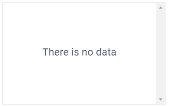
List with 'no data' message
webix.ui({
    view:"list",
    url:"...",
    ready:function(){
        if (!this.count()){ // if no data are available
            webix.extend(this, webix.OverlayBox);
            // show custom HTML
            this.showOverlay("<div style='...'>There is no data</div>");
        }
    }
});
Component-specific support of overlay boxes
Webix datatable features prebuilt overlay support.