Responsive Layouts
Webix layout and accordion structures can respond to the changes of window size by hiding & showing or moving their rows (cols) depending on currently available space.
It occurs when:
- Layout or Accordion are initialized without an HTML container, and hence, feature no fixed sizing;
- The size of any component in such a layout/accordion is bigger than the space available for its rendering.
The right way to solve this issue is to apply fixed sizing for inner components. Read more on initial component sizing.
Responsive behavior features 2 modes:
- Views are hidden and can be shown back;
- Views are moved to another place in the layout.
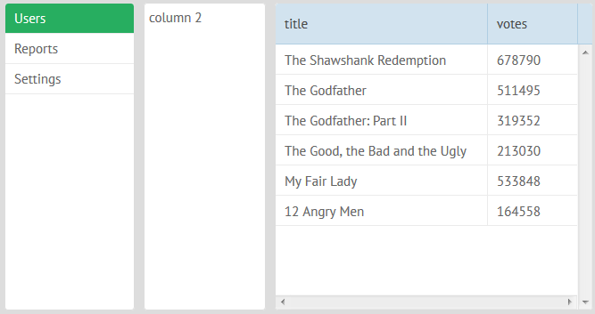
Initial Layout
Responsive Hiding
To enable view hiding and showing on window resizing, set the responsive property of a layout/accordion to true.
webix.ui({
   view:"layout", //optional line
   responsive:true,
   cols:[
        {view:"list", ...},
        {view:"template", ...}
        {view:"datatable", ...}
    ]
});
Related sample: Responsive Layout - Hidden Cells
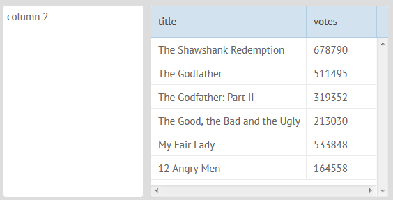
When space is not enough, the last view from the left is hidden first.
After Window Resizing
Responsive Moving
To enable component moving during window resizing, set the ID of the target layout as a value of the responsive attribute of the parent layout of the needed component:
webix.ui({
    id:"a1", rows:[
        { responsive:"a1", cols:[ // parent layout for template
             { view:"list", ...},
             { view:"template", ... }, // template will be moved to "a1" layout
             { view:"datatable", ... }
        ]}
    ]
});
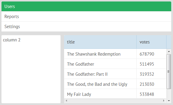
When space is not enough, the middle and right views are more likely to be moved.
Related sample: Responsive Layout
After Window Resizing
If accordion items are placed into layout during resizing, they will behave like layout rows and cols.
For layouts and accordions that lie inside an HTML container, the functionality can be switched on by calling the resize() method after the container has been resized:
webix.event(window, "resize", function(e){
    $$("layout").resize();
});
Responsive Layouts API
Events
- onResponsiveHide - fires when some view is hidden/moved because of responsive attribute processing
- onResponsiveShow - fires when some view is shown/restored because of responsive attribute processing
You can use events to make some changes in the app (when side menu is hidden, the icon on a toolbar can be shown, for example)
webix.attachEvent("onResponsiveHide", function(id){
    if (id === "side_menu_id")
        $$("topbar_menu_button").show();
});
Properties
Inside of the responsive layout you can mark some cell as non-responsive, so they will not be moved/hidden, even if there isn't enough space to show them.
webix.ui({
   responsive:"hide", cols:[
     { view:"list", responsiveCell:false, width:320 }, // will always be visible
     { view:"template", minWidth:500 } // will be hidden if the space isn't enough
   ]
});
Flex Layout
The FlexLayout component will try to place all components in a single row, but if space is not enough, a single line of layout will be divided into a few sub-lines.
webix.ui({ view:"flexlayout", cols:[... ]});
Initial Flexlayout
After Window Resizing
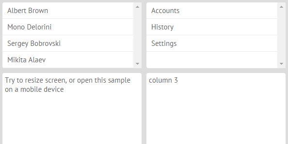
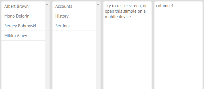
FlexLayout can be used as a top level view, which is perfect for mobile apps.
webix.ui({
    margin:10, padding:0, type:"wide",
    view:"flexlayout",
    cols:[
        { view:"list", data:[
            { value:"Albert Brown" },{ value:"Mono Delorini" }
        ], minWidth:320, select:true },
        { view:"list", data:[
            { value:"Accounts" },{ value:"History" },{ value:"Settings" }
        ], minWidth:320, select:true },
        {
            template:"Try to resize screen, or open this sample on a mobile device",
            minWidth:320, minHeight:400
        }
    ]
});
Related sample: Flex Layout - Fullpage Mode
or, it can be placed inside of a fixed layout to provide a dashboard-like view.
Related sample: Flex Layout - Dashboard
Limitations
This feature will work only in the latest Chrome, Safari, and Firefox versions.
FlexLayout must always define columns, there is no support for rows-based FlexLayout.
When placing FlexLayout inside of other Webix structures, you need to use a scrollview around the FlexLayout:
webix.ui({
 cols:[
  { view:"scrollview", body: {
   view:"flexlayout",
   cols:[
    ...
   ]
  }},
  { }
 ]
});
Related sample: Flex Layout - Dashboard
FlexDataLayout
This widget is available in PRO version only
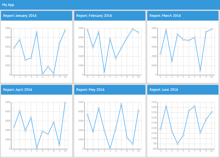
The FlexDataLayout widget behaves as DataLayout and renders each cell as an element of FlexLayout.
In other words, it is a perfect solution for dashboard-like applications.
var subconfig = {
    rows:[
        { template:"Report: #month# 2016", type:"header", name:"$value" },
        { view:"chart", type:"line", preset:"plot",
            xAxis:{ template:"'#ind#" },
            yAxis:{ },
            minWidth:300, height:300, name:"sales", value:"#sales#"}
    ]
};

var flex = {
    margin:10, padding:0, type:"wide",
    view:"flexdatalayout",
    cols:[ subconfig ],
    url:"data/year.js"
};
Related sample: Flex Data Layout
Back to top