How-tos
You can read about general customization rules in the corresponding article.
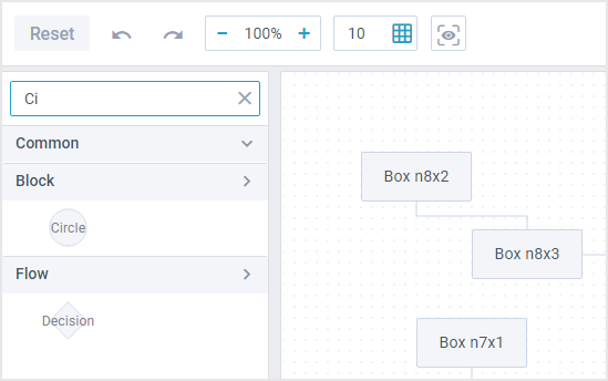
Custom Search Control for Shapes
To add a search input you need to:
1. Add a search input into UI.
2. Define events that will trigger the filtering.
3. Define filtering logic for the input.
4. (optional) Modify dataview items to display the name of shapes, since it is used for filtering.
Adding search field and events
1. Create a new class by inheriting it from the default (diagram.views["shapes"]).
2. Inside the config method describe the search view configuration and return the extended interface:
class CustomShapes extends diagram.views["shapes"] {
  config() {
    const ui = super.config();
    const search = {
      view: "search",
      placeholder: "Search shape by name",
      clear: "replace",
      // ...
    };

    return {
      rows: [
        {
          type: "wide",
          css: "search-container",
          padding: 5,
          rows: [search],
        },
        ui,
      ],
    };
  }
}
3. The filtering logic will be fired upon the onChange and onTimedKeyPress events. Add them into the on object and inside each of the events call the SearchShape() as in the sample below.
class CustomShapes extends diagram.views["shapes"] {
  config() {
    const search = {
      view: "search",
      on: {
        onTimedKeyPress() {           const text = this.getValue();
          this.$scope.SearchShape(text);
        },
        onChange(text) {           if (!text) this.$scope.SearchShape();
        },
      },
    };

    return {
      // UI
    };
}

  // methods
}
The next step is to describe logic for the handler.
Defining logic for search
4. Define a custom SearchShape() method that will accept the text from the input as a parameter. The method iterates through each shape group and filters out the shapes that do not match the input text.
class CustomShapes extends diagram.views["shapes"] {
  // ...
  SearchShape(text) {
    text = (text || "").toLowerCase();
    const dataViews = this.getRoot().queryView("dataview", "all");

    dataViews.forEach(view => {
      view.filter(shape => {
        const name = (shape.name || shape.id).toLowerCase();
        return name.indexOf(text) !== -1;
      });

      /* expand a group, if it contains a matching shape,
      otherwise - collapse */
      const panel = view.getParentView();
      view.count() ? panel.expand() : panel.collapse();
    });
  }
}
Modifying dataview items to display the name of shapes
5. By default shapes are displayed without their names. You can redefine the TemplateSvg() method to display a shape name in the center of the shape:
TemplateSvg(obj) {
  const dnd = !!webix.DragControl.getContext();
  const svg = super.TemplateSvg(obj);
  const name = obj.name ? this._(obj.name) : "";

  if (obj.id == "text" || dnd) return svg;

  return `<div class="dataview-item">${svg}<span>${name}</span></div>`;
}
6. Finally, do not forget to override the default view:
webix.ui({
  view: "diagram-editor",
  data: base_data,
  links: base_links,
  override: new Map([[diagram.views["shapes"], CustomShapes]]),
});
Related sample: Diagram Editor: Custom Search Control for Shapes
Removing the "Apply" Button

1. To remove the "Apply" button from the toolbar, you need to create a custom class by inheriting it from the default diagram.views["toolbar"].
2. The next step is to redefine the RightGroupConfig() method that generates the right part of the toolbar.
Access the elements and pop the last one out.
class CustomToolbar extends diagram.views["toolbar"] {
  RightGroupConfig() {
    // [ { spacer }, { apply_button } ]
    const elements = super.RightGroupConfig();
    elements.pop();     return elements;
  }
}
3. Do not forget to override the default view:
webix.ui({
  view: "diagram-editor",
  data: base_data,
  links: base_links,
  override: new Map([[diagram.views["toolbar"], CustomToolbar]]),
});
Related sample: Diagram Editor: Remove "Apply" Button
Back to top