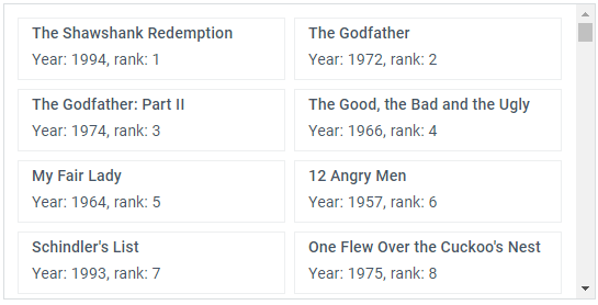
type
an object that specifies items presentation
object|string type;
Example
list = webix.ui({
    view:"list",
    type:{
        height:50
    }
});
Related samples
Details
Attributes of the type object:
- css - (string) the name of a css class that will be applied to component items (the default name of the applied class is 'default').
- height - (number) the height of an item in the component. Note that type.height:'auto' and autoheight:true do not work together.
- template - (function, string) an html template that will define item presentation in the component.
- width - (number) the width of the items list.
- type - (string) the type of presenting items in a dataview. To render items as tiles, set the option to the "tiles" value.

Named type
It is possible to create a type object separately and then refer to it by its name:
webix.type(webix.ui.dataview,{
    name:"typeA",
    width: 260,
    height: 90
});

webix.ui({
    view:"dataview",
    type:"typeA"
});
Related sample: Named Templates
See also
Articles
If you have not checked yet, be sure to visit site of our main product Webix web control library and page of javascript dataview product.