Edit Area
Adding Widgets
On the left, there is a gallery of widgets that you can drag to the interface. The gallery has a quick access panel that leads you to widgets of certain types and makes it easier to find widgets.
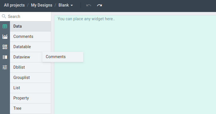
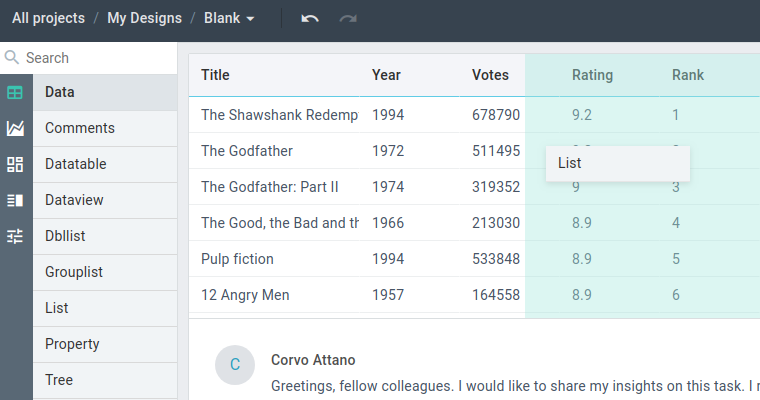
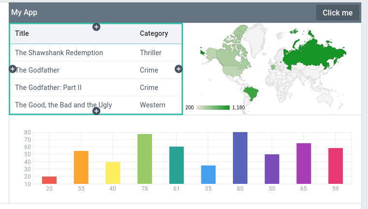
A drop area is highlighted in green when you hover a widget over it. If the drop area is empty (it is called a "placeholder"), the widget takes its place when dropped. If you drop a widget onto another widget, the tool will suggest to put it from any side.
If a widget is smaller than the suggested drop area, additional empty cells will be created around the widget to maintain stable sizing of your app.
Selecting Widgets
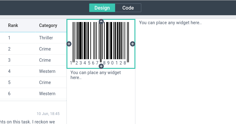
To start configuring a widget, you need to select it. You can select a widget or a placeholder by clicking on them in the central area. If you want to select a layout, select a widget and press Ctrl+A. If you press Ctrl+A several times, the selection will move further up in the hierarchy of views.
Once the widget is selected, you can resize or change the appearance of the widget.
Resizing widgets
Once the widget is selected, you can drag its frame borders to resize it.
Notes
- Some sides cannot be resized. Normally, these are interface edges.
- Sometimes a bigger part of the UI is resized when you drag a widget border. This is related to Webix sizing logic and is OK.
Creating Placeholders
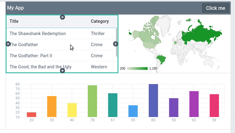
Once a widget is selected, you can use its selection frame to add empty cells next to the widget. You have two options:
- Click the + button from any side of the frame (the widget and the placeholder will be of the same width / height)
- Ctrl+drag a frame border (you can set the width / height of the placeholder while creating it)
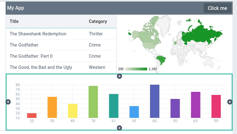
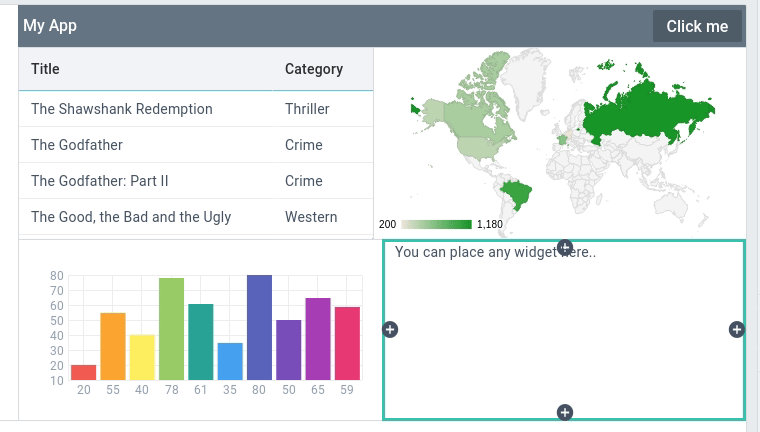
Placeholders can be used to align widgets or to reserve space for widgets that you plan to add later.
Customizing Widgets
Once a widget is selected, you can use the settings panel to the right to fine-tune its look and feel.
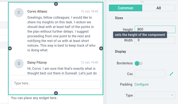
The Common tab has the main settings, e.g. width, height, etc. You will find more settings in the "All" tab.
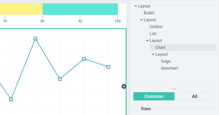
Some settings (e.g. Padding, Columns, Data) have wizards that open in the top-right section upon clicking the "Configure" label.
These settings are:
- datatable Columns
- Padding, Tooltip, chart Item, etc.
- Data of data widgets
For example, this is the wizard of a line chart item:
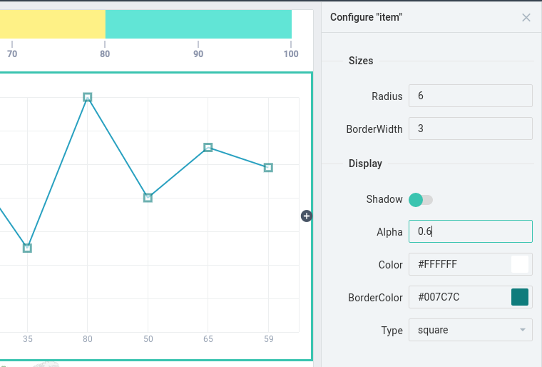
Here you can configure the way the points of the chart look: you can set their types, sizes and colors.
Data of Data widgets
By clicking the "Configure" label, you will open the list of available data sources. You can select any of them, and the data will fill the widget at once.
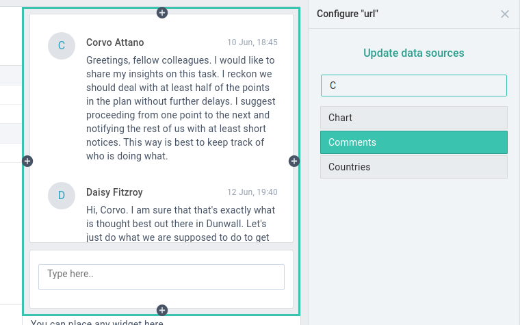
To view the data content, modify it or create a new data source, follow the "Update data sources" button. It will open the Project Data sources screen in the new tab. You can read more in Data sources.
CSS
In the CSS field, you can define a classname(s) for your widget.
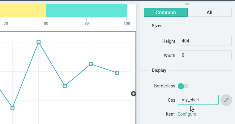
To provide a rule for the classname or check for the list of available rules, click on the "brush" icon. It will open the Project Custom Styles screen in the new tab. Read more in Custom styles.
Deleting Widgets
You can right-click any widget to see the Delete option. You can also select a widget and press Del/Backspace.
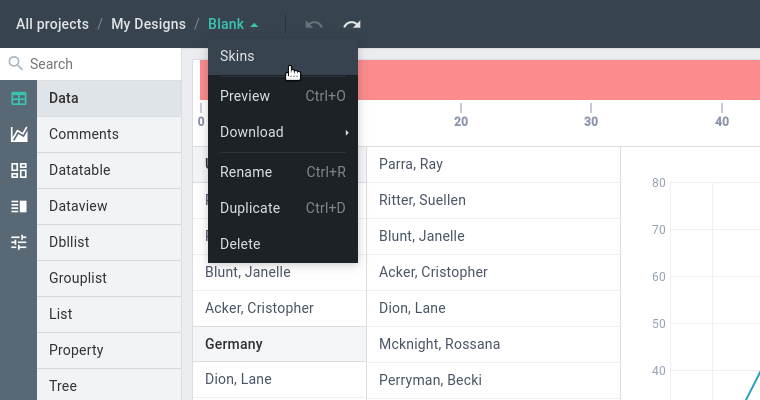
Skins
You can choose from 7 Webix skins for your app. Open the Top menu of the current design and choose Skins. You will be able to select a skin from the Skin wizard that will open on the right.
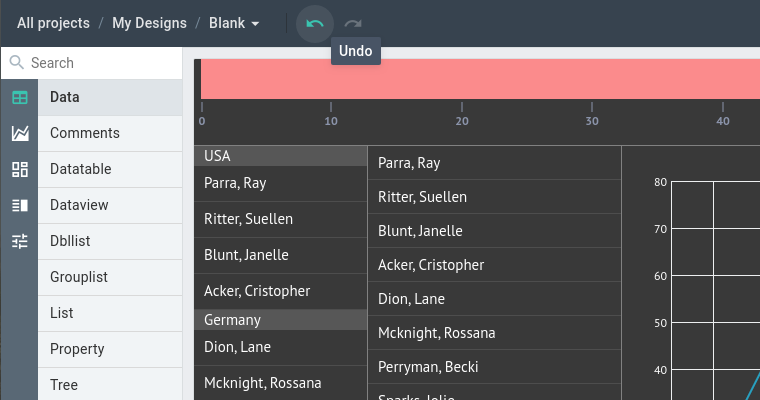
Undo/redo
You can undo or redo any change within a design. Use buttons on the toolbar or hotkeys:
- Ctrl+Z to undo
- Ctrl+Shift+Z / Ctrl+Y to redo
Hierarchy Tree
In the top right corner, you can see the Tree of all widgets in your design.
You can use the Tree to:
- select widgets by selecting them in the Tree,
- delete widgets with the help of a right click menu or Del/Backspace keys,
- drag-n-drop widgets to change their position in the UI.
Source Code
To see the source code, switch to the Code tab on the main toolbar.
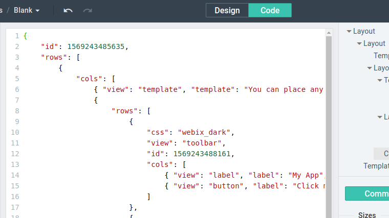
You can edit the code, and the changes will be applied once you get back to the Design tab. Note that only valid JSON is accepted. Remember that you are fully responsible for providing valid Webix configurations to the designer.
To get the full code of the design, you can download it as HTML.
Back to top