Chart Series
Chart series help display comparative graphs. In other words, you have an ability to present data of different objects within one and the same chart to see their dynamics in comparison. The functionality is true for line, bar, radar, area, pie and donut charts.
For instance, you want too see the sales progress of three companies during some time period.
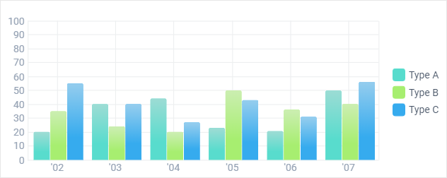
First of all, each item from dataset must contain data for all the needed objects (here - companies).
JSON Data
var multiple_dataset = [
    { sales:"20", sales2:"35", sales3:"55", year:"02" },
    { sales:"40", sales2:"24", sales3:"40", year:"03" },
    { sales:"44", sales2:"20", sales3:"27", year:"04" },
    { sales:"23", sales2:"50", sales3:"43", year:"05" },
    ....
];
Sales, sales2 and sales3 are sales amounts for three different companies, each of which should be represented in a separate chart. On the picture above, there are three bar chart series differing from each other in color.
In fact, here we initialize one component - bar chart and distribute data among its series. Hence, settings for the bar charts form an array called series. Each array item includes data values as well as settings for each series.
webix.ui({
    view:"chart",
    type:"bar",
    series:[
        {   // 1st company - turquoise blue bars
            value:"#sales#",
            color: "#58dccd",
            tooltip:{
                template:"#sales#"
            }
        },
        {   //2nd company - green bars
            value:"#sales2#",
            color:"#a7ee70",
            tooltip:{
                template:"#sales2#"
            }
        },
        {   // 3rd company - blue bars
            value:"#sales3#",
            color:"#36abee",
            tooltip:{
                template:"#sales3#"
            }
    }]
})
Related sample: Bar Chart: Several Graphs in One Chart
Chart series require a legend to explain different charts within one and the same scales. Legend markers act as well as buttons to show and hide dedicated chart series.
If you work with one and the same chart type, the series object only item settings should be included. Look for them in the setting for each chart type.
Different Chart Types
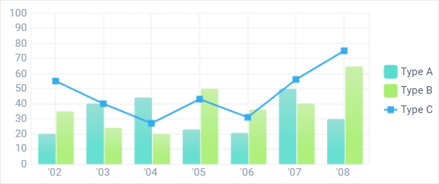
Still, chart series can encompass different chart types.
Related sample: Bar Chart: Different Types in One Chart
This time, the series object for a differing chart type should include the whole set of its properties:
webix.ui({
    container:"chartDiv",
    view:"chart",
    type:"bar",
    //bar chart config
    series:[
        {   //setting for each bar
            value:"#sales2#",
            color:"#69ba00",
            tooltip:{
                template:"#sales2#"
            }
        },
        {   //setting for a line chart
            type:"line",
            value:"#sales3#",
            color:"#36abee",
            item:{
                borderColor: "#b7286c",
                color: "#de619c",
                type: "s"
            },
            line:{
                color:"#de619c",
                width:2
            }
    }]
})