Material Skin
The Material skin is supported by Webix 6.0+. This is the default Webix skin, so you don't need to include any additional files. Check the full list of available skins.
How to Use
To start using the Material skin, you need to include the corresponding CSS file on a page. There are two options:
- either to include the default Webix CSS file - webix.css:
<html>
<head>
    <script type="codebase/webix.js"></script>
    <link rel="stylesheet" type="text/css" href="codebase/webix.css">
</head>
<body>
webix.ready(function(){
   // some Webix-related UI here
});
</body>
</html>
- or to include the material.css file:
<script type="codebase/webix.js"></script>
<link rel="stylesheet" type="text/css" href="codebase/skins/material.css">
Mini Version
There is also the Mini skin, which is a compact version of the Material skin.
It is added on a page by including the mini.css file:
<script src="../codebase/webix.js"></script>
<link href="../codebase/skins/mini.css" rel="stylesheet" type="text/css">
Icons
Both Material and Mini skins use icons based on Material Design Icons collection. The detailed information about usage of icons is given in the article Icons with UI Widgets.
Dark Theme
Material and Mini skins provide the css:"webix_dark configuration option that allows darkening the following widgets or their items:
Accordion
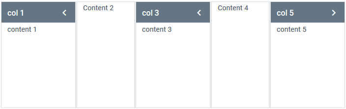
webix.ui({
    view:"accordion",
    multi:true,
    css:"webix_dark",     cols:[ //or rows
        { header:"col 1", body:"content 1" },
        { header:"col 2", body:"content 2" }
    ]
});
Related sample: Dark Accordion
Carousel (the navigation controls are darkened)
webix.ui({
    view:"carousel",
    css:"webix_dark",      cols:[// columns with items]
});
Related sample: Carousel: Dark Style
Template (with the "header" type)
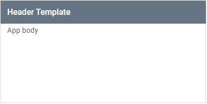
{
    view: "template",
    template: "Header Template",
    type: "header",            css:"webix_dark"       }
Toolbar

webix.ui({
    view:"toolbar",
    css:"webix_dark",
    cols:[//buttons objects]
});
Related sample: Toolbar: Dark Theme
Sidebar
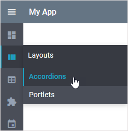
webix.ui({
    view: "sidebar",
    css:"webix_dark",     data: menu_data
});
Related sample: Inverted Sidebar
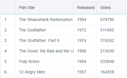
Borders of Сolumns
By default columns of tables in skins of the Material family have no borders.
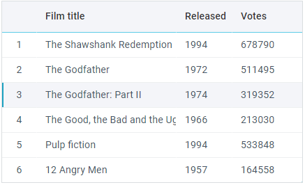
To restore the borders, you need to use the following configuration options:
- css:"webix_data_border"
- css:"webix_header_border"
- css:"webix_footer_border"
webix.ready(function(){
    webix.ui({
        view:"datatable", css:"webix_data_border webix_header_border",         columns:[
            { id:"rank",  header:"", css:"rank",  width:50},
            { id:"title", header:"Film title", width:200},
            { id:"year",  header:"Released", width:80},
            { id:"votes", header:"Votes", width:100}
        ],
        data:small_film_set
    });
});
Shadows
You can use the following options to apply shadows to widgets inside of Layout and panels of Dashboard:
- css:"webix_shadow_medium"
- css:"webix_shadow_big"
- css:"webix_shadow_small"
webix.ready(function(){
  webix.ui({
    view:"dashboard",
    css:"webix_shadow_medium",     cells:[
        { view:"panel", x:0, y:0, dx:1, dy:1, css:"webix_shadow_big",
            resize:true, body:{
                view:"chart", type:"pie", value:"#votes#", data:small_film_set
            }
        },
        { view:"panel", x:1, y:0, dx:2, dy:1,css:"webix_shadow_big",
            resize:true, body:{
                view:"chart", type:"spline", value:"#votes#", data:small_film_set
            }
        },
        // more cells
    ]
  });
});
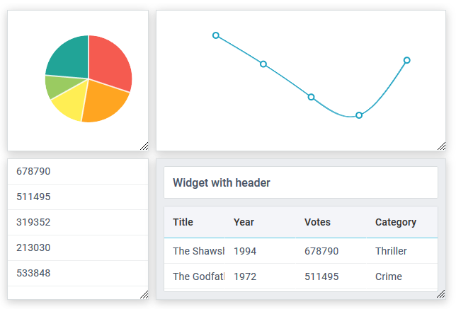
Related sample: Dashboard Shadows
Back to top