Working with Links and Labels
In Diagram links are connectors that represent relations between visual blocks. From this article you will learn how to manipulate links and customize them.
There may be occasions when links require explanation. In this case, you can add a "text" block in a specific position or use a special block - "label."
Loading Links
Links are loaded into Diagram via the dedicated links property of the configuration object. As links you can provide:
- plain JSON array or an XML string
- a URL to load links from
- a Data Collection with links.
{
  view:"diagram",
  data: [/*block data*/],
  links: "remote/data/links"
  // or
  links: [
    /* link objects */
  ]
}
Keep in mind, that if the incoming data for links and blocks is in XML format, you need to add the datatype property passing "xml" as its value:
webix.ui({
  view: "diagram",
  datatype: "xml",   links: "remote/links.xml",
  url: "remote/data.xml"
});
Note, that all the incoming data (blocks and links) should be in one and the same format: either JSON or XML.
Link Settings
Links define the relations between blocks, so each of them must have the following fields:
- source (string, number) - obligatory. Source of the link (where the link comes from)
- target (string, number) - obligatory. Destination point of the link (where the link comes to)
Additionally, you can provide the following parameters to each link:
- mode (string) - defines mode of the link. The possible values are:
- "edges" - default. Elbow-like connector going from and to the center of top/side edge of the block
- "direct" - a straight line going from the center of one block directly to the center of another
- "curve" - a curved line from the center of one block to the center of another
- "child" - a line that connects parent with a child element. Used in block list structures.
- "sibling" - a line that connects sibling elements (e.g. children of the same parent). Used in block list structures.
- from (string) - defines the edge of the block the link is headed from. Possible values are:
- "center"
- "top"
- "right"
- "bottom"
- "left".
- to (string) - defines the edge of the block the link is headed to. Possible values are the same as in the
fromfield described above. - line (array) - an array of coordinates according to which the link is drawn. Each segment of the link is defined as [[x, y], ...] or ["x, y", ...]
- $css (string, function) - CSS class name or a template function to apply a class name to the link line
- lineWidth (number) - defines the width for the link line. 1 by default. The property is applied to the line of the link (not arrow)
- lineColor (string) - defines color for the link line (color name or HEX code). #ccd7e6 by default. The property is applied to the line of the link and arrow stroke
- lineStyle (string, number) - stroke-dasharray for the link line (not its arrow). Possible values are:
- "dotted"
- "dashed"
- numeric value. The higher value is, the more space in between dashes of the link line.
And a set of parameters that are applicable to a link arrow:
- arrow (boolean, string, array) - defines whether to paint an arrowhead for the link. Can take the following values:
- boolean to enable (default) or disable an arrowhead for link
- "triangle" to draw a triangle instead of the arrow
- an array of custom coordinates according to which the arrow is drawn. Each segment of the arrow is defined as [[x, y], ...] or ["x, y", ...]
- $arrowCss (string, function) - CSS class name or a template function to apply a class name to the link arrow
- arrowSize (string, number) - defines the size of the link arrow. It is 6px by default
- backgroundColor (string) - defines color for the link arrow (color name or HEX code)
- fillOpacity (string, number) - opacity of the arrow fill. Ranges from 0.0 to 1 or percentage from "0%" to "100%".
Nuances when building a link path
To avoid conflicts when defining link path via the dedicated fields, investigate the following:
- if the
linefield is provided, Diagram will draw a link according to the array values - if
fromandtoare provided andlineis not, Diagram will build a path according to the provided values - if
modeis defined whilefrom,to, andlineare not, Diagram will build a link according to specified mode. In this case the link is guided from center to center - if
lineis provided, but either offrom/tois missing, the link will not follow its source/target block during drag-n-drop - if autoplacement is enabled, link is built according to its mode or mode defined in the
linkItem(from,to, andlinefields are ignored). In this case the link is guided from center to center.
Adding standalone lines
You can also add standalone lines that won't connect shapes by specifying link objects without the following properties: source, target, from and to. Such a link object should have the line property specified and can have any other link properties (except for the enumerated ones). For example:
// links dataset
[
    // a curved line with an arrow
    {
      "mode": "curve",
      "arrow": true,
      "line": [
        [ 277, 20 ],
        [ 293, 0 ],
        [ 310, 20 ],
        [ 327, 40 ],
        [ 343, 20 ]
      ],
    },
    // a direct line without an arrow
    {
      "arrow": false,
      "line": [
        [ 277, 110 ],
        [ 343, 110 ]
      ],
    },
  // other links
]
How to configure links individually
You can configure each link individually or tune all the links at once. To configure links separately, add the fields from the list above into the link data object and provide the desired values for them:
webix.ui({
  view: "diagram",
  data: [/* blocks */],
  links: [
    {
      source: "1",
      target: "1.2",
      lineColor: "#2d9bf0"
    },
    // other links
  ]
});
To provide settings globally for all links at once, define the linkItem property in the diagram object constructor. Common properties include css, mode (only "edges" or "direct"), arrow, arrowCss and arrowSize:
webix.ui({
  view: "diagram",
  data: [/* blocks */],
  links: "remote/data/links",
  linkItem: {
    css: "cssForLinks",
    mode: "direct",
    arrow: false,
    arrowCss: "cssForArrows",
    arrowSize: 5
  }
});
Please note that the properties defined within separate link items have a higher priority than those set globally.
Defining Link Mode
Diagram offers 5 default types of links: "edges", "direct", "curve", "child", and "sibling".
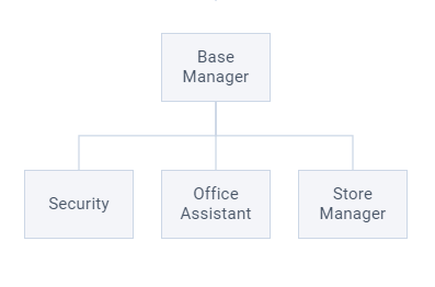
Edges
The "edges" links are elbow-like connectors that go from the center to the top/side edge of another block.
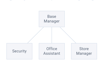
Direct
The "direct" link is a straight line that goes from one block to another.
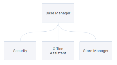
Curve
The "curve" link is a curved line that goes from the center of one block to the center of another.
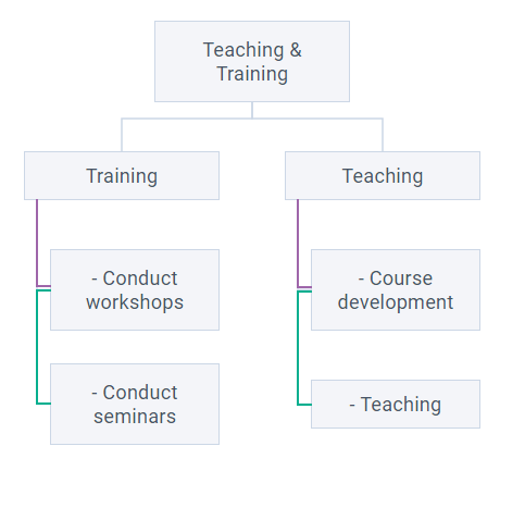
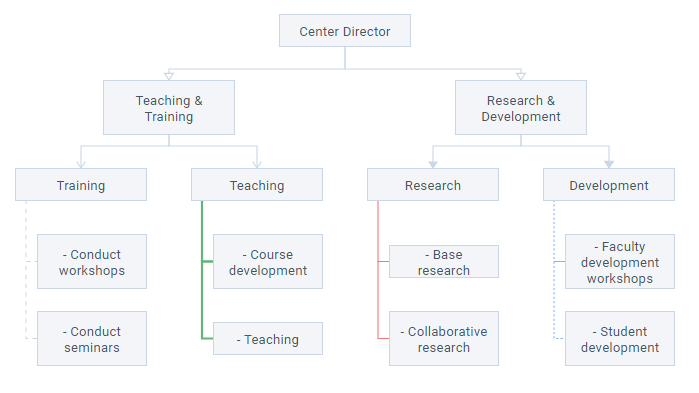
Child
The "child" link can help forming list structures by setting a connector between a parent and its child that is placed under its parent. On the picture below the "child" links are highlighted with purple.
Sibling
The "sibling" link is also a helper type for list structure being a connector between sibling blocks (e.g. children of the same parent). On the picture below the "sibling" links are highlighted with green.
webix.ui({
  view: "diagram",
  linkItem: {
    mode: "direct", //for all links that do not have their own mode
  },
  links: [
    { source:"1.2.1", target:"1.2.1.1", mode:"child"},
    { source:"1.2.1.1", target:"1.2.1.2", mode:"sibling"},
    // ... other links
  ],
});
Related sample: Diagram: Link Mode Priority
Styling Links
You can provide the desired link width, color and style. The color and width will be shared with a link arrow.
These parameters can be defined in the dataset:
// links dataset
[
  {
    source: "1",
    target: "1.2",
    lineColor: "#61b578",
    linkStyle: "dotted",
    lineWidth: 2
  }
]
To provide common styles for all links, define the linkItem object inside Diagram constructor. Set the name of the CSS class as a value for the css field:
{
  view: "diagram",
  links: [/* link objects */],
  linkItem: {
    css: "common_links"   }
}
If you want to style a particular link, add the $css field to its data object setting a CCS class name as its value:
// links dataset
[
  {
    source: "1",
    target: "1.2",
    $css: "styles_for_link"   }
]
Styling Arrows
Diagram allows you to render classic arrows (default) or empty or filled triangles to indicate the direction of a process.
You can provide the desired arrow type or disable an arrow for each separate link:
view:"diagram",
links:[
  //empty triangle
  { source: "1",  target: "1.2", arrow: "triangle" },
  //filled triangle
  { source: "1",  target: "1.2", arrow: "triangle", backgroundColor:"#CCD7E6" },
  // no arrow
  { source: "1.2", target: "1.2.2",  arrow: false},
]
You can also define arrow size and background opacity:
{
   source: "1",  target: "1.2",
   arrow: "triangle",
   arrowSize: 4,
   backgroundColor:"#CCD7E6", fillOpacity: "50%",
}
To provide common styles for all arrows, define the linkItem object inside Diagram constructor. Set the name of the CSS class as a value for the arrowCss field:
{
  view: "diagram",
  links: [/* link objects */],
  linkItem: {
    arrowCss: "common_arrows"   }
}
If you want to style a particular arrow, add the $arrowCss field to its data object setting a CCS class name as its value:
// links dataset
[
  {
    source: "1",
    target: "1.2",
    $arrowCss: "styles_for_arrow"   }
]
Related sample: Diagram: Styling Links
Fixed Coordinates for Links and Arrows
If your project requires links and arrows to be drawn by fixed coordinates you can provide them in the corresponding line and arrow arrays.
Each element of the arrays is a segment of a line/arrow. It can be either another array with two numbers representing x and y coordinates or a string with numbers, separated by comma. The rule is the same for both cases - define segments of a line/arrow sequentially one by one.
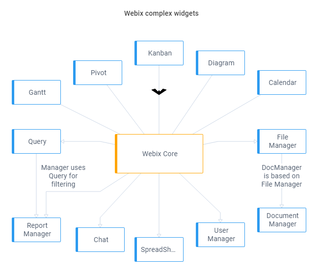
// links dataset
[
  {
    source:"core",
    target:"query",
    line:["300,230", "180,205", "100,205"],
    arrow:["300,101", "298,104", "292,98", "285,100",]
    // or
    line:[[300,230], [180,205], [100,205]],
    arrow:[[300,101], [298,104], [292,98],]
  },
  // other links
]
A curved link may consist of one or several quadratic Bézier curves. The lines in a "curve" mode are defined by a set of control points. By default, these control points are calculated automatically. But you can specify the corresponding points in the "line" array to render the curved links by the fixed coordinates.
{
    source: "core",
    target: "kanban",
    mode: "curve",
    line: ["300 190", "300 157", "425 157", "550 157", "550 110"]
}
Related sample: Diagram: Custom Links
The starting point for arrows and lines is the left top corner of the widget (0, 0).
Accessing Links Storage
On the client side links are stored in a view-less storage called DataCollection. To access the collection, call the getLinks method on Diagram:
const links = $$("diagram1").getLinks();
You can work with the collection using the dedicated API. For example, you can get the links array by serializing the collection:
const linksArray = $$("diagram1").getLinks().serialize();
/*
[
  { id: 161968034646, source: "core", target: "diagram" },
  {
    $arrowCss: "batman",
    arrow: ["300,101", "298,104"],
    id: 1619680346462
    source: "core"
    target: "kanban"
  }
  // ...
]
*/
Adding Labels
To add one or more labels to a link you need to add your label objects to the data property array and define labels property for a target link. The labels property is an array of IDs or a list of IDs separated by commas.
{
    view: "diagram",
    data: [{
            id: "querytext",
            value: "First label"
        },
        {
            id: "querytext1",
            value: "Second label"
        },
    ...
    ],
    links: [
        // one label with id "querytext"
        {
            source: "query",
            target: "rmanager",
            labels: "querytext"
        },

        // for multiple labels
        {
            source: "query",
            target: "dmanager",
            labels: "querytext, querytext1" // or ["querytext", "querytext1"]
        }
    ]
}
Related sample: Diagram: Built-in Block Styles
Aligning Labels
Unlike regular blocks, a label does not require x and y properties.
By default, a label is set in the link center. You can change the alignment to the link start or link end by using linkAlign property. Possible options are "center", "start" and "end" respectively:
{
    id: "querytext",
    value: "Report Manager uses Query for filtering queries",
    linkAlign: "start"
}
dx and dy label properties define the horizontal (x) and vertical (y) offsets relative to the label position. Starting coordinates are calculated depending on the linkAlign property value.
For example, if dy is -20, the label with be shown 20px higher than it is calculated:
{
    id: "querytext",
    value: "Report Manager uses Query for filtering queries",
    dy: -20
}
Styling Labels
By default, labels have "text" stylistic type — they are rendered as plain text with a transparent background. You can read about further customization here.
Back to top