Working with Block Types
Types serve to express the purpose of each block. Each type is a set of properties that will be applied to each individual block that uses this or that type.
From this article you will learn how to use predefined types, style them and create custom ones.
Built-in Style Types
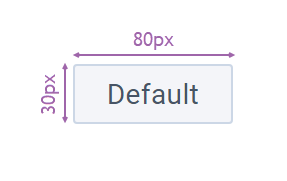
By default a block has a simple rectangular shape with no styling:
There are two stylistic types:
- "text" - it is used to render a plain text with a transparent background
- "org" - it is used to render organization chart blocks
- "default" - default template.
Related sample: Diagram: Built-in Style Types
Built-in SVG Types
On the picture below you can find the set of predefined SVG shapes (types).
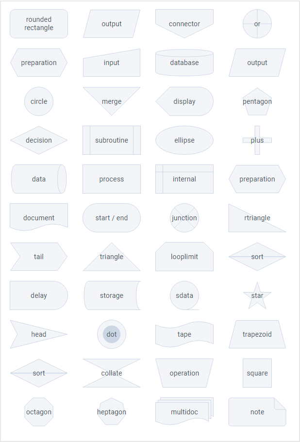
Related sample: Diagram: Built-in Shapes
Setting Types for Blocks
You can set a stylistic or an SVG type (shape) for each block individually or define them globally for all the blocks at once. To define types individually, you need to add the type field to the corresponding block object and set the ID of the desired type as its value.
view: "diagram",
data: [
  {
    id: "start",
    value: "start",
    x: 0,
    y: 80,
    type: "disk",   },
  // other blocks
]
In case your project requires all blocks to be of the same type, you can define it globally via the item property:
webix.ui({
  view: "diagram",
  data: [/* item blocks */],
  item: {
    // all blocks will have the heptagon type
    type: "heptagon"   }
});
Styling Blocks via Properties
There are 2 ways to style blocks both SVG-based and default ones:
- inside block data objects
- inside the shapes array.
Here you can apply the following properties:
Text styles
- fontColor (string) - color of the inner text (color name or HEX value). "#475466" by default
- fontSize (number) - size of the inner text font in pixels. 14 by default
- fontWeight (number) - weight (boldness) of the font. 400 by default
- fontStyle (string) - font style. Possible values are:
- "normal" - default. Regular face of the family
- "italic" - cursive font
- "oblique" - a sloped version of the normal face of the font.
- textAlign (string) - inner text alignment. "left", "center" (by default), "right"
- textVAlign (string) - inner text vertical alignment. "top", "middle" (by default), "bottom"
SVG styles
- angle (string, number) - angle of the shape rotation. The rotation origin is center
- fillOpacity (string, number) - opacity of the fill color inside the shape. Ranges from 0.0 to 1 or percentage from "0%" to "100%"
- lineWidth (number) - width of the shape outline
- lineColor (string) - color of the shape outline. "#ccd7e6" be default
- lineStyle (string, number) - stroke-dasharray for outline. Possible values are
- "dotted"
- "dashed"
- numeric value. The higher value is, the more space is in between dashes.
- backgroundColor (string) - background color (color name or HEX value). "#f4f5f9" by default
- altBackgroudColor (string) - alternative background. "#ccd7e6" by default. The property is only applicable to the "dots" type and custom shapes.
Styling inside block objects
You can style blocks that use SVG-based types directly within the data items:
webix.ui({
  view: "diagram",
  data: [
    {
      id: "process",
      backgroundColor:"#F67B72",
      lineColor:"#F67B72",
      fontColor:"#fff"
    },
    // other blocks
  ],
});
Styling inside the shapes array
You can provide the defaults settings for each SVG-based type in the shapes configuration array.
The shapes property takes an array of type objects, so you can provide the defaults for several SVG-based types at once.
view:"diagram",
shapes: [
  // customize styles for the action shape
  {
    id: "process",
    backgroundColor:"#F67B72",
    fontColor: "magenta"
  },
  // other shapes
]
Now all the blocks that use the "action" type will have the defined background and font colors, unless they have these colors of their own.
Changing Styling Dynamically
You can also use the setShape method to provide defaults for a particular SVG-based type.
$$("diagram1").setShape("dot", {
  lineColor: "#2d9bf0"
});
Related sample: Diagram: Shape Styling
Now all the blocks that use a "dot" type will have the defined line color, unless they have a line color of their own.
Styling Blocks Using CSS
You can style blocks globally or individually. To style them all the same way, define the item object inside the Diagram constructor and set CSS class name as a value for the css field:
{
  view: "diagram",
  data: [/* blocks data */],
  item: {
    css: "common_blocks"
  }
}
Styling block shapes and text
When styling blocks and their content (shape and text) you need to define a custom class for that block via the $css field in its data object:
{
  id: 1,
  // can be any class name
  $css: "my_css"
}
Below we cover how to access and style block shape and text.
Styling shapes
You can think of a block item as of a container with a shape and text inside. So to style the inner shape of a default stylistic block you need to add a CSS rule depending on a shape template. Block shape possesses its own CSS class, that you can access:
<!-- css classes for the "default" block-->
<div class="webix_diagram_shape webix_diagram_shape_default"></div>

<!-- css classes for the "org" block-->
<div class="webix_diagram_shape webix_diagram_shape_org"></div>
CSS rules for the "org" shape would look like the following:
.my_css .webix_diagram_shape_org { border-color: orange; }
SVG-based shapes are styled the same way, however you you need to refer to the SVG element itself (not a CSS class):
.my_css svg { stroke: orange; }
Related sample: Diagram: Built-in Block Styles
Styling block text
The block text is rendered above the shape element and has the "webix_diagram_text" CSS class. So to style the block text you need to refer to this class as follows:
.my_css .webix_diagram_text {
  font-weight: 500;
  background: transparent !important;
}
Related sample: Diagram: Decision Tree
Adding Custom Shapes
Diagram allows you to create and utilize custom SVG shape (type) to meet your needs.
You can provide custom shapes in the shapes array in the configuration:
{
  view: "diagram",
  shapes: [
    {
      id: "internet",
      // used for tooltips in Diagram editor
      name: "Network",
      // used to group shapes in Diagram editor
      group: "device",
      template: '<svg width="60" height="60" viewBox="0 0 60 60">...</svg>',
      lineColor: "98E4ED",
      backgroundColor:"#fff",
      altBackgroundColor:"#98E4ED",
      textVAlign:"bottom"
    },
    // other custom and predefined shapes
  ]
}
Or via by the addShape method:
$$("diagram").addShape("internet", {
  template: '<svg width="60" height="60" viewBox="0 0 60 60">...</svg>',
  name: "Network",
  group: "device",
  lineColor: "98E4ED",
  backgroundColor:"#fff",
  altBackgroundColor:"#98E4ED",
  textVAlign:"bottom"
});
Related sample: Diagram: Custom Shapes
Note that for custom shapes, you need to specify the following fields:
- id (string) - shape id, if defined via the shapes property
- name (string) - shape name. It is displayed in the tooltip when the corresponding shape is hovered over in the Diagram Editor
- group (string) - name of the group in the Diagram Editor the shape belongs to.
- You can add shapes to one of the default groups:"block", "flow" and "common"
- Shapes that come without the group property will be automatically added to "extra" group
- If a custom name is provided, the Editor will create a group with this name
If you are adding an SVG with the path elements that need to be filled via altBackgroundColor, the elements must have the webix_diagram_shape_alt class.
<svg width="60" height="60" viewBox="0 0 60 60" fill="none" >
   <rect width="60" height="60" />
   <path class="webix_diagram_shape_alt" .../> </svg>`
Also make sure the shape ID is unique and does not coincide with any shape IDs from the predefined set. Otherwise the built-in shape will be overwritten with a custom one.
Accessing Shape Storage
You can get a data object of a particular shape. For that call the getShape method on the diagram passing the shape ID as a parameter. The method returns a configuration object of the specified shape.
$$("diagram1").getShape("plus");

/*
{
  id: "plus",
  name: "Plus",
  svg: "...svgCode"
}
*/