Pivot User Guide
Webix Pivot is a modern solution for visualization and business analysis of large data volumes. The widget allows you to create pivot tables and charts, configure them and work with data in three modes: Table, Tree and Chart. In this guide, we'll go over all main features of this multifunctional tool.
Main Screens
Visually, the widget is made up of 4 main parts:
- Toolbar
- Left panel
- Data panel (Pivot table/Chart)
- Settings panel.
Toolbar
Toolbar is at the top part of the application. It contains controls for managing the widget. On the right part of the toolbar, there are buttons to select a display mode: Table, Tree, and Chart. On the left part is a button to toggle the Settings panel of the component. In the middle part of the toolbar the applied filters will be displayed.

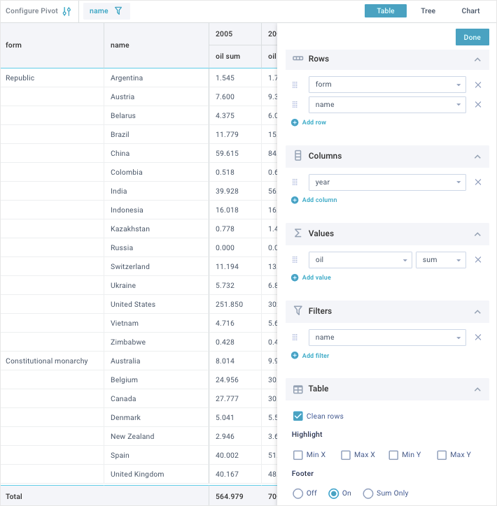
Table Mode
In the Table mode, information on the Data panel is displayed in the form of a pivot table. In this mode, the Left panel will also be displayed as a table. On the Settings panel, you can set the Data panel and Left panel as you see fit. Settings features are described in detail further in the guide.
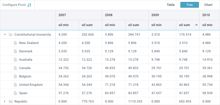
Tree Mode
In the Tree mode, information on the Data panel is displayed in the form of a pivot table. The Left panel will be displayed as a tree (hierarchical structure). On the Settings panel, you can set the Data panel and Left panel as you see fit. Settings features are described in detail further in the guide.
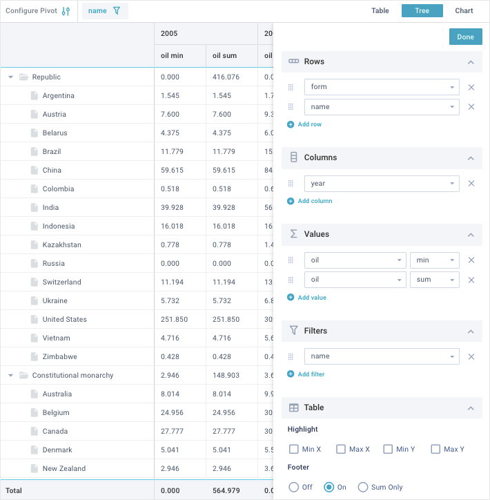
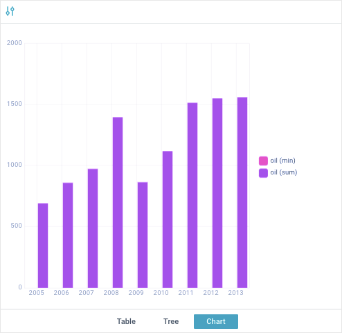
Chart Mode
In the Chart mode, information on the Data panel is displayed in the form of the diagrams. On the Settings panel, you can set charts to your needs. Settings features are described in detail further in the guide.
Please note, that there is no Left panel in this mode!
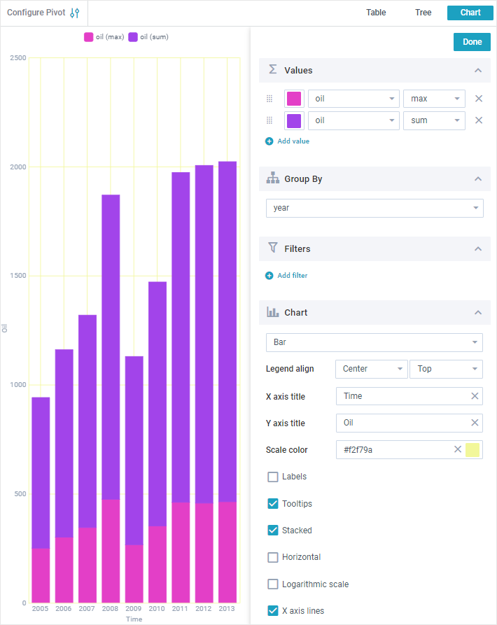
Table Rows Settings
In the Table and Tree modes, you can set the rows of the pivot table. The row names will be displayed on the Left panel in the form of the table or tree (depending on the selected mode). To configure them, click on the "Configure Pivot" button on the left part of the Toolbar and go to the Rows section on the Settings panel.
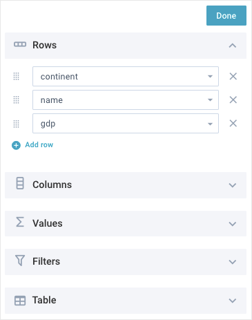
In the Rows section, you can perform the following operations:
- add new rows by clicking on the "Add row" button
- remove rows by clicking on the delete icon opposite the selector
- change the order and priority of displaying rows. To do this, drag an item to the desired position using a special control on the left of the selector. The higher the row is in the list, the higher its priority and position in relation to the left edge on the Left panel. The rows with the highest priority are in the leftmost position and include other rows with lower priority
- set the parameter, the data of which will be displayed in the current row. To do this, click on the row selector and select the required option from the drop-down list. See the picture below:
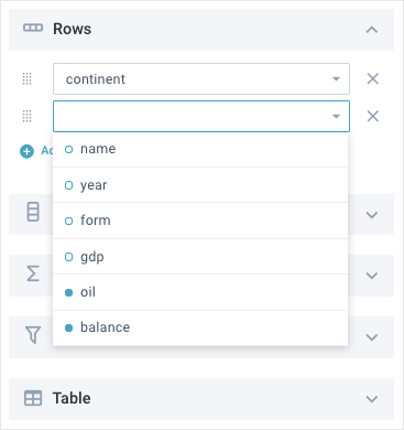
The drop-down list options marked with the field round icons are already used to define the columns or values. If you select such options to define the rows, they will disappear from the columns and values of the table!
Depending on the selected mode (Table or Tree), the Left pane will look like this:
Left pane in the "Table" mode
Left pane in the "Tree" mode
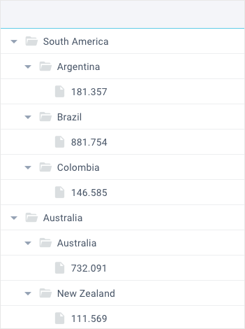
Table Columns Settings
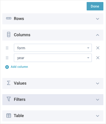
In the Table and Tree modes, you can set the columns of the pivot table. The column names will be displayed in the table header. To configure them, click on the "Configure Pivot" button on the left part of the Toolbar and go to the Columns section on the Settings panel.
In the Columns section, you can perform the following operations:
- add new columns by clicking on the "Add column" button
- remove columns by clicking on the delete icon opposite the selector
- change the order and priority of displaying columns. To do this, drag an item to the desired position using a special control on the left of the selector. The higher the column is in the list, the higher its priority and position in the table header. The columns with the highest priority are in the topmost position and include other columns with lower priority
- set the parameter, the data of which will be displayed in the current column. To do this, click on the column selector and select the required option from the drop-down list. See the picture below:
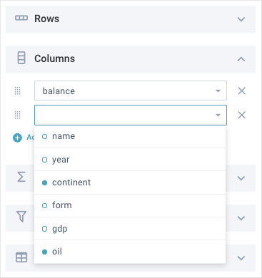
The drop-down list options marked with the field round icons are already used to define the rows or values. If you select such options to define the columns, they will disappear from the rows and values of the table!
Table Values Settings
In the Table and Tree modes, you can set the values of the pivot table. The value names will be displayed in the table header under the column titles. To configure them, click on the "Configure Pivot" button on the left part of the Toolbar and go to the Values section on the Settings panel.
In the Values section, you can perform the following operations:
- add new values by clicking on the "Add value" button
- remove values by clicking on the delete icon opposite the selector
- change the order and priority of displaying values. To do this, drag an item to the desired position using a special control on the left of the selector. The higher the value is in the list, the higher its priority and position in the table columns. The values with the highest priority are in the leftmost position in the column they belong to
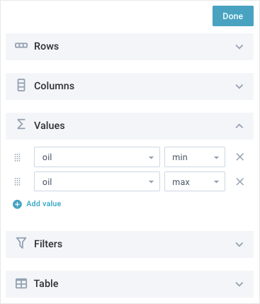
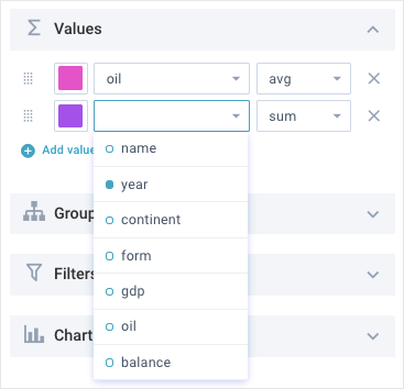
- set the parameter, the data of which will be displayed in each cell of the value column. To do this, click on the value selector and select the required option from the drop-down list. See the picture below:
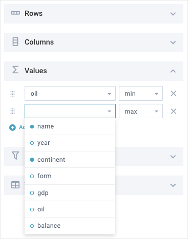
The drop-down list options marked with the field round icons are already used to define the rows or columns. If you select such options to define the values, they will disappear from the rows and columns of the table!
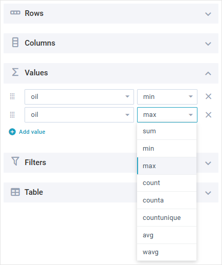
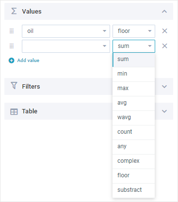
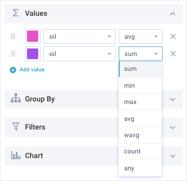
- set functions that will be applied to all data in the value column of the table. To do this, click on the function selector next to each value selector, and select the required option from the drop-down list. See the picture below:
You can view the function result both in the table footer (if displayed) or in the row with the highest priority in the Tree mode.
In particular, you can apply the following functions:
- sum – returns the sum of all values (used by default)
- min – returns the minimum value
- max – returns the maximum value
- count – returns the number of numeric values
- avg – returns the average value of a range of numbers
- wavg – returns the weighted average value
- counta - returns the number of values in a dataset. Counts all types of data, does not count empty cells
- countunique - returns the number of unique values in a list of specified values and ranges
- median - returns the middle number of a group of numbers
- product - returns the number obtained by multiplying all the given numbers
- var - returns the variance of the values, treating them as a sample of a bigger set of values
- varp - returns the variance of the values, treating them as an entire set of values
- stdev - returns the standard deviation of the values, treating it as a sample of a bigger set of values
- stdevp - returns the standard deviation of the values, treating it as the entire set of values
- any – any value
- complex - works with compound expressions and applies custom functions with more than two parameters
If you have custom functions in your project (read more about them in the related article), they will be added at the end of the drop-down list:
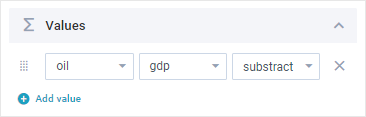
If you select a custom function that takes two parameters, the widget will display two value selectors:
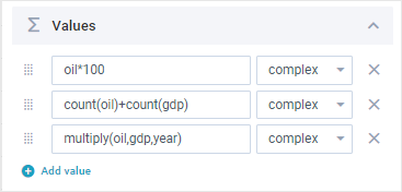
In the complex function input field you can write your own compound expressions. Also this field is used to apply custom functions that take more than two parameters:
General Table Settings
In the Table and Tree modes, you can manage the general settings of the pivot table. To do this, click on the "Configure Pivot" button on the left part of the Toolbar and go to the Table section on the Settings panel.
In the Table section, you can perform the following operations:
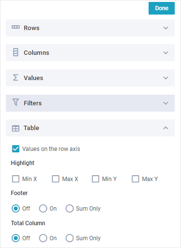
- arrange math results on the row axis using the "Values on the row axis" checkbox
- highlight the minimum values of the rows using the "Min X" checkbox
- highlight the maximum values of the rows using the "Max X" checkbox
- highlight the minimum values of the column using the "Min Y" checkbox
- highlight the maximum values of the column using the "MaxY" checkbox
- manage the table footer, using the following options:
- Off - hides the footer
- On - shows the footer and displays the column values according to the applied functions
- Sum Only - shows the footer and displays the column value the sum function is applied to
- manage column(s) with totals for each value, using the following options:
- Off - hides column(s) with totals
- On - shows column(s) with totals for each value
- Sum Only - shows only the column(s) with totals the "sum" function is applied to
- hide/show the recurring titles of the rows with the highest priority on the Left panel in the Table mode. To do this, select/unselect the "Clean rows" checkbox. See the picture below:
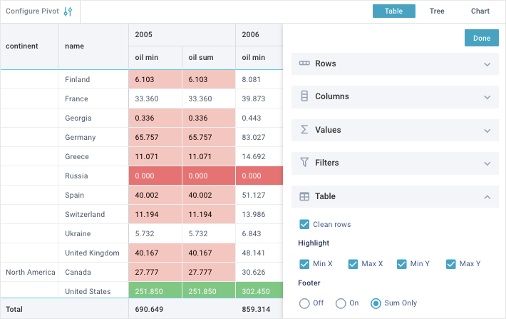
Chart Settings
In the Chart mode you can look through the data in the form of the diagrams and customize them to your needs. To do this, click on the "Configure Pivot" button on the left part of the Toolbar to display the Settings panel. Here you can do the following:
- set chart values (series)
- group data by one of the parameters
- add filters
- manage general chart settings.
Chart values
In the Values section, you can work with the chart values (series) in the following way:
- add new values (series) by clicking on the "Add value" button
- remove values by clicking on the delete icon opposite the selector
- change the order and priority of displaying the chart series. To do this, drag the an to the desired position using a special control on the left of the selector. The higher the item is in the list, the higher its priority and position in the chart
- set the parameter, the data of which will be displayed in each diagram. To do this, click on the value selector and select the required option from the drop-down list. See the picture below:
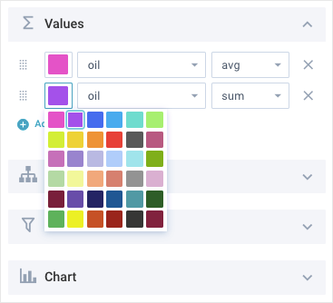
- set the chart color. To do this, click on the color selector and select the appropriate color. See the picture below:
- set the function that will be applied to the data of the selected chart. To do this, click on the function selector next to the target value selector and select the required option from the drop-down list. See the picture below:
Grouping chart data
In the Group By section, you can group chart data by one of the parameters. To do this, click on the parameter selector and select the required option from the drop-down list. See the picture below:
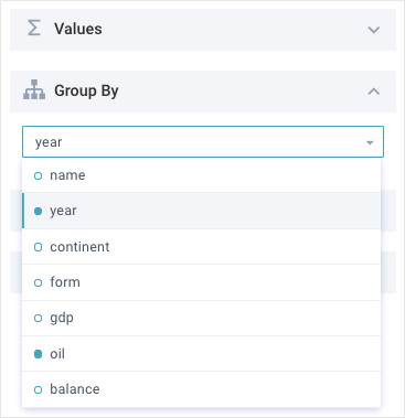
In the Chart, the grouped data will be displayed on the X-axis!
The chart, which data are grouped by years, will look like this:
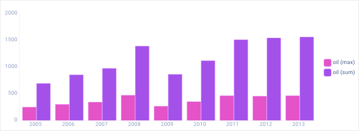
You can show/hide any of the chart series by clicking on the corresponding icons on the right part of the Chart.
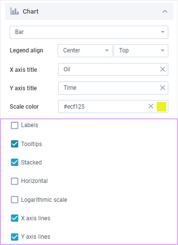
General chart settings
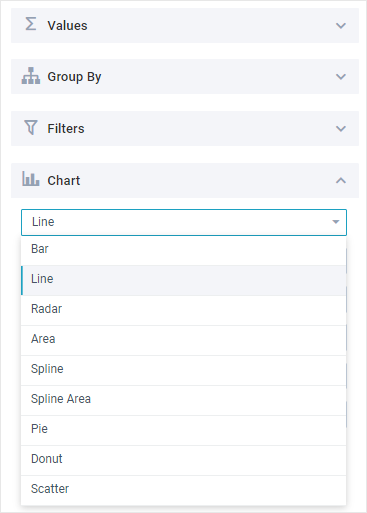
In the Chart section you can perform the following operations:
- set the chart type. To do this, click on the chart selector and select the required type from the drop-down list. See the picture below:
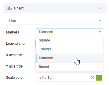
- select the type of markers: square, triangle, diamond or round (for Line, Spline, Radar, Scatter charts);
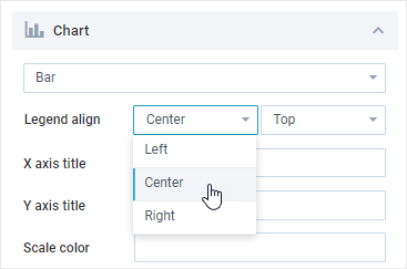
- change the position of the legend using the Legend align selectors;
- specify the label for the X axis of the chart via a dedicated field;
- specify the label for the Y axis of the chart via a dedicated field;
- set the color of the chart scale. To do this, go to the "Scale color" field and select the desired color on the color palette. You can also specify the color name in the input field directly (HEX code or string value). See the picture below:
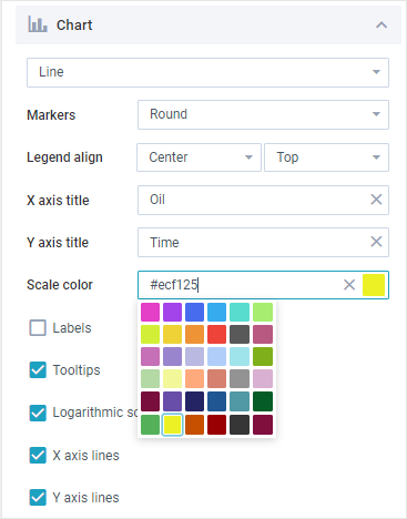
The next block of settings is represented by a series of checkboxes. Their number varies depending on the type of chart:
- show/hide labels using the Label checkbox (for Bar, Line, Radar, Spline, Scatter charts);
- show/hide tooltips using the Tooltips checkbox;
- create a stacked chart using the Stacked checkbox (for Bar and Area charts);
- change the orientation of the chart to horizontal using the Horizontal checkbox (for Bar charts only);
- show/hide the logarithmic scale using the Logarithmic scale checkbox;
- show/hide the X and Y axes lines using the corresponding X axis lines and Y axis lines checkboxes (for Radar charts use the Lines checkbox);
- fill the chart area with color using the Fill area checkbox (for Radar charts only);
- round out the lines by using the Circled lines checkbox (for Radar charts only).
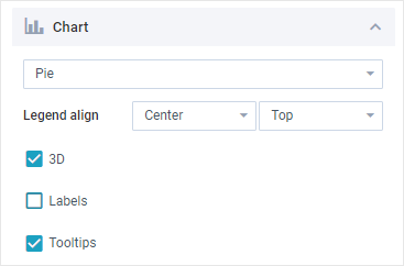
For Pie and Donut charts you can:
- enable/disable 3D view of the chart
- show/hide values inside the chart
- show/hide tooltips.
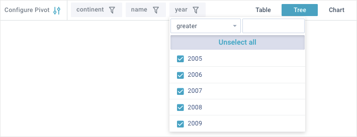
Filtering Data
Webix Pivot allows filtering data by multiple criteria, regardless of the mode set (Table, Tree or Chart). You can add new filters to the app toolbar and set them flexibly.
Adding filters
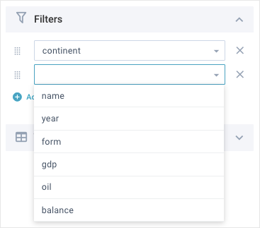
To work with filters, go to the Filters section on the Settings panel (in any mode). Here you can manage the filters in the following way:
- add new filters by clicking on the "Add filter" button
- remove filters by clicking on the delete icon opposite each selector
- change the order and priority of displaying filters. To do this, drag an item to the desired position in the list using a special control on the left of the selector. The higher the filter is in the list, the higher its priority and position on the toolbar. The filter with the highest priority is in the leftmost position on the toolbar
- set the desired filter from the list of available ones. To do this, click on the filter selector and select the required option from the drop-down list. See the picture below:
Configuring filters
All added filters will be displayed on the Toolbar. The data filtering priority starts from the leftmost filter.

To configure data filtering, click on the required filter on the Toolbar and specify the needed filtering parameters.
Compact Mode
You can use Webix Pivot on your mobile phone or tablet. For this, the widget has a compact mode. The component functionality is the same as in the desktop mode. See the pictures below, to look through the interface changes.
Tree mode
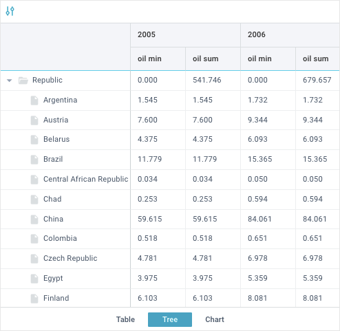
Table mode
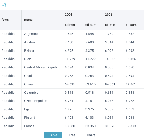
Chart mode