How-tos
You can read about general customization rules in the corresponding article.
How to Limit App Tabs
To limit the tabs on a toolbar, you need to redefine options for the NavBarView. Keep in mind that tab IDs must coincide with the possible display modes.
class CustomBarsView extends scheduler.views["bars/nav"] {
    config() {
        const ui = super.config();

        ui.options = [
            { id: "week", value: "Week" },
            { id: "month", value: "Month" },
        ];
        return ui;
    }
}
To limit menu options in the compact mode, you need to change the NavPopupView in the same way:
class CustomNavPopupView extends scheduler.views["bars/navpopup"] {
    config() {
        const ui = super.config();

        const options = [
            { id: "week", value: "Week", icon: "shi-week" },
            { id: "month", value: "Month", icon: "shi-month" },
        ];

        ui.body.body.rows[0].data = options;
        return ui;
    }
}
Do not forget to override the default classes:
webix.ui({
  view: "scheduler",
  override: new Map([
    [scheduler.views["bars/nav"], CustomBarsView],
    [scheduler.views["bars/navpopup"], CustomNavPopupView]
  ])
});
Related sample: Scheduler: Limited Tabs
How to Display Only Working Days in Week View
Configure WeekView to display only 5 day columns and adjust its GetWeek method so that it returns the data only for the first 5 days.
class CustomWeekView extends scheduler.views["modes/week"] {
    config() {
        const ui = super.config();
        if (!this.Compact) ui.rows[2].body.cols.length = 6; //scale + 5 days
        return ui;
    }
    GetWeek(start, end) {
        if (!this.Compact) end = webix.Date.add(end, -2, "day");
        return super.GetWeek(start, end);
    }
}
Then adjust MultiDayView and WeekHeaderView to show only 5 cells:
class CustomWeekHeader extends scheduler.views["modes/week/header"] {
    config() {
        const ui = super.config();
        ui.cols[1].xCount = 5;
        return ui;
    }
}

/* and the same for scheduler.views["modes/week/multiday"] */
Do not forget to override the default classes with the new ones:
webix.ui({
  view: "scheduler",
  mode: "week",
  override: new Map([
    [scheduler.views["modes/week"], CustomWeekView],
    [scheduler.views["modes/week/header"], CustomWeekHeader],
    [scheduler.views["modes/week/multiday"], CustomWeekMultiDay],
  ]),
});
Related sample: Scheduler: Working Days
Note that this customization will work if a week begins with Monday in your locale. If not, you can set it beforehand:
webix.Date.startOnMonday = true;
How to Display Only Working Hours in Day/Week Scales
Define and parse the necessary hour cells into the HourScale and DayEvents views. If needed, you can increase the height of scale cells.
DayEvents view is reused in the week scale, so no extra actions are required for the latter.
class CustomHours extends scheduler.views["modes/common/hourscale"] {
    config() {
        const ui = super.config();
        ui.type.height = 60;
        return ui;
    }
    ParseHours() {
        const data = [];
        for (let h = 8; h < 22; h++) {
            data.push({ id: h + "" });
        }
        this.List.parse(data);
    }
}
/* and the same for scheduler.views["modes/day/events"] */
Additionally, if your data contains events that do not fit into the desired working hours, you can adjust them before rendering:
class CustomDayEvents extends scheduler.views["modes/day/events"] {
    /* as above */
    config() { ... },
    ParseHours() { ... }
    // adjust out of scale events
    RenderEvents() {
        const evs = this.Events;
        if (evs && evs.length) {
            for (let i = 0; i < evs.length; i++) {
                if (evs[i].start_date.getHours() < 8) {
                    evs[i].start_date.setHours(8);
                    evs[i].start_date.setMinutes(0);
                }
                // same logic for the end_date
            }
        }

        super.RenderEvents();
    }
}
Do not forget to override the default classes:
webix.ui({
  view: "scheduler",
  mode: "week",
  override: new Map([
    [scheduler.views["modes/common/hourscale"], CustomHours],
    [scheduler.views["modes/day/events"], CustomDayEvents],
  ]),
});
Related sample: Scheduler: Working Hours
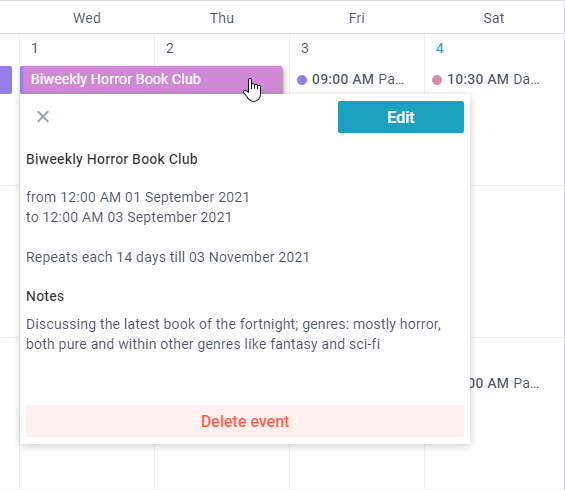
How to Display Info Window and Wide Form
This example shows how to get rid of the right panel and:
- display a small information popup instead of the right panel
- open a big form for editing in place of the Events area
The changes concern desktop mode only, the compact view remains unchanged.
Preparing Popup
Event Info view will be placed into a popup, so we need to make several adjustments beforehand:
- set paddings and sizes of UI elements
- change the "Edit" button action, so that it can open the form in place of the chart
class CustomInfo extends scheduler.views["event/info"] {
  // styling
  config() {
    this.Compact = this.getParam("compact", true);
    const ui = super.config();
    if (!this.Compact) {
      ui.body.rows[0].padding = 4;
      ui.body.rows[1].padding = 4;
      ui.body.rows[1].rows[1].inputWidth = 0;
    }

    return ui;
  }
  // opens form for editing
  EditEvent() {
    if (!this.Compact) {
      this.getParentView().Hide();
      this.app.show("main/event.form");
    } else super.EditEvent();
  }
}
After that create InfoPopup class with a Popup component that contains the above Info view. Also, define methods to show/hide the popup:
class InfoPopup extends scheduler.views.JetView {
  config() {
    return {
      view: "popup",
      width: 450,
      height: 350,
      body: CustomInfo,
    };
  }
  Show(node) {
    this.getRoot().show(node);
  }
  Hide() {
    this.getRoot().hide();
  }
}
Showing and Hiding Info Popup
The next step is to show and hide the Info Popup upon clicking the events. You should redefine the default scheduler.views.main class:
class CustomMainView extends scheduler.views.main {
  init(view) {
    super.init(view);
    this.Info = this.ui(InfoPopup);
  }
  ShowEvent(ev) {
    //"0" is for new events, form must be opened
    if (!this.Compact) {
      if (ev.id === "0") {
        const mode = this.app.getState().mode;
        this.show(`event.form`);
      } else this.Info.Show(ev.node);
    } else super.ShowEvent(ev);
  }
  HideEvent() {
    this.Info.Hide();
    super.HideEvent();
  }
}
Preparing Form View
Next major step is to redefine the Form View. If needed, you can split its UI into columns and show the Notes field on the right side.
class CustomForm extends scheduler.views["event/form"] {
  config() {
    let ui = super.config();
    if (!this.Compact) {
      //textarea
      const notes = ui.body.rows[1].elements.splice(5, 1)[0];
      notes.labelPosition = "top";
      notes.height = 334;

      //form with 3 columns
      const form = ui.body.rows[1];
      form.cols = [
        { margin: form.margin, rows: ui.body.rows[1].elements },
        { rows: [notes, {}] },
        { width: 300 },
      ];
      form.margin = 20;
      delete ui.body.rows[1].elements;
      ui.body.rows[1] = form;

      //bar
      ui.body.rows[0].padding.right = 335;
    }

    return ui;
  }
}
After that you should adjust saving logic in the FormView:
- when users click on the "Done" button, the data must be saved and form must be closed;
- when users click on the "Close" button, you can ask them whether to save the changes, if any;
// clear the form and show the Events area
Back(close) {
  this.Form.clear();
  this.State.selected = null;
  if (!this.Compact)
    this.app.show(`main/modes.${this.State.mode}/event.form`);
  else super.Back(close);
}
// "Done" button action
Done(close) {
  // save data if a new event is created or the existing one is updated
  const change = this.Form.getDirtyValues();
  if (this.SubForm && this.SubForm.IsDirty()) {
    change.$recurring = this.SubForm.GetValues();
    delete change.rec_option;
  }

  this.UpdateEvent(change).then(() => this.Back(close));
}
// "Close" icon action
Close() {
  const dirty =
        this.Form.isDirty() || (this.SubFrom && this.SubForm.IsDirty());
  // ask to save form data in case of changes
  if (dirty) {
    webix
      .confirm({
      text: "Save changes?",
    })
      .then(() => this.Done(true))
      .catch(() => this.Back(true));
  } else this.Back(true);
}
Finally do not forget to override the default classes with the new ones.
webix.ui({
  view: "scheduler",
  override: new Map([
    [scheduler.views.main, CustomMainView],
    [scheduler.views["event/info"], CustomInfo],
    [scheduler.views["event/form"], CustomForm]
  ])
});
Related sample: Scheduler: Info Window and Wide Form
How to Add New Timeline Scales
By default, there are three scales: day, week, and month. However, the inner logic supports other types, and you can add them via customization. Let's add 'quarter' scale.
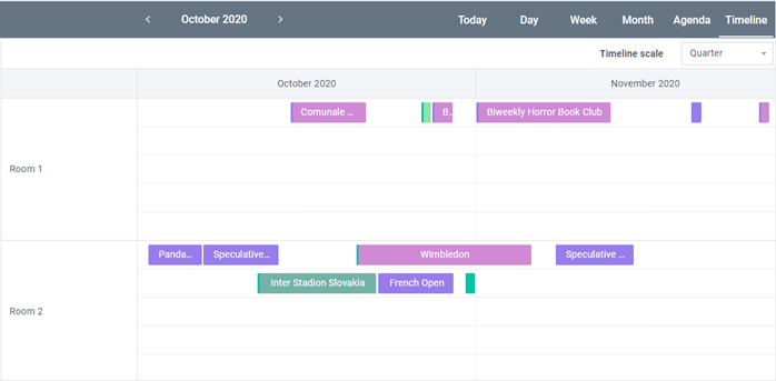
1.Add configuration for the scale:
class CustomTimelineView extends scheduler.views["modes/timeline"] {
  // the array with scales
  GetScalesArray(type) {
    if (type === "quarter") return [{
      unit: "month",
      format: "%F %Y"
    }];
    return super.GetScalesArray(type);
  }

  // the width of the unit (which is a month in this case)
  GetScalesCellWidth(type) {
    if (type === "quarter") return 500;
    return super.GetScalesCellWidth(type);
  }
}
2.Add 'quarter' option to the selector on the bar:
class CustomBarView extends scheduler.views["modes/timeline/bar"] {
  config() {
    const ui = super.config();

    const rich = ui.elements[1];
    rich.options.push({
      id: "quarter",
      value: "Quarter"
    });

    return ui;
  }
}
Related sample: Scheduler: adding new scale types
How to Highlight Days Where There Are Two or More Events
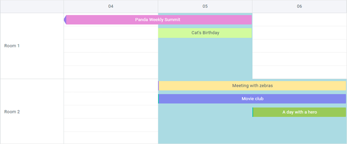
You will need to extend scheduler.views["modes/timeline/chart"].
1.Find where events are overlapping:
Create some kind of collection to store overlaps (a simple array will do):
ClearCollections() {
  super.ClearCollections();

  this._intersections = [];
}
Check all events if they overlap with those that already have been processed:
getIntersectionDates(task) {
  const intersections = [];

  this._processed.forEach(obj => {
    if (obj.section == task.section) {
      if (this.CheckDatesIntersection(obj, task)) {
        const intersection = {
          start: Math.max(obj.$x, task.$x),
          end: Math.min(obj.$x + obj.$w, task.$x + task.$w),
          section: task.section,
        };
        // here repeated overlaps are pushed to create 'opacity effect'
        // you can add a check and not push duplicates
        intersections.push(intersection);
      }
    }
  });

  return intersections;
}

CheckDatesIntersection(a, b) {
  return a.id !== b.id && b.$x < a.$x + a.$w && b.$x + b.$w > a.$x;
}
Call this method after events were processed before rendering:
RefreshTask(updID) {
  super.RefreshTask(updID);

  const t = this.GetEvent(updID);
  this._intersections.push(...this.getIntersectionDates(t));
}
2.Render highlighting:
RenderEvents() {
  super.RenderEvents();

  let html = "";
  const sheight = this.GetSectionHeight();
  this._intersections.forEach(intersection => {
    const x = intersection.start;
    const x1 = intersection.end;
    const y = this.Bars.getItemNode(intersection.section).offsetTop;
    html += `<div class="intersection" style="top:${y}px; left:${x}px; width:${x1 -
      x}px; height:${sheight}px; position:absolute;"></div>`;
  });
  this._DataObj.insertAdjacentHTML("afterbegin", html);
}
3.Style them:
.webix_scheduler_timeline_bars .intersection,
.webix_scheduler_timeline_touch_bars .intersection {
  background: #abdbe3;
  pointer-events: none; /* ! important to add this so that all actions
                        with timeline were available where highlights are added */
}
Related sample: Scheduler: Timeline with highlighted overlaps
Back to top