Report Manager User Guide
Report Manager is a complex system for report management. The widget provides a wide range of tools for creating, editing, grouping, deleting and exporting the reports. Read further to dive into the app interface and main controls.
Main Screens
Visually Report Manager consists of 3 parts:
- Top panel
- Left panel
- Right panel.
You can find the Top panel on the very top of the Report Manager. It is a Toolbar with the controls and the name of the current report. The controls will differ depending on the widget display mode.
You can find the Left panel on the left part of the screen. It is the core of the widget. Depending on the mode, it is displayed as the Navigation panel (in the preview mode) or Edit panel (in the edit mode).
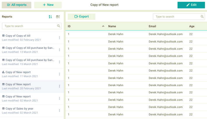
The Right panel is on the right part of the screen. It is the Reports panel, which is designed to display and export the data reports. The Reports panel does not change depending on the display mode.
Display Modes
Report Manager has 2 display modes:
- Preview mode
- Edit mode.
Toolbar and Left panel are changed depending on the current mode.
Preview Mode
The Preview mode allows you to look through, sort and filter the reports list in the Navigation panel. Here you can also select a specific report to display or export it via the Reports panel.
Toolbar
The Toolbar in the preview mode allows you to show and hide the Navigation panel, manage the creation of the new reports and edit the existing ones. It also displays the name of the current report.

On the left part of the panel there are 2 buttons:
- "All reports"
- "+ New".
In the center of the panel there is a label with the name of the current report. When you switch to another report, the name will change accordingly.
The "Edit" button is on the right part of the panel.
Click on the "All reports" button to show/hide the Navigation panel, where you can view all reports and display the desired one.
Click on the "+ New" button to display the Edit panel, where you can create a new report.
Click on the "Edit" button to display the Edit panel, where you can edit the current report.
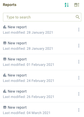
Navigation panel
The Navigation panel allows you to view, sort, delete and filter the list of the existing reports, as well as display a specific report on the Report panel. Here you can find the following controls:
- sorting icons that allow you to sort reports:
- alphabetically
- by date
- search bar
- list of reports.
To sort the list of reports alphabetically or by date of the latest change, click on the corresponding icon. The widget will sort the items in the ascending or descending order.
If the list of reports is too long, you can use the search bar to find the desired item.
Each element of the list includes the following components:
- report type icon
- report name
- date of the latest change
- "Menu" icon.
When you click on the "Menu" icon, the widget will display a drop-down list with the following options:
- Edit
- Create copy
- Delete.
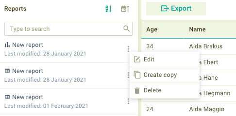
Select the "Edit" option to open the current report in the edit mode.
Select the "Create copy" option to create a copy of the current report and open it in the edit mode.
Select the "Delete" option to delete the current report. Confirm the action in the pop-up window.
Reports panel
The Reports panel is designed to display and export reports. Depending on the report configuration, the widget can display data in one of the following ways:
- Table
- Chart
- Heatmap.
To export the report, there is an "Export" button in the top left corner of the panel. When you click on this button, the widget will display a drop-down list with the following export formats:
- Excel / CSV (for a table)
- PNG / PDF (for a chart and heatmap).
To save the report in the desired format, select the corresponding option.
If a report is displayed as a Table, you can sort and filter its data.
To sort the table data in the ascending or descending order, click on the header of the required column.
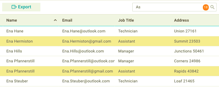
To find a record in the table, you can use the search bar in the top right corner of the panel. The system will highlight cells with the matched data and display their quantity on the right part of the search bar.
The Reports panel is not changed depending on the mode.
Edit Mode
The Edit mode allows you to create and edit the reports via the Edit panel and manage changes via the Toolbar controls.
Toolbar
The Toolbar in edit mode allows you to manage changes when creating a new report and editing an existing one.

In the center of the panel there is a label with the name of the current report.
On the right part of the panel there are 2 buttons:
- "Save"
- "Cancel".
Click on the "Save" button to apply changes and return to the preview mode.
Click on the "Cancel" button to cancel the changes and return to the preview mode.
Edit panel
The Edit panel allows you to create new reports, edit and delete the existing ones. The panel consists of 4 tabs:
- Common
- Query
- Data
- View.
Each tab contains a specific set of settings.
Common Tab
In the Common tab you can view, edit and delete general information about the report.
It includes a form with the following controls:
- "Report name" input field
- "Description" input field
- "Data source" selector
- "Join data" button
- "Delete report" button.
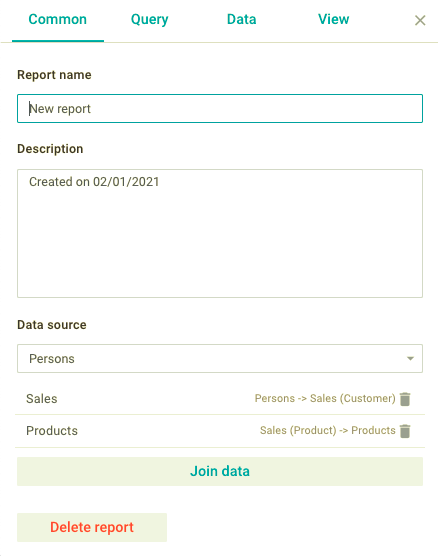
To change the report name and description, enter the desired data in the corresponding input fields.
You can set the source of server data. The widget will load the data tables from this source for generating reports. To change the data source, click on the "Data Source" selector and select the required option from the drop-down list.
To use one more data source, click on the "Join data" button and select the desired option from the drop-down list with available sources. The widget will display a new item in the list of joined sources above the button. You can join several data sources.
To remove the added data source, click on the "Remove" icon opposite to it.
To delete the report, click on the "Delete report" button at the bottom of the panel and confirm the action in the pop-up window.
Query Tab
In the Query tab you can create, edit, delete and apply filters to the data source which is set in the Common tab. The widget loads data from the data source according to the applied conditions.
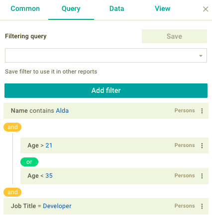
You can also save filters of the current data source to apply them to other reports that use the same data source.
Filter
To create a new filter, take the following steps:
1) Click on the "Add filter" button
2) In the appeared form, set the required filtering criteria
3) Click on the "Apply" button.
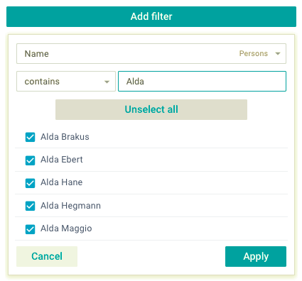
The widget will add a new filter to the end of the list and apply it to the data report.
Each filter has a "Menu" icon. It allows you to do the following:
- create a new filter after the current one
- create a group of filters after the current one
- edit filter
- delete filter.
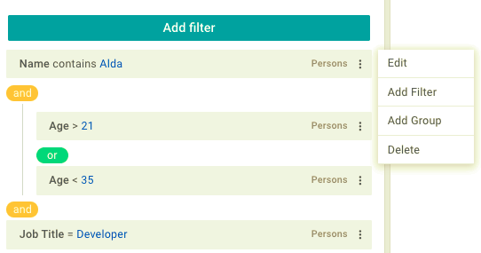
To create a new filter after the current one, select the "Add filter" option. In the appeared form, you should configure the filtering criteria and click on the "Apply" button.
To create the group of filters after the current one, select the "Add group" option. In the appeared form, you should configure the filtering criteria and click on the "Apply" button.
To edit the filter, select the "Edit" option. In the appeared form, you should edit filtering criteria and click on the "Apply" button.
To delete a filter or a group of filters, select the "Delete" option. The widget will immediately remove the selected item.
When you create several filters or groups, the widget will combine them using "AND" or "OR" logic. If the "AND" condition is set, the widget will take into account the filtering criteria of both filters at the same time. If the "OR" condition is set, any of the criteria will be taken.
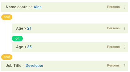
You can switch between "AND" and "OR" conditions. To do this, click on the oval marker with the corresponding name between the filters or groups.
Query
You can save a set of filters for the current data source to apply it to the reports that use the same data source.
Creating queries
To create a new query for the current data source you should take the following steps:
1) Make sure that the query selector is empty
2) Create the required filters
3) Click on the "Save" button
4) In the pop-up window enter the name of the query and confirm the action.
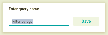
The widget will save, apply and make the query available to other reports that use the same data source.
Applying queries
To apply the query, click on the query selector and select the desired option from the drop-down list. The report data are displayed considering the filters of the query.
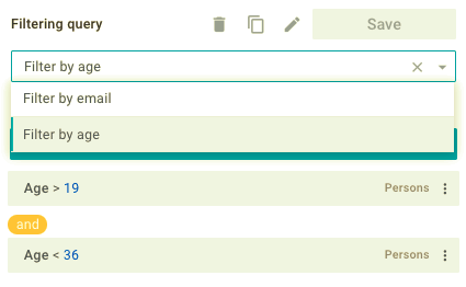
Editing queries
To edit the current query, go to the list of its filters and modify them.
To reset the current query, click on the "Close" icon on the right part of the query selector.
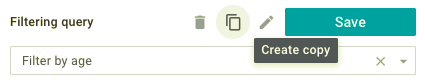
You can create a copy and rename the current query. To do this, use the "Create copy" and "Rename" icons at the top of the panel.
When you click on the "Create copy" icon, the widget will create a copy of the current query and apply it.
When you click on the "Rename" icon, the widget will display a pop-up window with an input field.
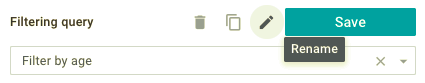
Enter the new name and confirm the action.
Deleting queries
To delete a query, click on the "Delete" icon at the top of the panel and confirm the action.
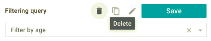
The widget will remove the query and reset the query selector. The removed query will be unavailable for other reports that use the same data source.
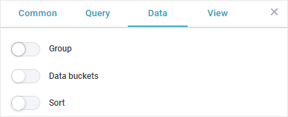
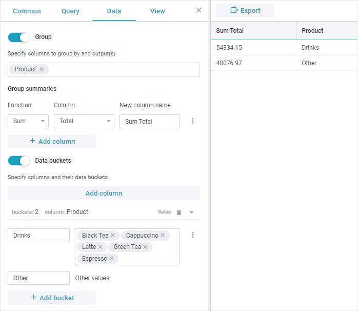
Data Tab
In the Data tab you can group and sort the report data. There are 4 toggles for it:
- Group
- Data buckets
- Sort
- Facets
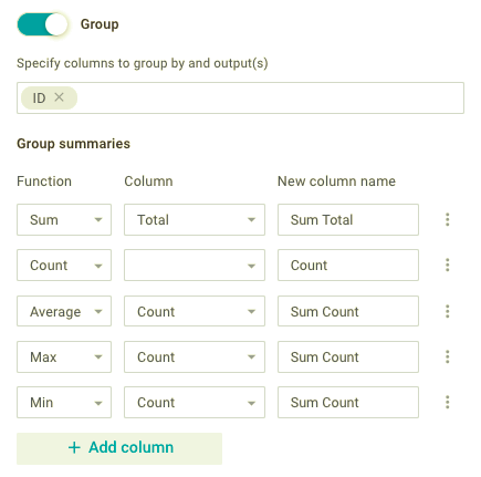
Group
The "Group" toggle allows you to manage grouping of the report data. You can show and hide the available columns and create new columns that display data grouped according to the specific criteria. To do this, you can use the following:
- selector of available columns
- Group summaries section.
The selector of available columns allows you to include the desired columns into a report. When you click on the selector, the widget will display a drop-down list with available columns.
Check columns in the drop-down list to display the desired ones in the report. The checked options will be also displayed as the tags in the selector field.
When you check the column with the date values, its tag will include a time scale selector on the left part.
To remove a column, click on the "Close" icon of the corresponding tag or uncheck it in the drop-down list.
The Group summaries section is designed to create, edit and delete additional columns that display data according to a set of specific functions. You can do this with the following controls:
- "Function" selector
- "Column" selector
- "New column name" input field
- "Menu" icon
- "+ Add Column" button.
The "Function" selector allows you to set a function for processing column data. The widget provides the following functions:
- Sum (sum of all column values)
- Count (quantity of all column values)
- Average (average value)
- Max (maximum value)
- Min (minimum value).
The "Column" selector allows you to select the column to which the selected function will be applied. The drop-down list of the selector contains only the columns with numeric values.
In the input field you can change the name of the additional column.
To create a new column, click on the "+ Add column" button. The widget will display a new item below the list of additional columns.
To delete the additional column, click on the "Menu" icon on the right part of the additional column and select the "Delete" option.
Data buckets
The "Data buckets" toggle allows you to create categories (group names) for field values.
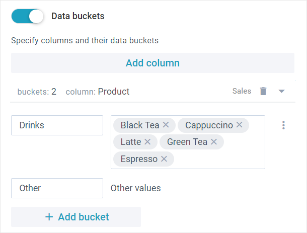
Use data buckets if you want to give a common name to the selected values. If both "Group" and "Data buckets" toggles are turned on and configured, report records will be aggregated by the names of the buckets.
One column may include multiple buckets. The values of one bucket cannot be used in the other buckets of the same column.
To create a new bucket for a specific column, you should take the following steps:
1.Click on the "Add column" button.
2.Select the column for which the data bucket will be created.
3.Enter the name of the bucket into a "Bucket name" text field.
4.Click on the "Bucket values" selector and select one or more options. The selected options will be displayed in the selector field.
Field values that are not selected in any of the buckets will be renamed to “Other”. You can rename it for your needs.
To add another bucket for the same column, click on the "+ Add bucket" button.
To delete a specific bucket, click on the  icon and select the "Delete" option from the dropdown menu.
To delete all buckets from the column, click on the  icon.
icon.
Sort
The "Sort" toggle allows you to manage the order and direction in which the data is sorted initially. You can do this with a special selector.
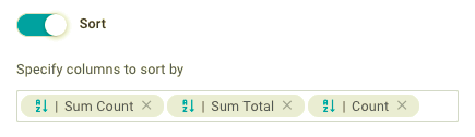
Click on the selector to display the drop-down list with available columns. Check the columns in the required order, to set the order of their sorting in the report.
The checked columns will be also displayed as the tags in the selector field.
The tag allows you to set the sorting direction of the column data and remove it.
To change the sorting direction, click on the "Sort" icon in the tag of the required column. The data are sorted in the ascending or descending direction.
To remove a column, click on the "Close" icon of the corresponding tag or uncheck it in the drop-down list.
All changes are immediately displayed in the report.
Facets
The "Facets" toggle allows you to group multiple datasets by particular values for a selected column.
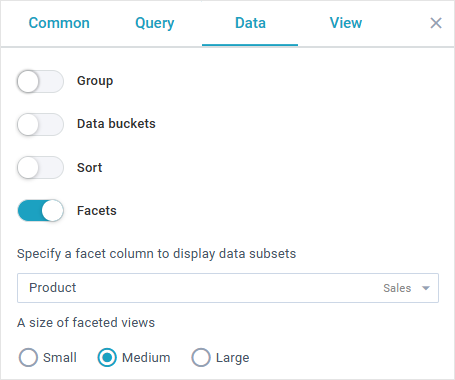
Here you can also set the size of facets:
- "large" ("l") - facets are located in one column and take all the available width
- "medium" ("m") - facets are displayed with the 500px minimal width
- "small" ("s") - this size requires 320px as min width for facets
View Tab
In the View tab you can manage the visual display of the report data. There is a selector in the top left corner of the panel, where you can select the desired type of report. Click on the selector to show the drop-down list with the following options:
- Table
- Chart
- Heatmap.
Each type includes a corresponding set of settings for configuring the visual representation of the report.
Table
The Table type allows you to display report data as a table and manage it. For each column of the table you can specify the following:
- header
- filter
- place in the table
- visibility
- fixed position.
The tab includes the list of all available columns and the search bar.
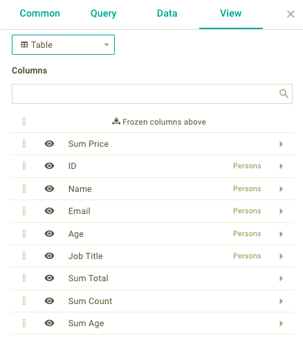
To change the displaying order of the columns, drag them to the desired position in the list. The columns in the list are arranged from top to bottom, while in the table from left to right. Thus the highest column in the list will be the leftmost in the table.
To show or hide the column in the table, click on the "Eye" icon in the list.
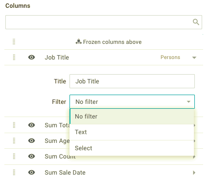
To edit column settings, click on its edit label. The widget will show the form, where you can specify the following:
- column name
- type of filter:
- text
- selector.
On the very top of the list there is a "Frozen columns above" element. To fix the columns and disable their vertical scrolling, drag the required columns above the "Frozen columns above" element in the list. The fixed columns are separated by a vertical line in the report table.
Chart
The Chart type allows you to display report data as a chart and manage it. Here you can specify the chart type, data series source, labels and styles for individual graphs.
To configure the chart, use the following controls:
- "Chart type" selector
- "X axis column" selector
- "Data series" section
- "Axes" section
- "Legend" section.
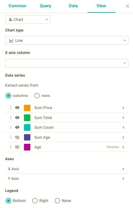
The "Chart type" selector allows you to specify the view of the chart. To do this, select the corresponding option from the dropdown list:
- Line
- Spline
- Area
- Stacked area
- Spline area
- Bar
- Stacked bar
- Radar.
The "X-axis column" selector allows you to specify a column which values are set as the names of the "X-Axis" columns of the chart.
Data series
The "Data series" section allows you to set the data source for individual graphs and control their visibility. Here you can see 2 radio buttons for switching between sources:
- Extract series from columns
- Extract series from rows.
Extract series from columns
Click on the "columns" radio button, to show the list of columns, from which the data are extracted to form the graphs. Each column corresponds to one graph.
For each graph you can specify the following parameters:
- name (for its legend)
- color
- type and filling of marker (depending on the chart type)
- visibility
- the priority of display.
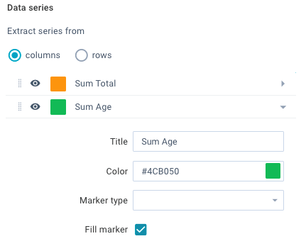
To show or hide the graph in the chart, click on the "Eye" icon in the list.
To set the order of displaying graphs, drag them to set the desired order in the list.
To change the appearance of the graph, click on the required item in the list. The widget will display a form where you can specify the following:
- legend name
- chart color.
- type and filling of marker (depending on the chart type).
Extract series from rows
Click on the "rows" radio button, to show 2 controls next to it:
"Keys column" selector "Values column" selector.
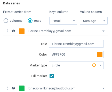
The "Keys column" selector allows you to specify a column from which the unique values are extracted to form the graphs. The list of generated graphs is displayed below. For each graph you can specify the following parameters:
- name (for its legend)
- color
- type and filling of marker (depending on the chart type)
- visibility
- the priority of display.
The "Values column" selector allows you to specify a column from which the unique values are extracted to form the "Y-Axis" values.
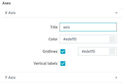
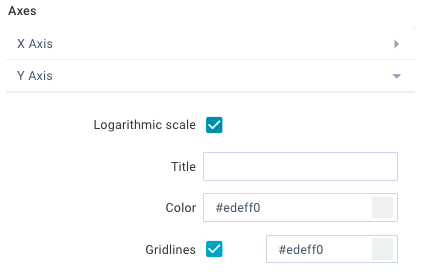
Axes
The "Axes" section allows you to control the display of the chart axes. Here you can specify the axes name, axes color, color or grid lines and control the labels of columns.
You can do this with the following controls:
- X-Axis
- Y-Axis.
When you click on the "X-Axis" control, the widget will show a form where you can specify the following:
- name of axis
- color
- color of lines (or remove them)
- positioning of the labels for the graph points.
When you click on the "Y-Axis" control, the widget will show a form where you can specify the following:
- mode of scale (logarithmic or not)
- name of the axis
- color
- color of the lines (or remove them).
Legend
The "Legend" section allows you to control the display of the chart legend. You can display the legend in the following ways:
- vertically at the right
- horizontally at the bottom
- remove the legend.

To change the position of the legend, click on the corresponding radio button.
Heatmap
The Heatmap type allows you to display the report data as a heatmap and manage it. Here you can specify the columns, values of which will form the view of the heatmap elements. You can do this with the following controls:
- "Values column" selector
- "Labels column" selector
- "Color column" selector.
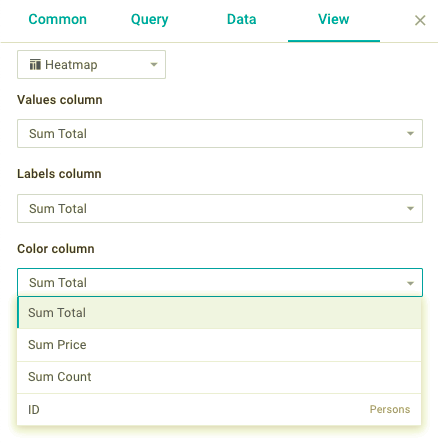
When you click on the "Values column" selector, the widget will show a drop-down list with the columns of numeric values. On the heatmap, the values of the selected column are displayed as rectangles in the ascending order from the smallest one in the bottom right corner to the largest in the top left corner.
When you click on the "Labels column" selector, the widget will show a drop-down list with all available columns. Select the required column to display its values as labels of the corresponding rectangles.
When you click on the "Color column" selector, the widget will show a drop-down list with the columns of numeric values. On the heatmap, the values of the selected column are displayed as shades of the blue color of the corresponding rectangles. The higher value is, the more the color of the corresponding rectangle is saturated.
Back to top