Settings for Pie Charts
Data Presentation
Template items are taken from the dataset defined for the component.
data=[{sales:"20", month:"Jan", color: "#ee3639"}]
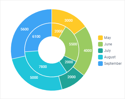
- value ('#sales#') - data item that is taken for graphical representation. Its values form 'pie' pieces;
- label ('#month#') - data item used for making text label for 'pie' pieces;
- labelOffset (number) - the offset of sector labels from the pie frame (20px by default);
- pieInnerText ('#sales#') - text (numeric) values displayed on each 'pie' piece;
- color ('#color#') - the color of each piece. Can be set in the dataset. If not mentioned, default colors will be displayed.
Styling and Positioning
These settings just add style to your chart and can be easily omitted:
- radius (number) - the radius of the "pie" chart;
- innerRadius - (number) - the radius of the inner circle of the "pie" chart;
- x (number) - horizontal offset of pie center from the left side of the parent container;
- y (number) - vertical offset of pie center from the top border of the parent container;
- gradient (boolean) - gradual color shifting;
- shadow (boolean) - decorative shadow for the component;
- cant (number) - defines the slope angle of a 3D pie (from 0 to 1, 0.5 by default).
Chart Series
Both Pie and Donut Charts support series. More about series here.
Related sample: Pie Chart: Series
Back to top