Progress Bar for Uploader
Progress bar is set with CSS means for each file separately and is displayed in the dedicated component (e.g. list) set to a custom type.
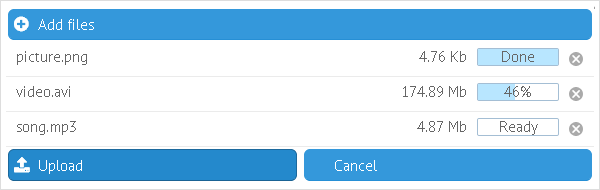
Related sample: Uploader: Progress Bar
Webix.type defines the way component items look like. Here you specify the component you make the type for, name of this type and item property(-ies) you set.
webix.type(webix.ui.list, {
    name:"myUploader",
    template: function(f, type){},
    status:function(f){},
    on_click:{},
    height: 35
});
Template:
As a rule, displayed info contains the following data wrapped in the chosen CSS class (defined in the document head section).
- f.name - name and extension of the file
- cancel icon (a built-in icon set via the CSS class cancel_icon). More about Iconization
- f.status - "transfer" or "server" with f.percent value for the latter
- f.sizetext - size of the file.
template:function(f,type){
var html = "<div class='overall'><div class='name'>"+f.name+"</div>";
html += "<div class='remove_file'><span style='color:#AAA'"+
"class='cancel_icon'></span></div>";
html += "<div class='status'>";
html += "<div class='progress "+f.status+"'"+
"style='width:"+(f.status == 'transfer'||f.status=="server"?f.percent+"%": "0px")+"'>"+
"</div>";
html += "<div class='message "+ f.status+"'>"+type.status(f)+"</div>";
html +=  "</div>";
html += "<div class='size'>"+ f.sizetext+"</div></div>";
return html;
};
Status:
Here you put a function that defines status message displayed in the progress bar.
status:function(f){
    var messages = {
        server: "Done",
        error: "Error",
        client: "Ready",
        transfer:  f.percent+"%"
    };
    return messages[f.status]
}
Functionality for the "cancel" icon.
on_click:{ "remove_file":function(ev, id){
    $$(this.config.uploader).files.remove(id);}
}
Minor parameters
The ones like width and height of each list item.
Beware to set the created type for the list!
{view:"list", id:"mylist", type:"myUploader", ...}