Configuring Kanban
Enabling Card Editor
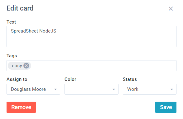
Kanban cards can be edited with the help of a popup form. To enable editing, you need to set the corresponding configuration property - editor:
webix.ui({
    view:"kanban",
    editor:true,        cols:[
        { header:"Backlog", body:{ view:"kanbanlist", status:"new" }},
        { header:"In Progress", body:{ view:"kanbanlist", status:"work" }},
        { header:"Done", body:{ view:"kanbanlist", status:"done" }}
    ],
    url:"/data/tasks"
});
Related sample: Default Editor
You can also create your own form with different controls. For details, go to Kanban UI Editor.
Defining Common Tags
You can define a collection of tags for the Kanban board and add them to cards. You need to:
1. Provide data for tags with IDs and values.
2. Point to the tags by their IDs within the card data items.
webix.ui({
    view:"kanban",
    editor:true,
    tags: [                                 { id:1, value:"webix" },            { id:2, value:"jet" },              { id:3, value:"easy" }          ],                                  data:[
        { id:1, status:"new", text:"Test service", tags:[1,2,3] },
        { id:2, status:"work", text:"Performance tests", tags:[1] }
    ],
    cols:[
        { header:"Backlog", body:{ view:"kanbanlist", status:"new" }},
        { header:"In Progress", body:{ view:"kanbanlist", status:"work" }},
        { header:"Done", body:{ view:"kanbanlist", status:"done" }}
    ]
});
Tags can be added to cards in UI with the Kanban editor.
Note: Inline tags within data items are supported as well.
webix.ui({
    view:"kanban",
    data:[
        { id:1, status:"new", text:"Test service", tags:"webix,jet" },
        { id:2, status:"work", text:"Performance tests", tags:"webix" },
    ]
});
Enabling Colored States for Cards
You can define a collection of colored states common for all cards and assign them to the necessary ones. You need to:
1. Provide data for colors with IDs and values.
2. Point to the colors by their IDs within the card data items.
webix.ui({
    view:"kanban",
    editor:true,
    colors: [                                          {id:1, value:"Normal", color:"green"},         {id:2, value:"Low", color:"orange"},           {id:3, value:"Urgent", color:"red"}        ],                                             data:[
        { id:1, status:"new", text:"Test service", color:1 },
        { id:2, status:"work", text:"Performance tests", color:2 }
    ],
    cols:[
        { header:"Backlog", body:{ view:"kanbanlist", status:"new" }},
        { header:"In Progress", body:{ view:"kanbanlist", status:"work" }},
        { header:"Done", body:{ view:"kanbanlist", status:"done" }}
    ]
});
Colors can be assigned to cards in the UI with the means of the Kanban editor.
Note: Inline colors within data items are supported as well:
webix.ui({
    view:"kanban",
    data:[
        { id:1, status:"new", text:"Test service", color:"red" },
        { id:2, status:"work", text:"Performance tests", color:"green" }
    ]
});
Enabling Card Comments
You can add and visualize card comments with the Comments widget.
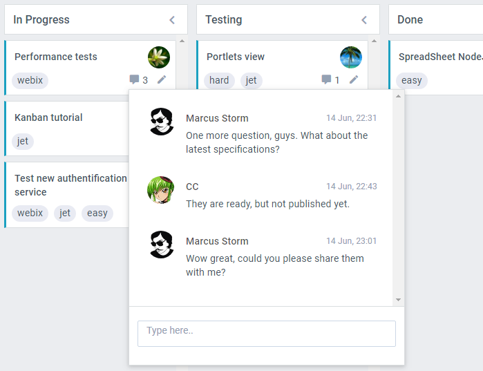
You need to:
1. Provide a data set that includes comments arrays within data items.
2. Define the comments property.
webix.ui({
    view:"kanban",
    comments:true,       data:[
        { id:5, text:"Portlets view", comments:[
            { id:6, user_id:4, date:"2018-06-14 23:01", text:"No worry, I am planning to finish it up in half an hour and make them public for all. Just wait..)"}
        ]}
    ],
    cols:[
        { header:"Backlog", body:{ view:"kanbanlist", status:"new" }},
        { header:"In Progress", body:{ view:"kanbanlist", status:"work" }},
        { header:"Done", body:{ view:"kanbanlist", status:"done" }}
    ]
});
You can also customize the inner comment widget:
webix.ui({
    view:"kanban",
    comments:{ currentUser:1 },     ...
});
Adding User List for Quick Task Assignment
Tasks can be assigned to users in the editor. You can also create a quick way to assign tasks by attaching a dropdown list of users to the avatars.
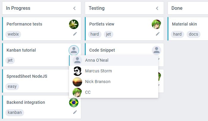
You can do this by following two steps:
1. Enable the userList setting of Kanban configuration.
2. Provide data for users with IDs, values and paths to images.
webix.ui({
    view:"kanban",
    userList:true,      users:[
        { id:1, value:"Margaret Atwood", image:"imgs/matwood.jpg" },
        { id:2, value:"Fannie Flagg", image:"imgs/fflagg.jpg" },
        { id:3, value:"Irvine Welsh", image:"imgs/iwelsh.jpg" }
    ],
    cols:[
        { header:"Backlog", body:{ view:"kanbanlist", status:"new" }},
        { header:"In Progress", body:{ view:"kanbanlist", status:"work" }},
        { header:"Done", body:{ view:"kanbanlist", status:"done" }}
    ],
    url:"/data/tasks"
});
Related sample: Users and user list
You can also change the list by setting List configuration Properties and passing them to userList:
webix.ui({
    view:"kanban",
    userList:{                          yCount:9,                       width:150                   },                              cols:[
        { header:"Backlog", body:{ view:"kanbanlist", status:"new" }},
        { header:"In Progress", body:{ view:"kanbanlist", status:"work" }},
        { header:"Done", body:{ view:"kanbanlist", status:"done" }}
    ],
    url:"/data/tasks"
});
Related sample: Custom User List
Adding Context Menu with Card Actions
Kanban cards have context menus with card actions:
- Edit - opens the editor for changing card details,
- Copy - makes a copy of the card and places it below in the same list,
- Remove - opens a confirmation dialogue for removing the card.
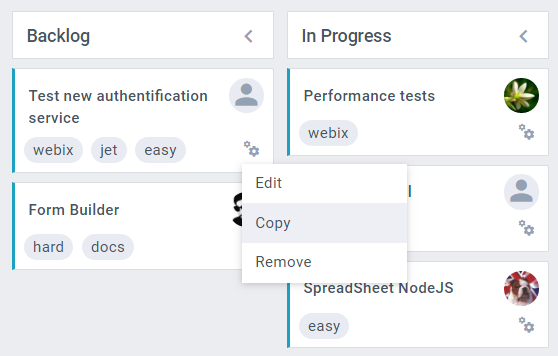
You can enable this context menu by the cardActions property:
webix.ui({
    view:"kanban",
    cardActions:true,       cols:[
        { header:"Backlog", body:{ view:"kanbanlist", status:"new" }},
        { header:"In Progress", body:{ view:"kanbanlist", status:"work" }},
        { header:"Done", body:{ view:"kanbanlist", status:"done" }}
    ],
    url:"/data/tasks"
});
If you want to reorder actions, remove any of them or add your own, follow these steps:
1. Define cardActions as an array with the names of all the actions (default or your own) in lower-case. Let's add one more option that will complete the task and move it to the last list - "Done":
webix.ui({
    view:"kanban",
    id:"myBoard",
    cardActions:[                                       "edit", "copy", "remove", "complete"        ]                                           });
2. Provide labels for your new actions. These labels will be displayed in the menu. Let's add the label for the "Complete" action:
webix.i18n.kanban.menu.complete = "Mark complete";
3. Provide handlers for new actions. Each action will get two events:
- onBefore{action name}
- onAfter{action name}
For example, this is how the Complete action is handled:
$$("myBoard").attachEvents("onBeforeComplete",function(id){
    if(this.getItem(id).status !=="done"){
        var target = this.queryView({ status:"done" });
        var source = this.getOwnerList(id);
        source.move(id, 0, target);
    }
});
Related sample: Custom Card Actions
Dynamic Rendering of KanbanLists
When you work with Kanban, only the modified cards are re-rendered. There is one more way to enhance Kanban performance.
You can enable dynamic rendering of Kanban lists. If you set the dynamic:true option of each list, only the cards that are currently visible will be rendered:
webix.type(webix.ui.kanbanlist,{
  name: "cards",
  height: 100
});


webix.ui({
    view:"kanban",
    cols:[
        { header:"Backlog", body:{ view:"kanbanlist", type: "cards", status:"new", dynamic:true }},
        { header:"In Progress", body:{ view:"kanbanlist", type: "cards", status:"work", dynamic:true }},
        { header:"Done", body:{ view:"kanbanlist", type: "cards", status:"done", dynamic:true }}
    ],
    url: "/data/tasks"
});
Note that if you want to enable dynamic loading, make sure that the height of the item is not "auto." It must be a number.
Using Markdown in Kanban Cards
You can control how the main content of Kanban cards is interpreted and displayed via the textFormat property. The widget can render card text either as plain text (the default) or as Markdown.
To enable Markdown parsing and rendering, set the textFormat property in the Kanban configuration to "markdown":
webix.ui({
  view:"kanban",
  textFormat:"markdown",   cols:[
    {
      header:"In Progress",
      body:{ view:"kanbanlist", status:"work" }
    },
    //other columns here
  ],
  editor:true,
  data:kanban_data
});
When textFormat has the default "text" value, the webix_kanban_body_text CSS class is automatically applied to the card's body.
With textFormat set to "markdown", the card's body receives the webix_kanban_body_markdown class, which provides Markdown styling.
Note that the markdown parser of the Kanban widget doesn't support nested structures (except bold inside italic). This means that combinations such as bold inside a link, italic inside a list, or multi-level lists will not render correctly when used in the card's text content.
Using Markdown in Custom Templates
When you build a custom card template with templateBody, Markdown parsing and styling are not applied automatically. To ensure correct Markdown rendering in this case, you need to:
- Parse the card text with the markdownToHtml helper.
- Add the webix_kanban_body_markdown class to the container that wraps the card text.
Check out the sample below for an example of how to implement this in code:
webix.type(webix.ui.kanbanlist,{
  name: "cards",
  templateBody: function(obj){
    return `
      id: ${obj.id}
      <div class="webix_kanban_body_markdown">${this.markdownToHtml(obj.text)}</div>`;   }
});