Advanced
Deprecated
Starting from Webix 8.0 the widget is deprecated. Use a more powerful alternative - the Scheduler.
Changing Structure of Scheduler
The mobile scheduler has a multiview-based architecture. For details see the related article of documentation - Building App Layout.
Please remember that you can customize just toolbars of the scheduler.
So in this article we will concentrate on toolbars. Below you can find all the available toolbars and their default definitions.
For detailed information on toolbar see the appropriate article of Webix documentation - Toolbar.
Multiview
The main multiview of the scheduler contains 3 views:
- Selected event view;
- Edit form;
- Start(end) date edit form;
- Sub-multiview (supplemented by the bottom toolbar):
- Day;
- Week;
- Month.
'Day' view
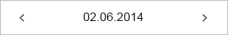
In the "Day" view, the toolbar contains navigation buttons and the label displaying the selected date.
scheduler.config.day_toolbar = [
    {view:'label', id:"prev", align:"left",
      label:"<div class='webix_cal_prev_button'><div></div></div>"},
    {view:'label', id:"date", align:"center", width:200},
    {view:'label', id:"next", align:"right",
      label:"<div class='webix_cal_next_button'><div></div></div>"}
];
'Week' view
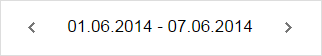
scheduler.config.week_toolbar = [
    {view:'label',name: 'prevWeek', id:"prevWeek", width: 40, align:"left",
      label:"<div class='webix_cal_prev_button'></div>"},
    {view:'label',id:"weekTitle",align:"center"},
    {view:'label',id:"nextWeek", align:"right",
      label:"<div class='webix_cal_next_button'></div>",width: 40}
];
'Month' view
In the "Month" view the toolbar is a part of calendar integrated to the view (not an individual component). So if you want to customize this toolbar, please, refer to the related Calendar documentation.
'Selected Event' view
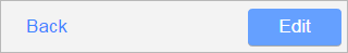
Here, the toolbar contains 2 buttons: "Back" and "Edit" (the buttons are hidden in the read-only mode).
scheduler.config.selected_toolbar = [
    {view:'label',width:scheduler.xy.icon_back,css:"cancel",name:"back",id:"back",
      align:"center", label:scheduler.locale.labels.icon_back},
    {view:'button', inputWidth:scheduler.xy.icon_edit, name:"edit", id:"edit",
      align:"right", label:scheduler.locale.labels.icon_edit}
];
Start(end) date edit form
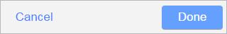
The toolbar contains 2 buttons: "Cancel" and "Done" and the label that displays which date is edited: start or end (the view is hidden in the read-only mode).
scheduler.config.date_toolbar = [
    {view:'label', width:scheduler.xy.icon_cancel, name:"cancel_date",id:"cancel_date",
      css:"cancel", align:"center",label:scheduler.locale.labels.icon_cancel},
    {view:'label',id:"datetype",align:"center"},
    {view:'button', width: scheduler.xy.icon_done, name:"done", id:"done",align:"right",
      label:scheduler.locale.labels.icon_done}
];
Edit form
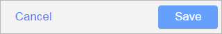
The toolbar of the "Edit" form has 2 buttons: "Cancel" and "Save".
scheduler.config.form_toolbar = [
    {view:'label', width:scheduler.xy.icon_cancel, name:"cancel",
      id:"cancel",css:"cancel",align:"center",label:scheduler.locale.labels.icon_cancel},
    {view:'button', inputWidth:scheduler.xy.icon_save, name:"save",
      id:"save",align:"right",label:scheduler.locale.labels.icon_save}
];
Main bottom toolbar
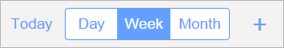
The main scheduler toolbar contains 3 controls:
- "Today" button
- a tabbar with the "Day", "Week" and "Month" tabs
- "Add" button
scheduler.config.bottom_toolbar = [
    {view:"label",id:"today", name:"today", label:scheduler.locale.labels.icon_today,
      inputWidth:scheduler.xy.icon_today, align:"center",width:scheduler.xy.icon_today+6},
    {view:"segmented", id:"buttons", value:"week", align:"center",
      multiview:true, options:[
        {id:"day", value:scheduler.locale.labels.day_tab, width:scheduler.xy.day_tab},
        {id:"week", value:scheduler.locale.labels.week_tab, width:scheduler.xy.week_tab},
        {id:"month",value:scheduler.locale.labels.month_tab, width:scheduler.xy.month_tab}
     ]},
    {view:"label", css:"add",name:"add",id:"add", align:"center",label:" + ",
      width:45},
    {view:"label", label:"",width:45, batch:"readonly"}
];
Adding new elements to the toolbar and event handling
If you want to add some custom button to one of the mentioned toolbars, you need to redefine the structure of that toolbar. Clicks on the default buttons are handled automatically. But for new buttons you should define the "click" event handlers.
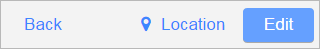
Let's assume you want to add a new button "Location" to the Selected Event view.
The definition of your new toolbar can be implemented as follows:
scheduler.config.selected_toolbar = [
    {view:'label', width:70, css:"cancel",name:"back",id:"back", label: "Back"},
    {
        view:'label', inputWidth:120, css:"cancel", id:"location", align:"right",
        label:"<span class='webix_icon fa-map-marker'></span>Location", click:showLocation
    },
    {view:'button', inputWidth: 70, width:90, name:"edit", id:"edit", label: "Edit"}
];
To show the event location on a button click, you need to define some handler function, for example:
function showLocation(){
    var eventId = $$("scheduler").getCursor();
    var location = $$("scheduler").getItem(eventId).location;
    webix.alert(location);
}
In the function you could be confused by the method getCursor. This method is a part of 'binding' functionality that's used by the scheduler. You can read about the mentioned functionality in the related Webix documentation - Data Binding.
Accessing elements of the scheduler
The scheduler includes different components: lists, toolbars, a form, etc. To access any of them you can use the $$(schedulerId).$$(componentId) construction.
The ids of the toolbars' buttons can be found above, in the toolbars' descriptions. And here are the ids of components from the multiview of the scheduler:
- 'event' - the 'Selected Event' view
- 'eventBar' - the top toolbar
- 'eventTemplate' - the template with the data of an event
- 'form' - the 'Edit form' view
- 'editBar' - the toolbar
- 'editForm' - the form with the details of an event
- 'tabViews' - the sub-multiview containing Day, Week and Month views
- 'bottomBar' - the bottom toolbar
- 'day' - the 'Day' view
- 'dayBar' - the top toolbar
- 'dayList' - the list with events
- 'week' - the 'Week' view
- 'weekBar' - the top toolbar
- 'weekEventsList' - the list with events
- 'month' - the 'Month' view
- 'calendar' - the calendar
- 'calendarDayEvents' - the list with events of the selected day
For example, if you want to show the 'Month' view initially, you need to call the show() method for the 'month' view and select the 'month' button of the tabbar control on the bottom toolbar:
$$('scheduler').$$('month').show();
$$('scheduler').$$('buttons').setValue('month');
- where 'month' and 'buttons' are the ids of the appropriate components of the scheduler.
For details on the mentioned components you can read the article UI Widgets.
A custom view
It's possible to add a custom view to the main multiview of the scheduler. All you need to do is to add view configuration to the scheduler.config.views array. Beware, view configuration should go before the code line with scheduler initialization.
For example, if you'd like to add 'list' view, it can be done as follows:
scheduler.config.views.push({
    view:"list",
    id:"mylist",
    ...
});