Deprecated
Starting from Webix 8.0 the widget is deprecated. Use a more powerful alternative - the Scheduler.
Styling Scheduler
It's possible to customize any element of Webix Scheduler.
All you need to do is to redefine the needed attributes of the related css class in the <style> block of your page.
The untouched attributes will take default values.
<style>    .webix_bottombar{
        background:#6699FF !important;
     }
</style>
In the above example we redefined only the background color. All the other attributes defined in the '.webix_bottombar' class took the default values.
CSS classes and the related elements
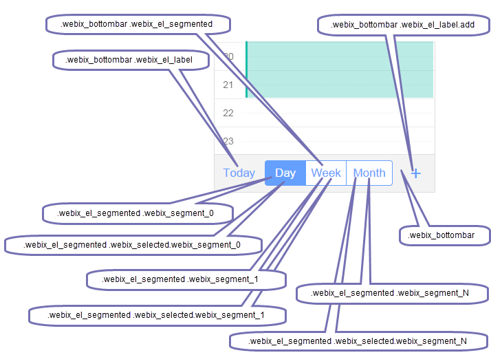
Main Toolbar
- .webix_bottombar - the toolbar
- .webix_bottombar .webix_el_label - the 'Today' button
- .webix_bottombar .webix_el_label.add - the '+' (add) button
- .webix_bottombar .webix_el_segmented - the tabbar
- .webix_el_segmented .webix_segment_0 - the first tab
- .webix_el_segmented .webix_selected.webix_segment_0 - the first tab in the selected state
- .webix_el_segmented .webix_segment_1 - the second tab
- .webix_el_segmented .webix_selected.webix_segment_1 - the second tab in the selected state
- .webix_el_segmented .webix_segment_N - the last tab
- .webix_el_segmented .webix_selected.segment_N - the last tab in the selected state
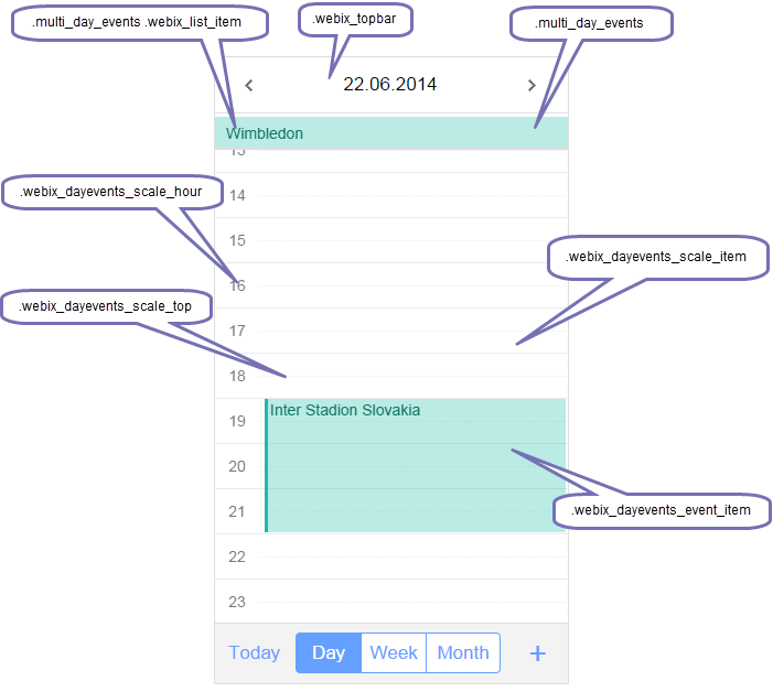
'Day' view
- .webix_dayevents_event_item - the container of an event
- .webix_topbar - the top toolbar
- .webix_dayevents_scale_item - the container of a single scale item
- .webix_dayevents_scale_top - the half an hour separator
- .webix_dayevents_scale_hour - the container inside of the scale item that divides an hour into halves
- .multi_day_events - the container for multi-day events
- .multi_day_events .webix_list_item - a multi-day event item
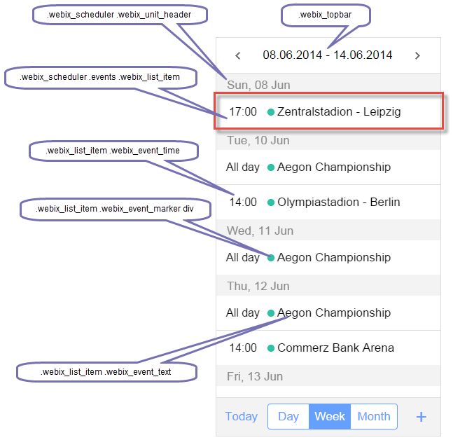
'Week view'
- .webix_topbar - the top toolbar
- .webix_scheduler .events .webix_list_item - the container for an event's elements
- .webix_scheduler .webix_unit_header - the event's header with the date
- .webix_list_item .webix_event_time - the container with the time of an event
- .webix_list_item .webix_event_marker div -the round marker of an event
- .webix_list_item .webix_event_text - the container with the text of an event
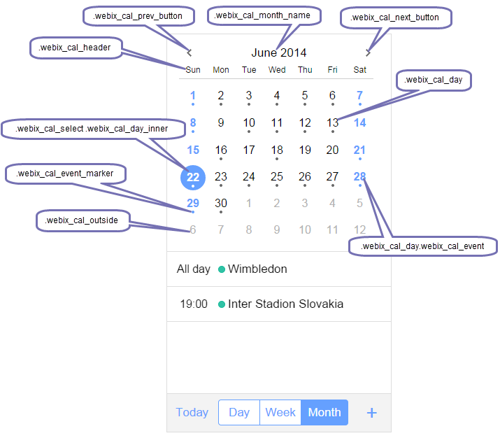
'Month' view
- .webix_calendar - the style of the calendar's container
- .webix_cal_prev_button - the 'previous' icon on the top toolbar
- .webix_cal_next_button - the 'next' icon on the top toolbar
- .webix_cal_month_name - the toolbar title
- .webix_cal_header - the container of the week header
- .webix_cal_day - the container for a day
- .webix_cal_day.webix_cal_event - the style of weekends
- .webix_cal_outside - the style for days outside the current month's date range
- .webix_cal_select .webix_cal_day_inner - the style of the selected day
- .webix_cal_event_marker - an event marker (for days with events)
The styles of an event's items (see the image of Week View):
- .day_events - the style of the events' list container
- .webix_scheduler .events .webix_list_item - the container for an event's elements
- .webix_list_item .webix_event_time - the container with the time of an event
- .webix_list_item .webix_event_marker div -the round marker of an event
- .webix_list_item .webix_event_text - the container with the text of an event
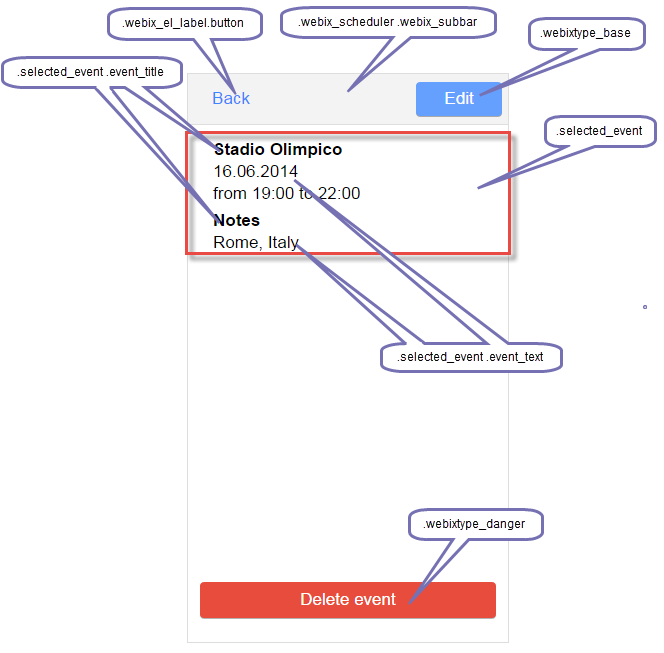
'Selected Event' View
- .selected_event - the container with an event
- .selected_event .event_title - the title of an event
- .selected_event .event_text - the description of an event
- .webix_scheduler .webix_subbar - the toolbar
- .webixtype_base - the 'Edit' button
- .webix_el_label.button - the 'Back' button
- .webixtype_danger - the 'Delete' button
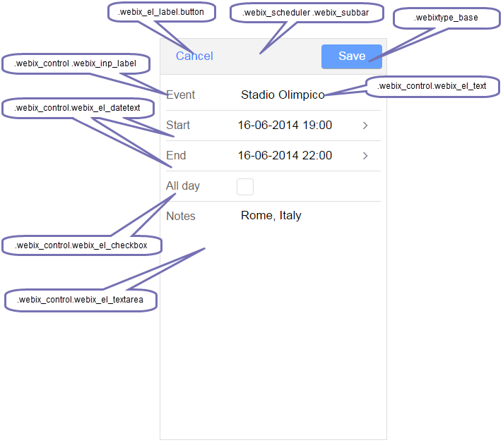
Edit form
- .webix_scheduler .webix_subbar - the toolbar
- .webixtype_base - the 'Save' button
- .webix_el_label.button - the 'Cancel' button
- .webix_control .webix_inp_label - the style of an element's label (ex. "Event","Start","End")
- .webix_control.webix_el_text - an event's title
- .webix_control.webix_el_datetext - the elements with "Start" and "End" dates
- .webix_control.webix_invalid - the style of a field with invalid data
- .webix_control.webix_el_checkbox - the "All day" checkbox element
- .webix_control.webix_el_textarea - the textarea style (the "Notes" field)
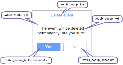
Confirm window
- .webix_modal_box - a window container
- .webix_popup_title - the window's title
- .webix_popup_text - the window's message
- .webix_popup_button.confirm div - the "Yes" button
- .webix_popup_button div - the "No" button
Event styling
It is possible to apply different styling to events in the scheduler. It's implemented with the help of templates.
The "event_class" template is applied to events in all 3 views: Day, Week and Month.
For example you can set different styles for event markers, depending on properties in event data:
<style>
.my_calendar .webix_event_marker div{
    background-color: rgba(102, 204, 255, 0.9);
    border-color: #66ccff;
}

.calendar2 .webix_event_marker div{
    background-color: rgba(0, 204, 204, 0.9);
    border-color: #00cccc;
}

</style>
<script>
// template for class name of event container
    scheduler.templates.event_class =  function(obj, type){
        return (!obj.group?"my_calendar":"calendar"+obj.group);
};
</script>
There is a possibility to apply different colors to events using the color property in the event's data. This property is applied to the event's background in the Day view and event markers in the Week and Month views. However, you can use any other property for styling events.
$$("scheduler").parse([{id:"1", text:"Event 1", color:"#66ccff",...},...],"json");
The default coloring rules can also be changed in the following templates:
scheduler.templates.day_event_style - returns CSS text that will be applied to the event container in the 'Day' view
scheduler.templates.multi_day_event_style - returns CSS text that will be applied to multi-day event in the 'Day' view
scheduler.templates.event_marker - returns CSS text that will be applied to markers in the 'Week' and 'Month' views