Configuring Columns
With the help of the columns parameter you can:
- specify headers/footers;
- set the width of columns;
- add built-in filters;
- set built-in sorting;
- set the text alignment in a column;
- set the format of data presentation;
- add math formulas;
- specify data source for the column;
- define templates for data presentation;
- define individual CSS class for any column;
- hide/show a column;
- hide/show batches of columns;
- add/delete columns dynamically;
- group columns;
- define colspans and rowspans;
- define popups and dropdown editors.
Automatic Column Configuration
Datatable can configure its columns based on the data. This is extremely useful for prototyping and creating simple tables. For automatic configuration, enable the autoConfig property. The columns property is not needed in this case.
{
    view:"datatable",
    autoConfig:true,
    data:[
        { id:"1", title:"Rage against the Machine", stars:5, $css:"top" },
        { id:"2", title:"Chalices and Blades", stars:3 },
        { id:"3", title:"Look back in Anger", stars:4 },
        { id:"4", title:"Look Homeward, Angel", stars:5, $css:"top" }
    ]
}
Datatable will analyze the data passed to it and build columns automatically. The columns will have default settings:
sort:"string"(columns that begin with$-are not included; these columns are helper fields, e.g.$css,$count);editor:"text"(works only ifeditable:truein the datatable configuration);fillspace:truefor the first column,width:100for the rest;select:"row"(unless other setting is passed in the datatable configuration)
Headers/Footers
The header and footer are enabled by the parameters header and footer, correspondingly (by default, headers are enabled).
The values of header and footer can be defined as a string, object or an array of strings and objects.
1. into a string, you can put into the text, images, HTML inputs, and links. Read more.
2. an object allows you to set more complex headers and footers. The object can have the following properties:
- text - the text label of a column;
- colspan - the number of columns a cell should span;
- rowspan - the number of rows a cell should span;
- content - the built-in filter or a counter for values in a column (textFilter, selectFilter or any other from the list of filters). Read more;
- tooltip - the tooltip for cells of the column, read more;
- height - defines a custom height for a header line;
- css - the name of a CSS class that will be applied to the column header.
3. an array allows you to define multiline headers.
Defining header and footer for a specific column
// a simple string
webix.ui({
    view:"datatable",
    footer:true,
    columns:[
        { id:"col1", header:"Column 1", footer:"Footer 1" }
    ]
});

// an array
webix.ui({
    view:"datatable",
    footer:true,
    columns:[
        {
            id:"col1",
            header:[
                { text:"Column1", colspan:"2"},
                { content:"selectFilter" }
            ],
            footer:[
                { text:"Total", rowspan:"2"},
                { text:" " }
            ]
        }
    ]
});
Related sample: Standard Header (Footer) Implementation
For more details, read the Headers and Footers article and Webix Tutorials.
Width of Columns
Dynamic Width
To make a column or several columns fill the unused space of the parent container, set fillspace:true:
columns:[
   { id:"title", header:"Film title", fillspace:true },
    //    ...
]
The column will take all the free space of the datatable container. If there is more than one column with the enabled fillspace attribute, they will equally divide the space.
Related sample: Adjusting Columns to the Parent Container
Proportional Width
If you want columns to divide the width of the datatable proportionally, set fillspace as a number:
// 75% : 25% of the available width
columns:[
   { id:"title", header:"Film title", fillspace:3 },
   { id:"year", header:"Released in", fillspace:1 },
   // ...
]
Related sample: Adjusting Columns to the Parent Container
Fixed Width
You can set the fixed width of all the Datatable columns. Use the columnWidth property in the DataTable configuration.
{ view:"datatable", columnWidth:200, columns:[ ] }
To set a fixed width for a specific column, use the width attribute:
Setting the width of a column
columns:[
    { id:"col1", width:200 }
]
Related sample: Sizing through the 'Width', 'Height' Parameters
Adjusting column width to its content
To adjust the width of a column to the content size, you can use the adjust attribute. There are three possible options:
- data - the width of the cell with the widest content;
- header - the width of the header text;
- true - a combination of both: it will adjust the column to the widest data or a header cell.
{
    view:"datatable",
    columns: [
        { id: "title", header: "Film", adjust: "data" },
        { id: "year", header: "Released in", adjust: "header" },
        { id: "notes", header: "Reviews", adjust: true }
    ]
}
If you have huge data, you can limit the number of rows, based on which the width of columns is calculated with adjust. Set the adjustBatch attribute:
webix.ui({
    rows:[
        {
            view:"datatable",
            columns:[
                {id:"id"},
                {id:"title", adjust:"data", adjustBatch:50},
                {id:"title", adjust:true}
            ],
            //data count is big
            data:big_film_data
        }
    ]
});
Related sample: Adjusting Columns to the Content
Good Practice for Dynamic Sizing
It is good practice to combine changeable sizing options (fillspace and adjust) with minWidth to ensure correct sizing.
For more details, read the Sizing and resizing article and test your knowledge in Webix tutorials.
Built-in Filters
You can add a filter to a header or a footer. See the full list of available filters.
A filter is set by the content property:
Adding filter to the header of a specific column
columns:[
    {
        id:"col1",
        header:[
            { text:"Column 1", colspan:"2"},
            { content:"selectFilter" }
        ]
    },
    {/* ... */}
]
Related sample: Filtering. Using Built-in Means
For more details, read the Filtering article and Webix Tutorials.
Built-in Sorting
You can enable sorting for columns. The sorting is specified by the sort attribute. The way of sorting depends on the data type. There are several predefined sorting types:
- "int"
- "date"
- "string"
- "string_strict" (case-sensitive string sorting)
- "text"
- "server"
- "raw"
Activating sorting for a specific column
columns:[
    { id:"col1", sort:"string" },
    {/* ... */}
]
Related sample: Sorting. Using Built-in Means
You can also set a custom sorting type.
For more details, read the Sorting article and Webix Tutorials.
Text Alignment
To set the text alignment in a column, use the css attribute:
Setting the text alignment in a column
<style>.myStyle{
    text-align:right;
}
</style>
columns:[
    { id:"col1" css:"myStyle"}, //a css class
    { id:"col2", css:{'text-align':'right'}} //styles directly in the attribute
]
Read more about using the css attribute in the Styling article and in Webix Tutorials.
Data Formats
You can format dates and numbers with the format attribute:
Setting the format for a specific column
columns:[
    // data will be formatted according to the current locale
    {
        id:"col2", format:function(value){
            return webix.i18n.numberFormat(value);
        }
    }
]
Related sample: Using Date Templates
Formatting does not affect the actual data. It's a purely visual feature.
For more details, read the Number and Date formatting article and Webix Tutorials.
Math in Columns
You can write simple math formulas in column cells. Formulas can be set for a whole column or for a single cell.
Using formulas for setting values in the whole column
columns:[
    { id:"col1", math:"[row_id,col_name] + [row_id,col_name]" }
]
Related sample: Using Cell References in Formulas
For more details, read the Using Formulas article and Webix Tutorials.
External Data Source for the Column
By default, values in columns are put into cells as they are in data (data key = column ID). Columns also can store sets of options, associated with real values by IDs.
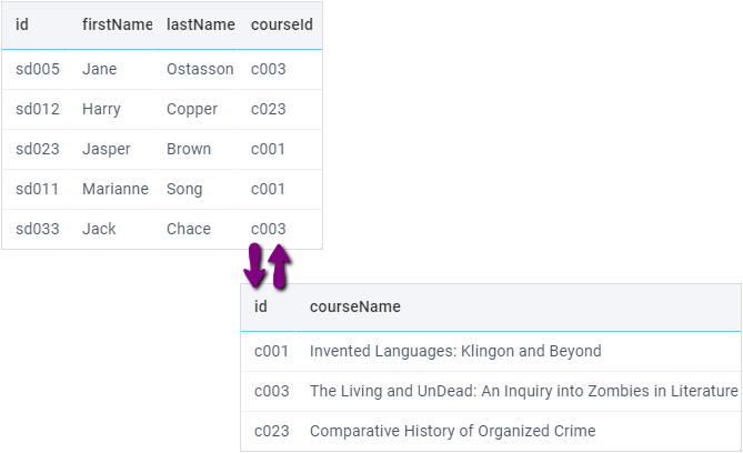
These options are called a column collection and can be used for:
- displaying meaningful values in cells (replacing IDs),
- a list of options for a selection editor in a cell,
- a list of options for a selection filter.
Filtering, sorting, and editing will still be performed on the real data (IDs), but the user should see readable text instead. That's why we recommend setting selection filters and editors for columns like this and sort them as sort: "text".
Adding Column Collections
You can provide data for the column from any source using the collection or options properties of the column. Column data can be taken from:
- DataCollection
- any data component (the source component must be initialized first)
- URL with the path to the data file
- array with id-value objects
[{ id:1, value:"one"}, ...] - array with values
["one", "two"] - object
{ 1: "one", 2: "two"} - function / proxy
{
    view:"datatable",
    columns:[
        //ID of datatable
        { id:"product", header:"Product", options:"dash-pro" },
        //path to a script
        { id:"quantity", header:"Quantity", options:"data/goods/" },
        //array of objects
        { id:"price", header:"Unit price", options:[
            { id:"1", value:100 },
            { id:"2", value:200 }
        ] }
    ],
    url:"data/orderproducts/", //main data source
};
Regardless of the way you define options/collection, the column data will be stored in a datacollection and can be accessed via the column configuration, e.g. within a data template:
{
    view:"datatable",
    columns:[
        { id:"price", header:"Unit price", options:[
            { id:"1", price:100 },
            { id:"2", price:200 }
        ],
        template:function(obj, common, val, config){
            //config is column config
            return config.collection.getItem(obj.price).price;
        } }
    ],
    url:"data/orderproducts/", //main data source
};
Related sample: Datatable: Option collections for columns, filters and editors
You can get to a specific collection via the getColumnConfig() method of DataTable:
var collection = $$("table").getColumnConfig("titleId").collection;
DataCollections and Relational Databases
You can display connected tables from relational database in one datatable with the help of the collection property. To unite related tables and display the resulting data in a DataTable, use several DataCollections for each table and set up the DataTable columns to display values from the corresponding collections.
1. Sync the datatable with either of the collections:
$$("orders_grid").sync(orders);
2. Specify the other collections as data sources for the corresponding columns:
{
    view:"datatable", id:"orders_grid",
    columns:[
        { id:"date", header:"Order Date" },
        { id:"employee", header:"Employee", collection:employee },
        // other columns
    ]
}
Read more in Webix Tutorials.
Templates
By default, raw field values are displayed in cells. To customise data content and specify which data is displayed,you can use templates. Almost any type of content - images, links, numbers, strings and dates - can be presented using string templates.
Using string templates
webix.ui({
    view:"datatable",
    ...
    columns:[
        { id:"title", header:"Film title",    template:"<strong>#title#</strong>"},
        { id:"year",  header:"Release year" , template:"at #year#",}
    ]
});
Related sample: Using String Templates
If you need a more customised solution, you can use a custom template by setting the template attribute as a function. This function takes the following parameters:
- obj - each data item
- common - common elements declared in type
- value - the value of the current cell
- col - the column configuration
- ind - the index of the current data item.
Using custom templates
webix.ui({
  rows:[
    {
      view:"datatable",
      data:grid_data,
      columns: [
        {
          id: "title",
          template: function(obj, common, value, column, index) {
            return obj.title
          }
        }
      ]
    }
  ]
});
For more details, read the Data Templates article and Webix Templates.
Styling
You can change the look and feel of every column. Column style can be set in a CSS class and applied through the css attribute.
Applying a CSS class to a specific column
columns:[
    { id:"col1", css:"someStyle" }
]
For more details, read the Styling article and in Webix Tutorials.
Hiding/Showing Columns
Initially, all the datatable columns are visible by default, unless the hidden property is true for a column:
var grid = webix.ui({
    view:"datatable",
    columns:[
        //this column is hidden initially
        { id:"col1", header:"Title", hidden:true},
        //this column is visible
        { id:"col2", header:"Rating"}
   ]
})
Through the hideColumn() and showColumn() methods you can manipulate visibility of columns dynamically.
Hiding a column
grid.hideColumn("col2");
Hiding and showing of headers/footers works in a different way. Read more about it here
Adding/Deleting Columns Dynamically
You can add columns and remove columns at runtime directly from its columns array.
Don't forget to repaint the Datatable afterwards using the refreshColumns method.
Replacing current columns with new ones
// redefine columns
$$("grid").config.columns = [/* ..new collection of columns.. */];
$$("grid").refreshColumns();

// or insert to the beginning
$$("grid").columns.splice(0, 0, { id:"year", header:"Release" });
$$("grid").refreshColumns();

// or remove the 2nd column
$$("grid").columns.splice(1, 1);
$$("grid").refreshColumns();

// or replace the 3rd column
$$("grid").columns.splice(2, 1, { id:"stars", header:"Rates" });
$$("grid").refreshColumns();
Related sample: Datatable: Adding/removing Columns
Working with hidden columns
If you work with a Datatable that contains hidden columns, you should get its columns via the getColumns method passing true as a parameter.
The method returns a copy of all columns including the hidden ones. After the changes are made, you need to reset the Datatable by passing the new array in the refreshColumns method.
Resetting columns
// get a copy of all the columns
var columns = $$("grid").getColumns(true);

// add new column
columns.splice(columns.length-1, 0, {
  id: "col_"+count,
  header:"Column "+count,
  hidden:true
});

// repaint the table with modified data
$$("grid").refreshColumns(columns);
Setting Hidden/Visible Columns in Batches
You can divide columns in batches and show/hide them. To assign a batch to a column, set the batch property. To set the initially visible batch of columns, use the visibleBatch setting.
grida = webix.ui({
    view:"datatable",
    visibleBatch:1,
    columns:[
        { id:"id",  header:"#", css:"rank",  batch:2,   width:50},
        { id:"title", header:"Film title", fillspace:true },
        { id:"year",  batch:1,  header:"Released" , width:80},
        { id:"category", header:"Category", batch:1},
        { id:"votes", batch:3, header:"Votes",  width:100},
        { id:"rating", batch:3, header:"Rating", width:100},
        { id:"rank", header:"Rank", css:"rank",  batch:2,width:50}
    ]
});
Any column batch can be shown with the showColumnBatch method that takes column batch value as parameter:
//show show id, rank
grida.showColumnBatch(2);
//show votes, rating
grida.showColumnBatch(3);
Related sample: Column Batches
Grouping Columns
The functionality is available in Webix Pro edition only.
Column batches can be used to organize batches of columns that are shown/hidden by clicking on the header of an aggregating column:
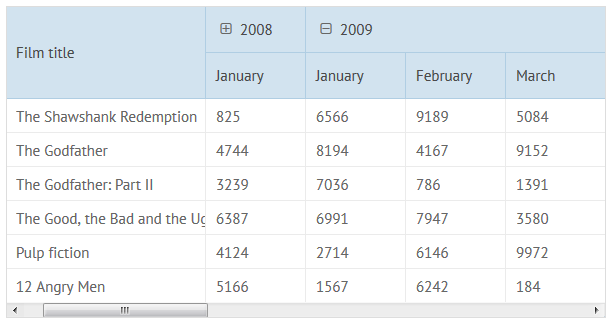
For these needs a multiple line header is used. The first line of an aggregating column is defined as an object with the following properties:
- content (string) - here it must be columnGroup (the property is also used to define header filters);
- batch (string, number) - the ID of the batch;
- groupText (string) - the title of the batch (it is shown when the batch is closed);
- closed (boolean) - if true, the batch is initially closed; false by default;
- colspan (number) - the number of columns in the batch, including the aggregating one.
columns:[
    //aggregating column
    { id:"2008_1", header:[
      { content:"columnGroup", closed:true, batch:"2008", groupText:"2008", colspan:12},
      "January"
    ]},
    //other columns from the group
    { id:"2008_2",  batch:"2008", header:[null, "February"] },
    { id:"2008_3",  batch:"2008", header:[null, "March"] },
    { id:"2008_4",  batch:"2008", header:[null, "April"] },
    // ...
]
Related sample: Grouped Columns in DataTable
Setting Colspans/Rowspans
The feature is available in Webix Pro edition only.
Datatable allows defining colspans and rowspans. Spans are stored in the span property in the dataset.
To enable the rowspans and colspans functionality, set the spans parameter to true in the datatable configuration.
Each rowspan/colspan definition consists of the row ID, column ID, width/height of the span, the value to display and the css class to apply:
webix.ui({
    view:"datatable",
    columns:[...],
    spans:true,
    data:{
        data:grid_data,
        spans:[
            [1, "title", 3]
        ]
    }
});
Related sample: Colspans in Datatable
Read more about colspans and rowspans in Webix datatable header.
Define Popups and Dropdown Editors
You can define configuration of popup and dropdown editors in DataTable columns using the suggest property.
Back to topIf you have not checked yet, be sure to visit site of our main product Webix html5 ui library and page of datagrid javascript product.