Toolbar Configuration Settings
The toolbar contains a panel with instruments for editing and formatting the content of the table's cells.
To refer to the toolbar object, first you need to specify the id of a toolbar in the toolbar configuration.
const bar = {
    view: "toolbar",
    css: "webix_ssheet_toolbar webix_layout_toolbar",
    id: "bar",
    elements: [{...}]
}
Then you can address the toolbar via its id.
spreadsheet.$$("bar");
Toolbar Modes
There are two display modes of a toolbar: the "default" short one and the "full" one.
Default mode
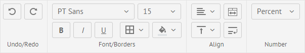
In the default mode, the toolbar contains four blocks of controls: Undo/Redo, Font, Align, Number.

Settings for the default toolbar are specified in the buttons configuration object. It contains the names of button blocks as parameters. The parameters' values are arrays of buttons that are included into the blocks.
const buttons = {
    "undo-redo": ["undo","redo"],
    "font": ["font-family","font-size","font-weight","font-style",
      "underline","strike","color","background","borders"],
    "align": ["text-align","vertical-align","wrap","span",
      "increase-indent","decrease-indent"],
    "format": ["format"]
}
The names of button blocks correspond to the properties defined in the localization files, which specify the language of the labels.
Full mode
To show all available buttons on the toolbar, you should set the toolbar property to the "full" value:
webix.ui({
    view:"spreadsheet",
    data: base_data,
    toolbar: "full"
});
Related sample: Toolbar with all buttons
The full code for all toolbar elements is given in a separate article.
Toolbar Structure
There are the following Toolbar blocks:
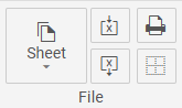
File block
webix.ui({
  view: "spreadsheet",
  data: base_data,
  toolbar: [
    {
      rows: [
        {
          margin: 2,
          cols: [
            {
              name: "sheet",
              view: "ssheet-button-icon-top",
              label: "Sheets",
              options: [
                { id: "new-sheet" },
                { id: "copy-sheet" },
                { id: "remove-sheet" },
                { id: "hide-sheet"}
              ],
            },
            {
              rows: [
                { $button: "excel-import" },
                { $button: "excel-export" }
            ]},
            {
              rows: [
                { $button: "print" },
                { $button: "print-borders" }
            ]},
        ]}
     ]}
   ]
});
The File block includes the "sheet" (Sheet) select, which allows working with a sheet and contains four options:
- "new-sheet" - for creating a new sheet
- "copy-sheet" - for copying the sheet's content into a new sheet
- "remove-sheet" - for removing a sheet
- "hide-sheet" - for hiding a sheet
and four buttons:
- "excel-import" (Import from Excel) button - allows importing data from Excel
- "excel-export" (Export to Excel) button - allows exporting data into Excel
- "print" (Print) button - for printing the data from a sheet
- "print-borders" (Hide/show print borders) button - toggles the visibility of the printing borders
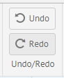
Undo/Redo block
  view: "spreadsheet",
  toolbar: [
    {
      rows: [
        { $button: "undo", view: "ssheet-button", label: "Undo", width: 80 },
        { $button: "redo", view: "ssheet-button", label: "Redo", width: 80 },
      ],
    },
  ]
The Undo/Redo block includes two buttons:
- the "undo" (Undo) button - discards the recent change and Spreadsheet reverts to its previous state
- the "redo" (Redo) button - restores the cancelled (undone) change
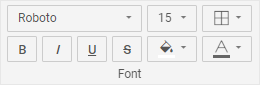
Font block
  view: "spreadsheet",
  toolbar: [
    {
      rows: [
        {
          margin: 2,
          cols: [
            {
              margin: 2,
              cols: [
                {
                  $button: "font-family",
                  width: (webix.skin.$active.inputHeight + 2) * 4 + 6,
                },
                { $button: "font-size" },
              ],
            },
            { $button: "borders" },
          ],
        },
        {
          margin: 2,
          cols: [
            {
              margin: 2,
              cols: [
                { $button: "font-weight" },
                { $button: "font-style" },
                { $button: "underline" },
                { $button: "strike" }
              ],
            },
            { $button: "background" },
            { $button: "color" },
          ],
        },
      ],
    },
  ]
The Font block contains a large group of buttons for setting fonts and cell borders:
- the "font-family" (Font family) select - allows choosing the necessary font
- the "font-size" (Font size) select - sets the font size
- a group of buttons for formatting the text content of the cell that includes:
- the "font-weight" button - makes the content of the cell bold
- the "font-style" button - makes the content of the cell italic
- the "underline" button - makes the content of the cell underline
- the "strike" button - makes the content of the cell strikethrough
- the "color" (Font color) select - sets the font color
- the "background" (Background color) select - sets the background color
- the "borders" (Borders) select - is used to apply a new style for cell borders
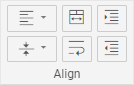
Align block
  view: "spreadsheet",
  toolbar: [
    {
      rows: [
        {
          margin: 2,
          cols: [
              { $button: "text-align" },
              { $button: "span" },
              {$button: "increase-indent"}
          ],
        },
        {
          margin: 2,
          cols: [
              { $button: "vertical-align" },
              { $button: "wrap" },
              { $button: "decrease-indent"}
          ],
        },
      ],
    },
  ]
The Align block includes controls for managing the cell alignment, text wrapping, indenting text in a cell to the left or to the right and merging the cell content:
- the "text-align" (Horizontal align) select - allows specifying one of the three modes of text alignment in a cell: left, right or center
- the "vertical-align" (Vertical align) select - defines the mode of vertical text alignment in a cell: top, middle or bottom
- the "span" (Merge) button - allows merging the content of several cells as well as splitting it
- the "wrap" (Text wrap) button - lets wrap text in a cell
- the "increase-indent" (Increase indent) button - indents text in a cell to the right
- the "decrease-indent" (Decrease indent) button - indents text in a cell to the left
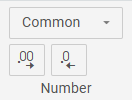
Number block
  view: "spreadsheet",
  toolbar: [
    {
      rows: [
        { $button: "format" },
        {
          margin: 2,
          cols: [
            { $button: "increase-decimals" },
            { $button: "decrease-decimals" },
          ],
        },
      ],
    },
  ]
The Number block contains the following controls:
the "format" (Number format) select, which sets the format of cell content. The available formats are: Common, Currency, Number, Percent, Date, Text, Custom
a pair of buttons which allow increasing/decreasing the number of decimal places:
- "increase-decimals" (Increase decimal places)
- "decrease-decimals" (Decrease decimal places)
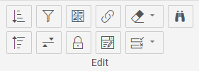
Edit block
  view: "spreadsheet",
  toolbar: [
    {
      padding: 3,
      rows: [
        {
          cols: [
            { $button: "sort-range" },
            { $button: "create-filter" },
            { $button: "conditional-format" },
            { $button: "add-link" },
            { $button: "clear" },
            { $button: "find" }
          ],
        },
        {
          cols: [
            { $button: "sort-sheet" },
            { $button: "add-range" },
            { $button: "lock-cell" },
            { $button: "add-dropdown" },
            { $button: "validation"}
          ],
        },
      ],
    },
  ]
The Edit block includes a set of buttons for editing the cell's content:
- the "sort-range" (Sort Range) select sorts within the selected range; it is hidden for single-row selections and contains the following options:
- the "sort-asc" option - for sorting in ascending order (A to Z)
- the "sort-desc" option - for sorting in descending order (Z to A)
- the "sort-custom" option - opens the multi-level sort dialog
- the "sort-sheet" (Sort Sheet) select sorts the entire sheet by the first selected column (column A if no column is selected) and contains the following options:
- the "sort-sheet-asc" option - for sorting the sheet in ascending order (A to Z)
- the "sort-sheet-desc" option - for sorting the sheet in descending order (Z to A)
- the "create-filter" (Create/remove filters) button sets a filter in a cell
- the "add-range" (Named ranges) button sets a named range of cells for using it further in math formulas
- the "conditional-format" (Conditional format) button allows specifying a particular style for a cell, depending on a certain condition
- the "lock-cell" (Lock/unlock cell) button blocks/allows editing of the cell's value
- the "add-link" (Add link) button sets a link in a cell
- the "add-dropdown" (Add dropdown) button creates an editor with options in a cell
- the "clear" (Clear) select contains a set of options for clearing a cell:
- the "clear-value" - for clearing the cell value
- the "clear-style" - for clearing styles applied to a cell
- the "clear-conditional-formats" - for clearing conditional formatting applied to a cell
- the "clear-dropdown-editors" - for clearing dropdown lists
- the "clear-filters" - for clearing the applied filters
- the "clear-all" - for clearing all of the above
- The "validation" (Validation) select contains a set of options for validating the cells' content:
- the "add-cell-validation" option - for adding validation rules to a cell
- the "remove-cell-validation" option - for removing validation rules from a cell
- the "highlight-invalid-data" option - for highlighting cells with invalid data
- the "remove-highlight-invalid-data" option - for removing highlighting from cells with invalid data
- The "find" (Find and Replace) button - for finding the specified content
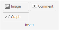
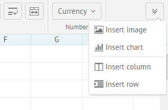
Insert block
  view: "spreadsheet",
  toolbar: [
    {
      padding: 3,
      rows: [
        {
          cols: [
            {
              $button: "image",
              view: "ssheet-button",
              label: "Image",
              width: 110,
            },
            {
              $button: "add-comment",
              view: "ssheet-button",
              label: "Comment",
              width: 110,
            },
          ],
        },
        {
          cols: [
            {
              $button: "graph",
              view: "ssheet-button",
              label: "Graph",
              width: 110,
            },
            {
              $button: "controls",
              view: "ssheet-button",
              label: "Controls",
              width: 110,
            },
          ],
        }
      ],
    },
  ]
The Insert block includes a set of controls for additional content, which can be attached to cells:
- the "image" (Image) button - adds an image into a cell
- the "add-comment" (Comment) button - adds a comment into a cell
- the "graph" (Graph) button - inserts a sparkline into a cell
- the "controls" (Controls) button - inserts a either a checkbox or a radio button into a cell
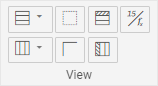
View block
  view: "spreadsheet",
  toolbar: [
    {
      padding: 3,
      rows:[
        { cols:[
          { rows:[
              { $button:"row" },
              { $button:"column" }
          ]},
          { rows:[
              { $button: "hide-gridlines" },
              { $button: "hide-headers" },
          ]},
          { rows:[
              { $button:"freeze-rows" },
              { $button:"freeze-columns" }
          ]},
          { rows:[
              { $button:"show-formulas" },
              {}
          ]}
        ]}
     ]}
  ]
The View block includes the following controls:
- the "row" (Rows) button is used to insert, delete, hide, show, group, and ungroup rows
- the "column" (Columns) button is used to insert, delete, hide, show, group, and ungroup columns
- the "hide-gridlines" (Hide/show gridlines) button toggles gridlines of Spreadsheet
- the "hide-headers" (Hide/show headers) button toggles the headers of rows and columns
- the "freeze-rows" (Freeze/unfreeze rows) button freezes and unfreezes rows
- the "freeze-columns" (Freeze/unfreeze columns) button freezes and unfreezes columns
- the "show-formulas" (Hide/Show formulas) button shows formulas in cells instead of values
Customizing the "toolbar" Collection
The Toolbar's specificity is that it can include only one row of buttons. However, there is also a way to customize the Toolbar so that it would have a multi-row structure. In this case the "toolbar" collection should be used. It allows specifying the width and height of buttons, setting margins and paddings and setting separators between the blocks of buttons.
The key points of the custom toolbar are the following:
- the Toolbar elements are placed into the toolbar object
- Toolbar has the Layout structure and the buttons' arrangement is defined by columns and rows (it allows making more than one row of buttons)
- a button extending a preset button should include the $button property with the button's name as a value
- the buttons' offsets can be set and managed using the padding and margin properties
- the labels of the buttons' blocks are defined by the ssheet-bar-title view with the help of templates
- the default sizes of buttons and templates can be changed using the width and height properties
- a separator between views can also be added using the ssheet-separator view
 toolbar: [
    {
        rows:[
          {
            margin: 2,
            cols: [
                {$button: "undo"},
                {$button: "redo"}
            ]
          },
          {},
          {template: "Undo/Redo", view: "ssheet-bar-title", height: 24}
        ]
    },
    {view: "ssheet-separator"},
    {
        rows:[
           {
             margin: 2,
             cols:[
                {$button: "font-family", width: 167},
                {$button: "font-size", width: 90}
             ]
           },
           ...
        ]
    },
    ...
]
Related sample: Custom toolbar
Customizing Buttons
The SpreadSheet toolbar contains blocks of buttons grouped according to their functionality. The arrangement of button blocks in the toolbar is specified in the "buttons" collection.
Removing a block or a button
In case you want to remove some block or button specified in the default configuration, don't define them in the buttons object.
Defining buttons position
Buttons object contains a hash of data, where the key is the name of a block of buttons and the value is an array of button names.
There are four blocks of buttons on the toolbar by default:
- "undo-redo" - Undo/Redo
- "font" - all operations related to font and color manipulations
- "align" - align operations including cell span and text wrap
- "format" - number format settings
webix.ui({
   view:"spreadsheet",
   buttons: {
       "undo-redo": ["undo","redo"],
       "font": ["font-family","font-size","font-weight","font-style",
            "underline","strike","color","background","borders"],
       "align": ["text-align","vertical-align","wrap","span"],
       "format": ["format"]
   }
});
You can add a new block with or without a name. To hide the name of the block, begin the name with a dollar sign.
You can specify the title of the buttons block in the Spreadsheet locale.
To define a preset button in the toolbar, you only need to state its name.
Adding text buttons
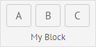
To add a new text button, you need to put an object with the configuration of the button (including its name) into the corresponding block set in the buttons property:
webix.ui({
   view:"spreadsheet",
   buttons: {
       "undo": ["undo","redo"],
        ...
       "My Block": [
           {   view: "button", name: "a", width: 40, label: "New button" },
           ...
       ]
    }
});
Adding icon buttons
For icon buttons in SpreadSheet we recommend to define the following settings in order to fit the general SpreadSheet appearance:
- set the width equal to 40px
- use "webix_ssheet_button_icon" as a part of the icon element classname
- as a background-image use simple icons with transparent background and the #787878 color
For example, you can specify icon buttons in the following way:
webix.ui({
   view:"spreadsheet",
   buttons: {
       "undo": ["undo","redo"],
       ...
       "Insert": [
        {
           view: "button", name: "insert-image", width: 40,
           label: "<span class='webix_ssheet_button_icon icon_image'></span>",
           tooltip: "Insert image", click: insertImage
         }
       ]
   }
});
Grouping buttons
If the number of buttons you want to show exceeds the Toolbar's width, you can group them. For this purpose, add an icon button and attach a popup to it. This popup will contain all buttons of the group.
Use the code below to create such a structure:
webix.ui({
   view:"spreadsheet",
   buttons: {
       "undo": ["undo","redo"],
       ...
       "$other": [
          {},
          {
            view: "button",  name: "a", width: 40,
            label: "<span class='webix_ssheet_button_icon icon_other'></span>",
            tooltip: "Other options", popup: $$("mypopup")
          }
       ]
   }
});
Related sample: Additional buttons
Using a custom skin
In case you use a custom skin for SpreadSheet, you need to specify the default styles for Toolbar buttons to render their values correctly. It means, you should use the copy of your custom styles from the CSS file while creating a skin. For example:
webix.skin[skin_name].spreadsheet = {
    "color": "#666666",
    "background" : "#ffffff",
    "font-family": "'PT Sans', Tahoma",
    "font-size": "15",
    "text-align": "left",
    "vertical-align": "middle",
    "white-space": "nowrap",
    "format": "common"
}
Customizing Popups
Popup with icon buttons
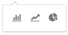
To create a popup with icons, use the datasuggest view and put the "ssheet-icons" view in its body:
webix.ui({
   id: "mypopup",
   view: "datasuggest",
   body:{
       view: "ssheet-icons",
       xCount:3,
       yCount:1,
       tooltip: {
           template: "#title#"
       }
   },
   data: [
       {id: "insert_image", css: "bar_chart", title: "Bar"},
       {id: "insert_chart", css: "line_chart",  title: "Line"},
       {id: "insert_column", css: "pie_chart", title: "Pie"}
   ]
});
The "ssheet-icons" is a Dataview-based view. So, you can set the layout for icons using the xCount and yCount properties of DataView.
The css property in data items defines the CSS rule where you can define the background image:
.bar_chart{
   content: url("images/bar-chart.svg");
}
Related sample: Icon buttons in popup
Styling icons in popups
The style of icons used in popups should be consistent with the rest of the icons in the toolbar. To achieve this, follow the tips below:
- use "webix_ssheet_button_icon" as a part of the icon element classname
- as a background-image use simple icons with transparent background and the #787878 color
Popup with named buttons
A popup can be attached to a button with the help of the popup property. You need just to set this property in the configuration of the button.
webix.ui({
   view:"spreadsheet",
   buttons: {
       ...
       "$other": [
           { view: "button", popup: $$("mypopup"),...}
       ]
   }
});
It's also possible to call the show() method and pass the DOM element of a button to show the popup, like this:
$$("mypopup").show($$("mybutton").$view);
Related sample: Additional buttons
List popups
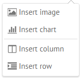
To create a list popup, use the "ssheet-suggest" view. This view is based on the ContextMenu view. Therefore, it supports sub-popups and line separators:
webix.ui({
   id: "mypopup",
   view: "ssheet-suggest",
   template: "<span class='webix_ssheet_button_icon #icon#'></span> #value#",
   data:[
       { id: "insert_image", icon: "image", value: "Insert image"},
       { id: "insert_chart", icon: "chart",  value: "Insert chart"},
       { $template: "Separator" },
       { id: "insert_column", icon: "column", value: "Insert column"},
       { id: "insert_row", icon: "row",  value: "Insert row"}
   ]
});
Form popups
You can also create a form popup and attach it to a Spreadsheet button.
Follow the tips below to set form controls inside of the popup properly:
- use only the bottom border
- set placeholders
- apply "webix_ssheet_suggest" CSS and set padding to 0 for a suggest of a form control
- use the "ssheet-colorpicker" view as a color selector
To apply correct borders for all controls in this popup, you can use the "ssheet-form-popup" view instead of "popup" and the "ssheet-form-suggest" one for the control's suggests:
webix.ui({
   id: "mypopup",
   view: "ssheet-form-popup",
   body: {
       view: "form",
       borderless: true,
       elements:[
            {view: "text", placeholder: "Name",...},
            {view: "richselect", label: "Type", placeholder: "Select", suggest:{
               view:  "ssheet-form-suggest",
               data:["Area","Bar","Line"]
            }},
            {view: "ssheet-colorpicker", label: "Color"}
      ]
   }
});
Related sample: Popup with Form
Customizing Dialogs
Form controls in a SpreadSheet dialog follow the same rules as popup controls do. We recommend to use the "ssheet-dialog" view to create a dialog instead of the window one.
The "ssheet-dialog" view applies styling for the header and adds three buttons: the Close icon at the top and two buttons (Cancel and Save) at the bottom.
To define the title of the dialog, use the head property.
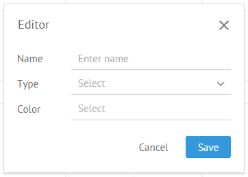
webix.ui({
   id: "mydialog",
   view: "ssheet-dialog",
   head: "Editor",
   body: {
       view: "form",
       elements:[
           ...
       ]
   }
});
The Close icon settings
The background of this icon is defined by the "webix_ssheet_hide_icon" CSS.
.webix_ssheet_hide_icon{
   content: url("images/edit.svg");
}
The dialog fires the onHideClick event on the icon click:
on:{
   onHideClick: function(){
       // click happened
       this.hide();
   }
}
The Cancel and Save buttons
The Cancel and Save buttons are added for dialogs automatically. Set the buttons property to false, if you don't want to show them:
view: "ssheet-dialog",
buttons: false,
…
The buttons' titles are specified in the SpreadSheet locale:
webix.i18n.spreadsheet.labels.cancel = "Cancel";
webix.i18n.spreadsheet.labels.save = "Save";
The dialog fires the following events on a button click: onCancelClick and onSaveClick.
Adding DataTable
Besides form controls you can add any views into the dialog, e.g. a datatable. In this case we recommend you to choose the "ssheet-dialog-table" view to apply the appropriate styling.
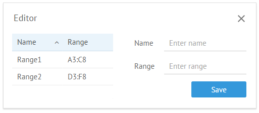
webix.ui({
    id: "mydialog",
    view: "ssheet-dialog",
    head: "Editor",
    body: {
      cols:[
        {
          view: "ssheet-dialog-table",
          autowidth: true,
          autoheight:1,
          autoConfig:true,
          data:[
              {id: 1, name: "Range1", range: "A3:C8"},
              {id: 2, name: "Range2", range: "D3:F8"}
          ]
        },
        {
            view: "form",
            elements:[
            ...
        ]}
    ]}
});
Related sample: DataTable in Dialog
Back to top