Adding Views above Cells
Spreadsheet provides an opportunity to insert images, charts and Webix views right over the cells. Users can move inserted elements to any place on the Spreadsheet using drag-n-drop.
Adding Images and Charts
There are three ways to add images or/and charts to the Spreadsheet:
Clicking buttons (by end user)
Editing charts and images (by end user)
Users can edit images and charts via the built-in dialogs:
And for charts:

Using API
You can add views by calling the add() method of Spreadsheet views module:
Adding a chart and an image
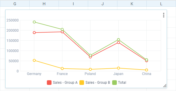
ssheet.views.add(750, 50, "chart", "B2:E7", {
    type:"line", legend:1, xAxis:1, width:550, height:400,
    yAxis:{start:-10000, end:50000, step:5000},
    series:[{tooltip:1, label:1, marker:"triangle", range:"C2:C7",color:"red"},
    // other series
    ]
});

ssheet.views.add(50,400,"image","path/to/image005.jpg");
Related sample: Spreadsheet: Adding images and charts
The method takes the following parameters:
- x (number) - a horizontal position
- y (number) - a vertical position
- type (string) - a type of view ("chart" or "image" or custom one)
- data (string) - data for the view, namely:
- range of cells, like "B3:C7" or a named range
- (for image) link to an image or a base64 string for it.
config (object) - an object with the following properties:
Common settings:
- width (number) - view width
- height (number) - view height.
Chart-specific settings:
- type (string) - type of charts
- dataSeries (string) - get data from columns/rows ("columns" by default)
- series (array) - an array of series objects. Each object represents a series and contains the following fields:
- tooltip (number | boolean) - defines whether to show a tooltip when a series marker is hovered over.
- label (number | boolean) - defines whether to show labels above the markers. The parameter does not work for the Spline Area and Area types. Use this property instead of pieInnerText for Pie charts.
- marker (string) - defines markers type (shape). "triangle", "square", "diamond"; "round" by default. The parameter does not work for the Spline Area, Area, and Bar types.
- range (string) - defines a data source for the series. For example, "C2:C7"
- color (string) - defines a color for the series. For example, "#03a1fc".
- xAxis (boolean | object):
- boolean - if true, uses left data column as an X axis
- object - an object with the following fields:
- fromData (number | boolean) - if true, uses left data column / top data row (depending on dataFrom) as an X axis
- title (string) - X axis title
- range (string) - range of cells, like "C3:C7" as an X axis.
- yAxis (object) - object with the following fields:
- title (string) - Y axis title
- origin (number) - the scale origin on the Y axis
- start (number) - the minimum value of the scale on the Y axis
- end (number) - the maximum value of the scale on the Y axis
- step (number) - the scale step on the Y axis.
- legend (boolean | object):
- boolean - if true, uses top data row as a legend
- object - an object with the following fields:
- fromData (number | boolean) - if true, uses top data row / left data column (depending on dataFrom) as a legend
- align (string) - the horizontal alignment of the block ("right", "left", "center" by default)
- valign (string) - the vertical alignment of the block ("top", "middle", "bottom" by default)
- range (string) - uses range of cells, like "C3:C7" as a legend.
- scale (object) - an object with the following fields:
- lines (number | boolean) - if false, scale lines are invisible
- circle (number | boolean) - the shape of the outer border of the radar area (radar type only)
- color (string) - scale lines color.
- 3D (number | boolean) - sets 3D chart (pie and donut charts only)
- stacked (number | boolean) - sets chart stacked (bar and area charts only)
- horizontal (number | boolean) - sets chart horizontal (bar charts only)
Loading with initial data
You can load views right in the views array in a data set. Each element contains an array of view parameters (described in the .add() method above):
webix.ready(function(){
  webix.ui({
      view:"spreadsheet",
      data: {
        data:[ /*data array*/ ],
        // ...
        views:[
            [ 750, 50, "chart", "B2:E7", {type:"line", legend:1, xAxis:1,
              yAxis:{start:-50000, end:500000, step:25000}}
            ],
            [ 50, 400, "image", "path/to/image005.jpg" ]
        ]
      }
  });
});
Related sample: Spreadsheet: Loading images and charts
Adding Webix Views
Apart from built-in charts and images, you can add any Webix view to the Spreadsheet by registering and showing a custom type.
The process consists of two steps:
Registering view
Firstly you should register a new view by calling the register() method on Spreadsheet views module. The method takes the following parameters:
- type (string) - type of a view;
- render (function) - function that is called during view rendering. It has the following parameters:
- node (object) - Webix window to render the view in;
- config (object) - object with configuration settings for the view;
- data (array) - JSON data ready for parse;
- track (function) - function that is called when data are changed in Spreadsheet. It has the following parameters:
- view (object) - view instance;
- data (array) - JSON data ready for parse.
Register new view
ssheet.views.register("table", (node, conf, data) => {
      // provide config and render the view
      const config = { view:"datatable", autoConfig:true, autoheight:true };
      return webix.ui(config, node);
  }, (view, data) => {
      // reload changed data
      view.clearAll();
      if(webix.isArray(data))
          view.parse(data);
  }
);
Adding view
After registering you can add the view to the Spreadsheet using the add() method:
Adding view
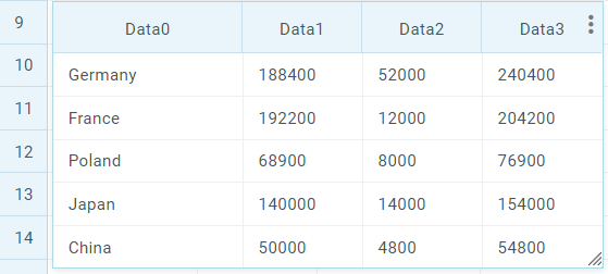
ssheet.views.add(50, 50, "table", "B3:E7", {width:550});
Related sample: Spreadsheet: Adding Webix view
Editing views
As you've already seen built-in content types, such as "chart" and "image" are supplied with dialogs for data editing. In case of a custom type, you need to provide a dialog pop-up for the end user to edit a view.
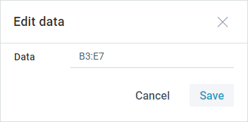
It is recommended to use the ssheet-dialog view to create a dialog. To keep it simple we added just one field for data. You can insert as many form controls as you want.
Setting a dialog
var dialog = webix.ui({
  view: "ssheet-dialog",
  head: "Edit data",
  position: "center",
  body: {
    view: "form",
    elements:[
        {view: "text", name:"data", label: "Data", placeholder: "Enter data"}
    ]
  }
});
Read more about styling dialogs.
To be able to open the dialog, you should attach a handler to Spreadsheet onCommand event:
Showing a dialog
ssheet.attachEvent("onCommand", function(obj){
  obj.data = obj.config.data;
  dialog.getBody().setValues(obj);
  dialog.show();
});
Related sample: Spreadsheet: Adding Webix view
To apply form values, you should handle the onSaveClick event of the dialog and call the update method of Spreadsheet views module:
var dialog = webix.ui({
  view: "ssheet-dialog",
  body: {
    view: "form"
  },
  on: {
    onSaveClick: function () {
        var values = this.getBody().getValues();
        // updates data according to the new values
        ssheet.views.update(values.viewid, values.data, values.config)
        this.hide();
    },
    // other handlers
  }
});
Customizing Added Views
You can customize added views just like other Spreadsheet elements.
For example, if you want to add shapes, you can make a separate editor for them:
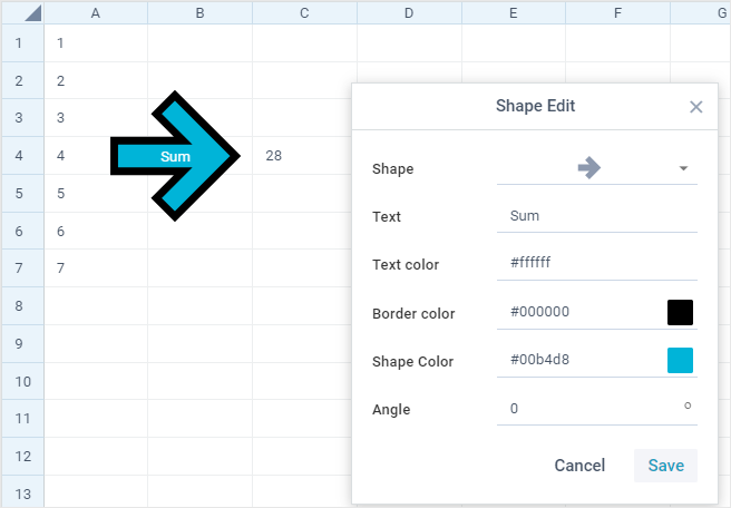
Related sample: Spreadsheet: Add Shapes
Another example is adding your custom palette for pie chars:
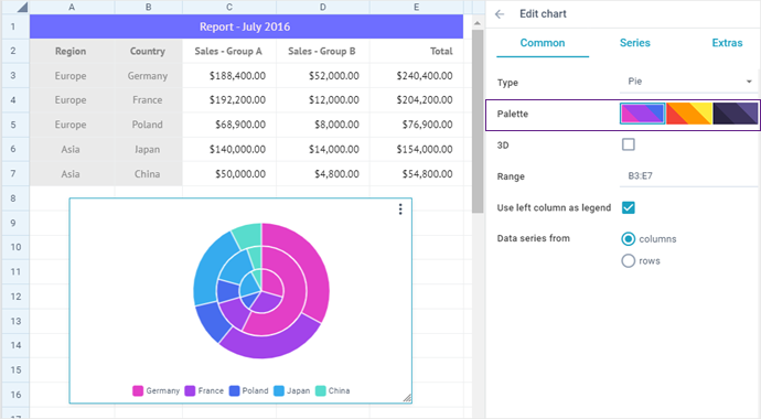
Related sample: Spreadsheet: Custom palette for Pie charts
Back to top